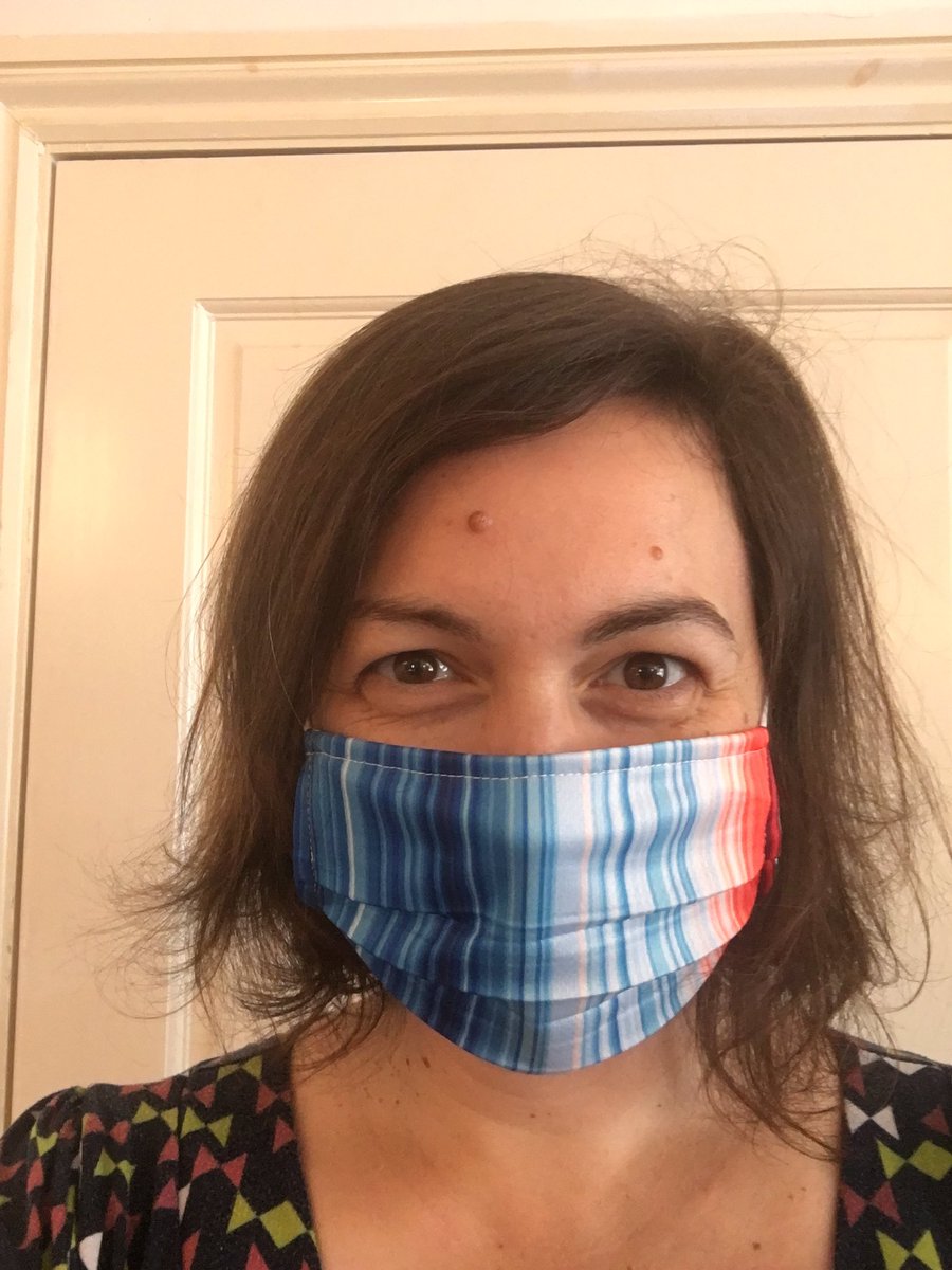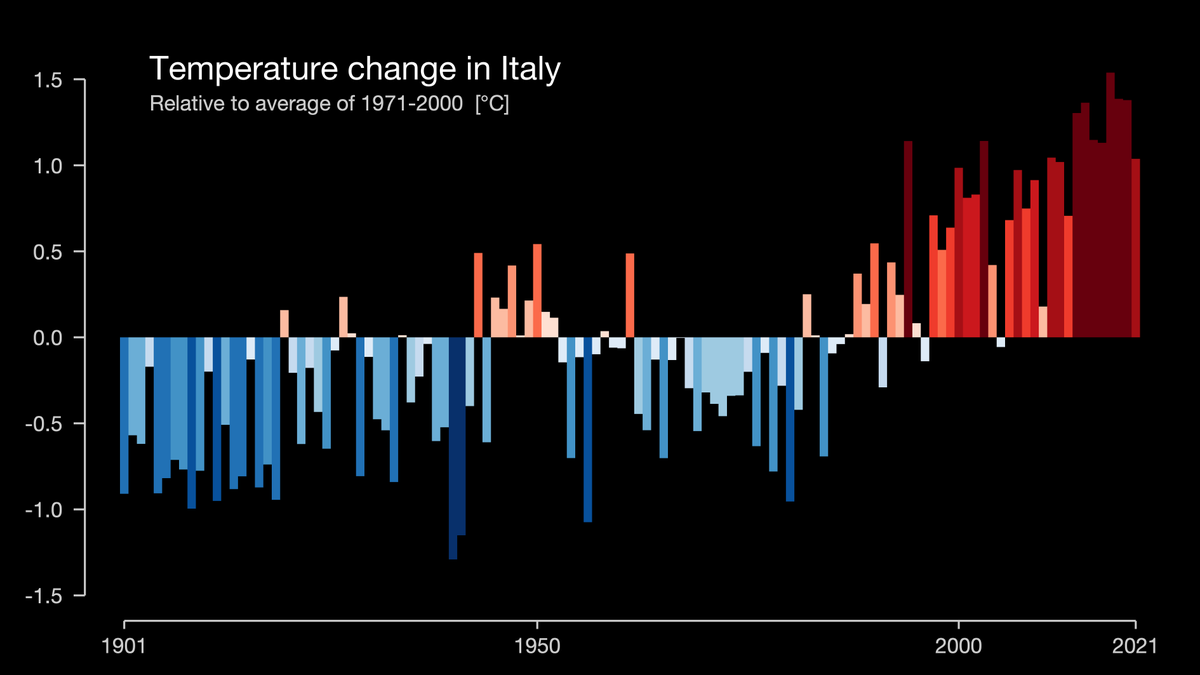
Today is the #SummerSolstice and #ShowYourStripes day, where people all over the world are thinking about #ClimateChange .
Here is a #ClimateStripes inspired animation.
Share your own climate stripes from showyourstripes.info

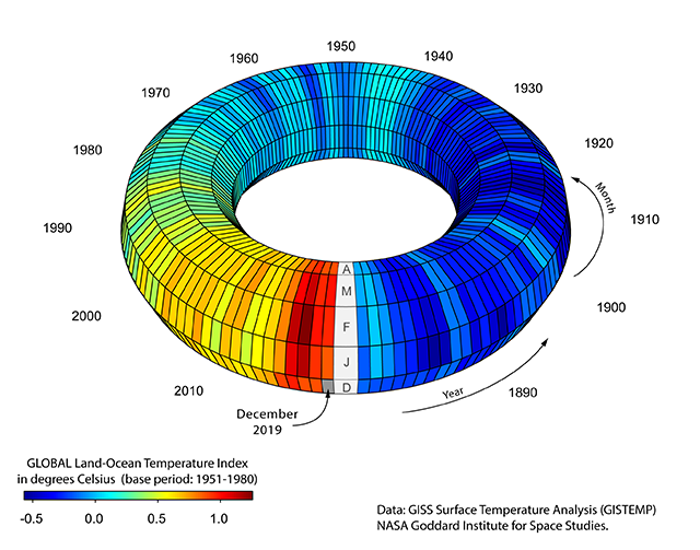
Inspired by Ed Hawkins #climatestripes I made a 3D climate donut 🍩😱
#ClimateChange #ShowYourStripes #ShowYourTorus #rstats #scicomm


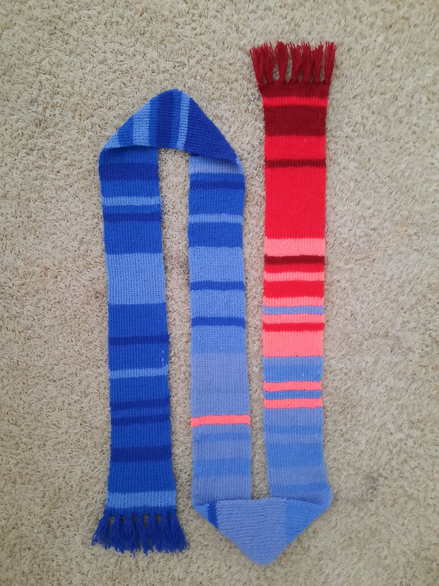
#ClimateStripes -kaulahuivi tuli valmiiksi! Kaulahuivi kuvaa keskilämpötilaa viimeisen 170-vuoden ajalta. Näyttää tosi kivalta, mutta lankojen päättely oli hirveetä kun väri vaihtu niin usein.
Arvaattekos muuten kumpi pääty huivista on 1850-luku ja kumpi 2010-luku?


The #FIFAWorldCup 2022 starts tomorrow. How has Qatar's climate changed since since the inaugural edition of the tournament in 1930? #climatestripes
#ShowYourStripes Ed Hawkins


Data visualisation helps us to understand the world, and in the case of the #ClimateStripes , helps us understand #ClimateChange . Explore five graphs that changed the world with Dr Adam Rutherford and BBC Ideas💡: #EarthDay

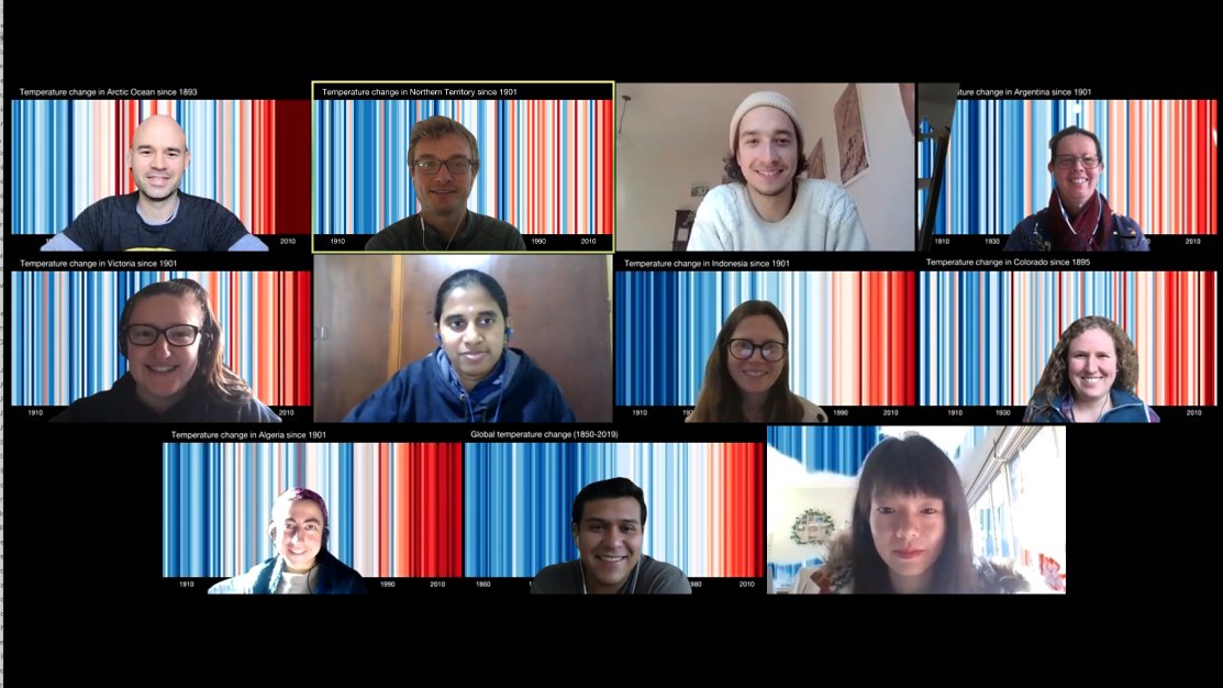
Happy Climate Scientists Day from @unimelb node of ARC Centre of Excellence for Climate Extremes showing our #climatestripes from a variety of regions thanks to Ed Hawkins and showyourstripes.info Firstdog Onthemoon Definitely no hugging today!

An oak sadly fell in #Reigate Priory Park last week. We counted rings, measured girth and height and found that in 150 years it sequestered 10 tonnes of CO2 which is now being slowly released into air and soil. It lived through a 1C temp rise..1/3 #climatestripes © Ed Hawkins


If watching today's #LondonMarathon you'll see the ad hoardings adorned with the #ClimateStripes .
If not already aware, have a little Google to see what it's all about.

Looking for #climatestripes for #FridaysForFuture events in #Canada ?
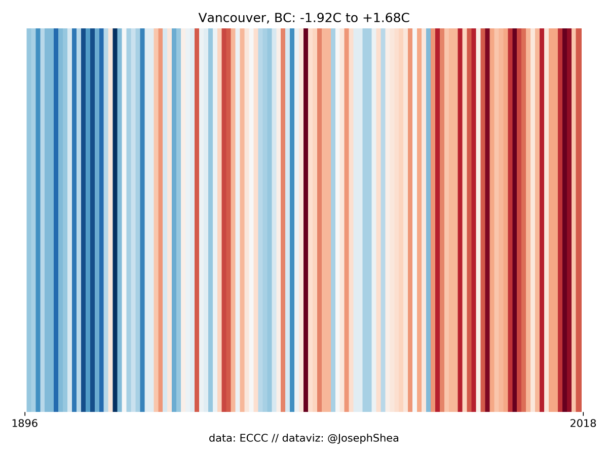
These plots show avg annual temperature anomalies (or departures from the mean) for Canadian cities. Blue = cold, red = hot, range of anomalies given in the title. #climatechange
1/n: Vancouver

Bugün #ShowYourStripes günüymüş. 1901'den günümüze Türkiyedeki sıcaklık değişimi, ulusal ısınma ya da iklim çizgilerimiz👇 #WarmingStripes #ClimateStripes #ClimateActionNow showyourstripes.info Ed Hawkins


Behold: Tom Di Liberto's and my new shower tiling, based on Ed Hawkins #ClimateStripes (global version where each tile is a country and year). #ShowYourStripes bbc.com/news/science-e…


5.3 million years of natural climate change expressed in the style of Ed Hawkins 's #climatestripes .
For the real paleoclimate geeks, this is the Lisiecki and Raymo (2005) (aka LR04) benthic oxygen isotope stack.
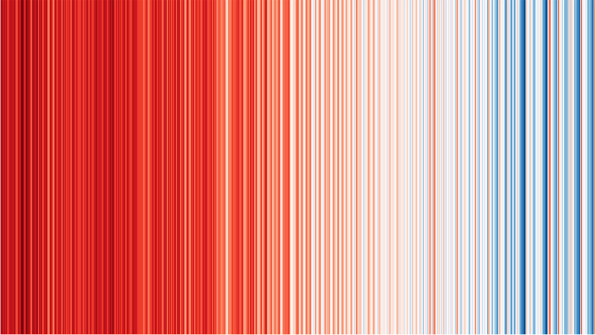

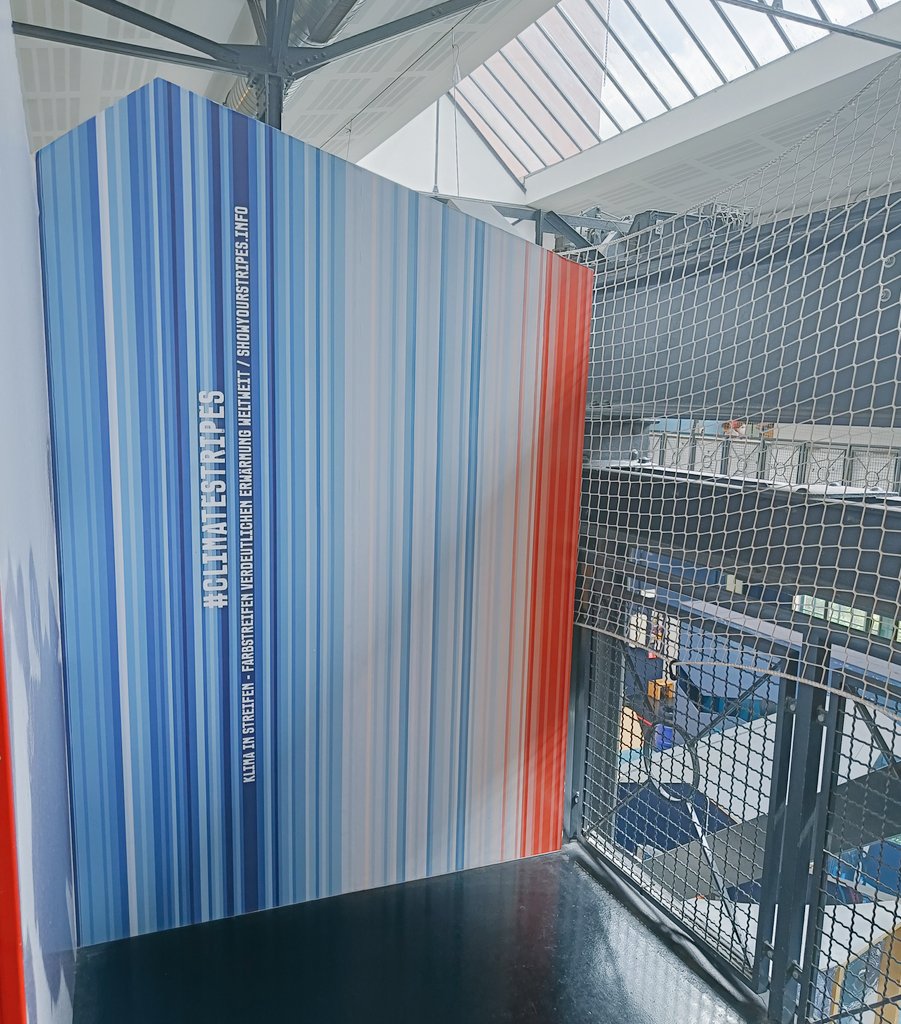
Even when spending time with the family, #dataviz is everywhere! #ClimateStripes at the 'Labyrinth' children museum in Berlin #ShowYourStripes
