Benjamin Nowak(@BjnNowak) 's Twitter Profile Photo

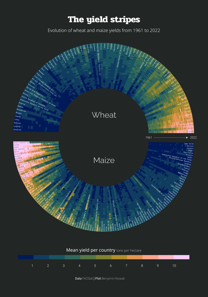
πŸ¦“For (time series X tiles) of , a repost of the yield stripes (radial version), showing the evolution of wheat and maize yields since 162

πŸ”—Link to code: github.com/BjnNowak/TidyT…

πŸ¦“For #Day23 (time series X tiles) of #30DayChartChallenge, a repost of the yield stripes (radial version), showing the evolution of wheat and maize yields since 162

πŸ”—Link to #RStats code: github.com/BjnNowak/TidyT…
account_circle
Isin Kosemen(@IsinKosemen) 's Twitter Profile Photo

Β | Day 22: Mobility | NYC Yellow Taxi Activity

The end of February has marked the peak activity of yellow taxi trips in New York City this year. Data is available only for January and February so far.

Created with React and D3.js.

isinkosemen.com/nyc_tlc.html

account_circle
bittersyrup.club 𓏔 ✿(@BittersyrupC) 's Twitter Profile Photo

πŸ“Š
πŸ—“οΈ : Correlation
This chart helps me to understand not only the number of PM2.5 that affect buyers to buy air purifiers but also social awareness about air pollution year by year that affects buying air purifiers.

πŸ“Š #30DayChartChallenge 
πŸ—“οΈ#Day20: Correlation
This chart helps me to understand not only the number of PM2.5 that affect buyers to buy air purifiers but also social awareness about air pollution year by year that affects buying air purifiers.
account_circle
bittersyrup.club 𓏔 ✿(@BittersyrupC) 's Twitter Profile Photo

πŸ“Š
πŸ—“οΈ : Glogal Change 🌎
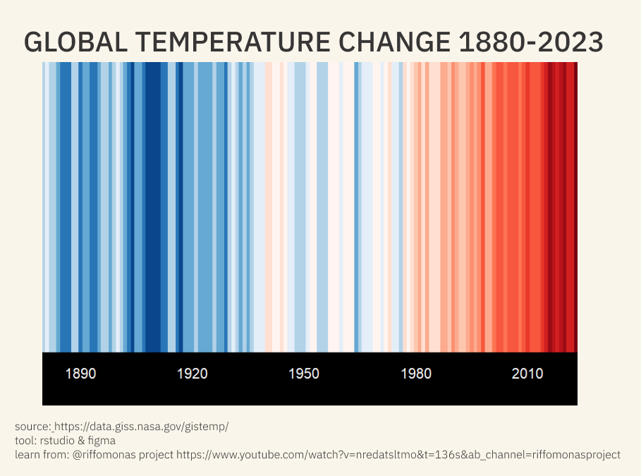
Today I made a chart by following youtube:Riffomonas Project instruction. long time no using R it was fun :) youtube.com/watch?v=NrEdAt…

πŸ“Š #30DayChartChallenge 
πŸ—“οΈ#Day25: Glogal Change 🌎
Today I made a chart by following youtube:Riffomonas Project instruction. long time no using R it was fun :) youtube.com/watch?v=NrEdAt…
account_circle
Shri Khalpada(@ShriKhalpada) 's Twitter Profile Photo

Today's the last day! The theme is 'FiveThirtyEight'.

I've seen some cool charts where FiveThirtyEight combines different chart types, so I went for that here (combining a line chart with a scatterplot), and used chess rating data.

Today's the last #30DayChartChallenge day! The theme is 'FiveThirtyEight'.

I've seen some cool charts where FiveThirtyEight  combines different chart types, so I went for that here (combining a line chart with a scatterplot), and used chess rating data.
account_circle