Jon Schwabish (@jschwabish) 's Twitter Profile
Jon Schwabish

@jschwabish

📈Economist & DataViz 🕸@urbaninstitute @PolicyViz 🎙PolicyViz Podcast 📺YouTube step-by-step tutorials 🗞On Substack: https://jschwabish.subst 👀All views mine

ID: 483273973

linkhttps://PolicyViz.com/ calendar_today04-02-2012 20:44:17

22,22K Tweet

23,23K Takipçi

951 Takip Edilen

Jon Schwabish (@jschwabish) 's Twitter Profile Photo

I've been thinking a lot about the current discussion in the #dataviz community about innovation and the future of the field. I agree with some points others have made, but I also have some disagreements. My read my rather-too-long post here: policyviz.com/2025/05/01/whe…

I've been thinking a lot about the current discussion in the #dataviz community about innovation and the future of the field. I agree with some points others have made, but I also have some disagreements. 

My read my rather-too-long post here: policyviz.com/2025/05/01/whe…
Jon Schwabish (@jschwabish) 's Twitter Profile Photo

Amazing new episode of the PolicyViz Podcast with Mandy Spaltman & Sebastian Gräff from the European Correspondent! You'll learn all about the team and how they go about their work in this week's episode of the show. 🎙 Zencastr: zencastr.com/The-PolicyViz-…

Amazing new episode of the PolicyViz Podcast with Mandy Spaltman & Sebastian Gräff from the European Correspondent! You'll learn all about the team and how they go about their work in this week's episode of the show.

🎙 Zencastr: zencastr.com/The-PolicyViz-…
Jon Schwabish (@jschwabish) 's Twitter Profile Photo

Bloomberg's Amanda Cox joins the PolicyViz Podcast to talk all things dataviz and data storytelling. We talk about shifts in data journalism and how these transitions affect newsroom priorities, audience interaction, and storytelling techniques. zencastr.com/z/yVo7ogua

Bloomberg's Amanda Cox joins the PolicyViz Podcast to talk all things dataviz and data storytelling. We talk about shifts in data journalism and how these transitions affect newsroom priorities, audience interaction, and storytelling techniques.

zencastr.com/z/yVo7ogua
Jon Schwabish (@jschwabish) 's Twitter Profile Photo

There are only two--that's right, just two--copies left of the Graphic Continuum Match It Game. This is your last and final chance to pick one up. etsy.com/listing/613021…

There are only two--that's right, just two--copies left of the Graphic Continuum Match It Game. This is your last and final chance to pick one up.

etsy.com/listing/613021…
Jon Schwabish (@jschwabish) 's Twitter Profile Photo

New podcast episode and newsletter dropping tomorrow morning. Now's your chance to subscribe to the show (wherever you get your podcasts) and the newsletter (on Substack). jschwabish.substack.com podcasts.apple.com/us/podcast/the… zencastr.com/The-PolicyViz-…

New podcast episode and newsletter dropping tomorrow morning. Now's your chance to subscribe to the show (wherever you get your podcasts) and the newsletter (on Substack).

jschwabish.substack.com

podcasts.apple.com/us/podcast/the…

zencastr.com/The-PolicyViz-…
Jon Schwabish (@jschwabish) 's Twitter Profile Photo

Join me July 28-29 for a special workshop to help you be a better and more impactful presenter. Powerful Presentations: From Design to Delivery publichealth.columbia.edu/academics/non-…

Join me July 28-29 for a special workshop to help you be a better and more impactful presenter.

Powerful Presentations: From Design to Delivery

publichealth.columbia.edu/academics/non-…
Jon Schwabish (@jschwabish) 's Twitter Profile Photo

#ColumbiaSHARP registration has opened for our virtual #PowerfulPresentations Workshop July 28-29! ColumbiaPublicHealth and Jon Schwabish team up to teach methods used to create effective, memorable presentations. Scholarships & early bird rate: publichealth.columbia.edu/BetterPresenta…

#ColumbiaSHARP registration has opened for our virtual #PowerfulPresentations Workshop July 28-29! <a href="/ColumbiaMSPH/">ColumbiaPublicHealth</a> and <a href="/jschwabish/">Jon Schwabish</a> team up to teach methods used to create effective, memorable presentations. Scholarships &amp; early bird rate: publichealth.columbia.edu/BetterPresenta…
Jon Schwabish (@jschwabish) 's Twitter Profile Photo

#ColumbiaSHARP registration has opened for our virtual #PowerfulPresentations Workshop July 28-29! ColumbiaPublicHealth and Jon Schwabish team up to teach methods used to create effective, memorable presentations. Scholarships & early bird rate: publichealth.columbia.edu/BetterPresenta…

#ColumbiaSHARP registration has opened for our virtual #PowerfulPresentations Workshop July 28-29! <a href="/ColumbiaMSPH/">ColumbiaPublicHealth</a> and <a href="/jschwabish/">Jon Schwabish</a> team up to teach methods used to create effective, memorable presentations. Scholarships &amp; early bird rate: publichealth.columbia.edu/BetterPresenta…
RBmediaTopAuthors (@rbmediaauthors) 's Twitter Profile Photo

Buy the "Elevate the Debate: A Multi-layered Approach to Communicating Your Research" audiobook today and save 50%! Offer ends 06/25. Jon Schwabish, Jon Schwabish audiobooks.com/promotions/pro…

Jon Schwabish (@jschwabish) 's Twitter Profile Photo

This week's episode of the PolicyViz Podcast is a repost of my 2015 interview with Edward Tufte, one of the pioneers of data visualization and author of seminal books like The Visual Display of Quantitative Information. Wherever you get your podcasts. zencastr.com/z/vjl7fbkV

This week's episode of the PolicyViz Podcast is a repost of my 2015 interview with Edward Tufte, one of the pioneers of data visualization and author of seminal books like The Visual Display of Quantitative Information.

Wherever you get your podcasts.

zencastr.com/z/vjl7fbkV
Jon Schwabish (@jschwabish) 's Twitter Profile Photo

New post: Can We Improve on the Stacked Bar Chart? The stacked bar chart is a tricky little devil. It stacks several segments on top of each other, asking the reader to make part-to-whole comparisons while comparing total amounts. policyviz.com/2025/06/24/can…

Jon Schwabish (@jschwabish) 's Twitter Profile Photo

I've just updated the downloadable PolicyViz Data Visualization Catalog! With around 1900 different charts and graphs, you can dive in to explore, play, and learn. policyviz.com/resources/poli…

I've just updated the downloadable <a href="/PolicyViz/">PolicyViz</a> Data Visualization Catalog! With around 1900 different charts and graphs, you can dive in to explore, play, and learn. 

policyviz.com/resources/poli…
Jon Schwabish (@jschwabish) 's Twitter Profile Photo

We mined the U.S. National Science Foundation grants database to explore which grants have been cancelled since April. We find that 94% of all canceled grants included at least one of the words in the The New York Times list of words that federal agencies have flagged to limit/avoid. urban.org/urban-wire/nsf…

Jon Schwabish (@jschwabish) 's Twitter Profile Photo

New dataviz going up on the office wall today—Annual Product of Coal in the US, from the 1891 Rand McNally New Family Atlas of the New World. The backside shows annual cotton production. /cc Philip Bump
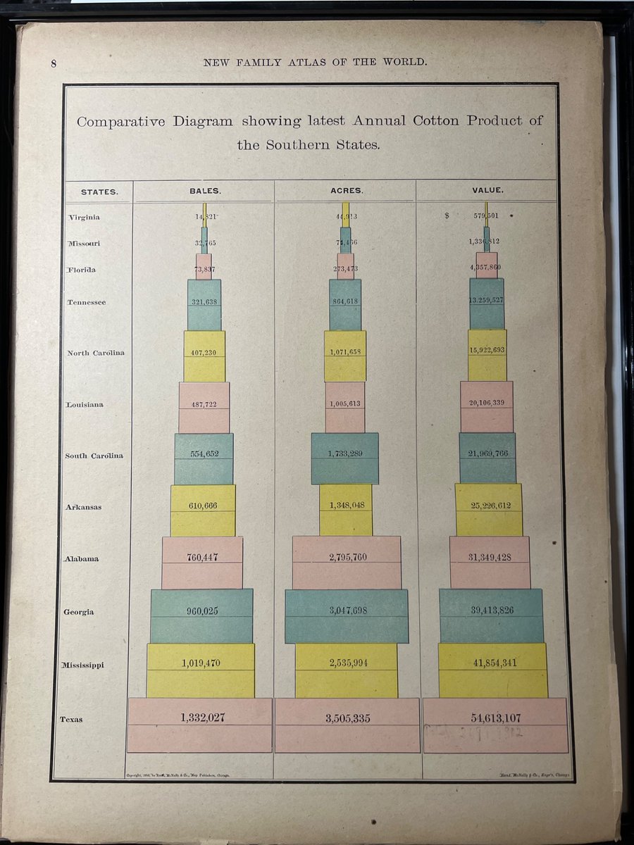
New dataviz going up on the office wall today—Annual Product of Coal in the US, from the 1891 Rand McNally New Family Atlas of the New World.

The backside shows annual cotton production.

/cc <a href="/pbump/">Philip Bump</a>
Jon Schwabish (@jschwabish) 's Twitter Profile Photo

I'm finally starting to move more content from the WooCommerce shop on my PolicyViz website over to my Etsy shop. So, if you're into data and data visualization stuff, check out the new coasters, tshirts, and downloadable dataviz guides. etsy.com/shop/PolicyViz

I'm finally starting to move more content from the WooCommerce shop on my <a href="/PolicyViz/">PolicyViz</a> website over to my <a href="/Etsy/">Etsy</a> shop. So, if you're into data and data visualization stuff, check out the new coasters, tshirts, and downloadable dataviz guides.

etsy.com/shop/PolicyViz
Jon Schwabish (@jschwabish) 's Twitter Profile Photo

In my latest Urban Institute blog post, I use ACS data to look at the number of households who receive Medicaid *AND* SNAP benefits. Importantly, I think this is the first time a Venn Diagram has appeared on the Urban website. Full post here: urban.org/urban-wire/abo…

In my latest Urban Institute blog post, I use ACS data to look at the number of households who receive Medicaid *AND* SNAP benefits. 

Importantly, I think this is the first time a Venn Diagram has appeared on the Urban website. 

Full post here: urban.org/urban-wire/abo…
Jon Schwabish (@jschwabish) 's Twitter Profile Photo

I've updated my data visualization book collection on Amazon. If you want to build out your data and dataviz library, this is where you should start. amazon.com/shop/jschwabis…

Jon Schwabish (@jschwabish) 's Twitter Profile Photo

My "Data Visualization in Excel" book is on sale today on Amazon! If you want to extend your dataviz skills in Excel, this book is for you. I give you a step-by-step guide to creating more advanced and often more effective data visualizations in Excel. amzn.to/4mA3IhH

Jon Schwabish (@jschwabish) 's Twitter Profile Photo

My thoughts on the recent firing of the BLS Commissioner Why the Firing of the BLS Commissioner Should Concern Every Data User urban.org/urban-wire/why…

Jon Schwabish (@jschwabish) 's Twitter Profile Photo

My thoughts on the firing of the BLS Commissioner. Check it out on the Urban Institute website. Why the Firing of the BLS Commissioner Should Concern Every Data User urban.org/urban-wire/why…

My thoughts on the firing of the BLS Commissioner. Check it out on the Urban Institute website.

Why the Firing of the BLS Commissioner Should Concern Every Data User

urban.org/urban-wire/why…