Harsha Kumar (@harshakumar666) 's Twitter Profile
Harsha Kumar

@harshakumar666

Behavioral ecology || PhD on behavioural adaptations of pikas to cold in the Trans - Himalayas || post-doctoral fellow at TIFR Hyderabad

ID: 1387066916322250755

calendar_today27-04-2021 15:31:46

29 Tweet

29 Takipçi

103 Takip Edilen

Harsha Kumar (@harshakumar666) 's Twitter Profile Photo

India Demands Resignation from Prime Minister Narendra Modi - Sign the Petition! chng.it/mDH2zQWv via Change.org India Go sign this. It matters. A Religious, non-scientific, egotistical, self-centred man cannot run a country. Let alone handling a pandemic crisis

Nandini Rajamani (@nandinirajamani) 's Twitter Profile Photo

Palm #squirrel colour & patterns evolved across the #Indiansubcontinent in response to the environment plus predators. Exciting results from work by Nivetha Murugesan Senan D Souza, Shijisha AC & collaborator Russell A Ligon at the #SciuridLab IISER Tirupati

Jorge Pereira (@jormipereira) 's Twitter Profile Photo

I'm thrilled to see my name together with this outstanding team of experts, and to see out this study led by Jamie Darby showing that stormy conditions reduce foraging success in albatrosses. cell.com/current-biolog… #ornithology #seabirds #extremeweather
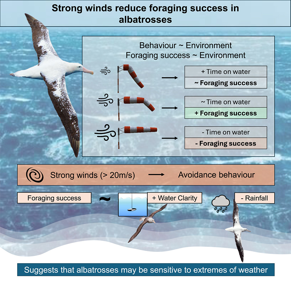
I'm thrilled to see my name together with this outstanding team of experts, and to see out this study led by <a href="/Jamie_Darby/">Jamie Darby</a> showing that stormy conditions reduce foraging success in albatrosses.
cell.com/current-biolog…

#ornithology #seabirds #extremeweather
Joachim Schork (@joachimschork) 's Twitter Profile Photo

Basic boxplots are often not the best way to visualize your data! They can hide important information, such as the distribution of individual data points or group-specific differences. However, with a few enhancements, boxplots can become powerful tools for uncovering insights

Basic boxplots are often not the best way to visualize your data! They can hide important information, such as the distribution of individual data points or group-specific differences. However, with a few enhancements, boxplots can become powerful tools for uncovering insights
Remote Sensing MDPI (@remotesens_mdpi) 's Twitter Profile Photo

🌳🌲 Individual #Tree-Crown #Detection and #Species Identification in Heterogeneous #Forests Using Aerial #RGB Imagery and #DeepLearning ✍️ Mirela Beloiu et al. 🔗 mdpi.com/2072-4292/15/5…

🌳🌲 Individual #Tree-Crown #Detection and #Species Identification in Heterogeneous #Forests Using Aerial #RGB Imagery and #DeepLearning

✍️ Mirela Beloiu et al.
🔗 mdpi.com/2072-4292/15/5…
Kirsty Franklin (@kirstyyfranklin) 's Twitter Profile Photo

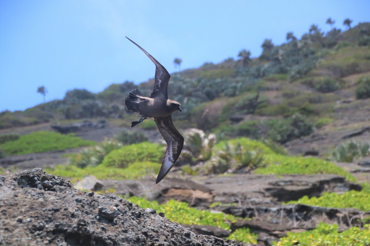
An exciting PhD opportunity to investigate the migration strategies of a fascinating tropical #seabird with a unique long-term geolocator dataset and great supervisory team! 🤩 findaphd.com/phds/project/c… 🔗 #ornithology #seabirds #RoundIslandPetrels

An exciting PhD opportunity to investigate the migration strategies of a fascinating tropical #seabird with a unique long-term geolocator dataset and great supervisory team! 🤩

findaphd.com/phds/project/c… 🔗

#ornithology #seabirds #RoundIslandPetrels
Archita (@archeeetah) 's Twitter Profile Photo

As an academic, I finally got an Equal Opportunities grant to attend a genomics workshop outside India, only to have my Visa rejected @CZinIndia. Despite having an invitation letter and a booked itinerary for the trip, the justification for the intended travel was unreliable.🧵

SARS‑CoV‑2 (COVID-19) (@covid19_disease) 's Twitter Profile Photo

⚠️ BREAKING: U.S. 🇺🇸 Reports 5.236 million New COVID-19 Infections in One Week. Currently, 1 in 64 Americans is Infected with COVID-19. COVID-19 transmission is currently higher than it was during 73.3% of the pandemic.

⚠️ BREAKING: 

U.S. 🇺🇸 Reports 5.236 million New COVID-19 Infections in One Week.

Currently, 1 in 64 Americans is Infected with COVID-19.

COVID-19 transmission is currently higher than it was during 73.3% of the pandemic.
Liam Revell (@phytools_liam) 's Twitter Profile Photo

This is one of my favorite visualizations made for the #phytools blog in 2024: parity mode, maximum altitude, & environmental temperature in liolaemid lizards using data from Damien Esquerre et al. (2018). More details here: blog.phytools.org/2024/03/functi….
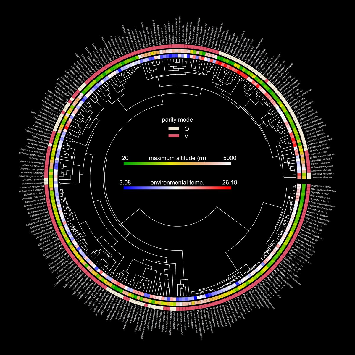
This is one of my favorite visualizations made for the #phytools blog in 2024: parity mode, maximum altitude, &amp; environmental temperature in liolaemid lizards using data from <a href="/DamienEsquerre/">Damien Esquerre</a> et al. (2018). More details here: blog.phytools.org/2024/03/functi….
TIFR Hyderabad (@tifrh_buzz) 's Twitter Profile Photo

A recent PhD graduate from Tamal Das's lab TIFR Hyderabad, Purnati Khuntia (Purnati Khuntia) spoke to Deccan Chronicle about her research goals as a Rowland Fellow Harvard University. Purnati would be setting up her independent lab at The Rowland Institute Harvard University. deccanchronicle.com/southern-state…

School of Biology, IISER-Thiruvananthapuram (@bio_iisertvm) 's Twitter Profile Photo

Congratulations to Dr Ullasa Kodandaramaiah (vanasiri.in) for being elected as a Fellow of the Indian Academy of Sciences. He is one among 40 scientists across all disciplines of sciences elected this year. ias.ac.in/public/Resourc…

Congratulations to Dr Ullasa Kodandaramaiah (vanasiri.in) for being elected as a Fellow of the Indian Academy of Sciences. He is one among 40 scientists across all disciplines of sciences elected this year. ias.ac.in/public/Resourc…
Chiti (@chitiarvind) 's Twitter Profile Photo

IISER Tirupati V. V. Robin lab at #NSAB2025 making a clean sweep of the poster awards! HUGE shout out to Manjari Jain and the entire organising team at nsab2025 for a seamless and fun filled conference at Mohali! 😄

IISER Tirupati <a href="/vvrobin/">V. V. Robin</a> lab at #NSAB2025 making a clean sweep of the poster awards! 
HUGE shout out to <a href="/minivets/">Manjari Jain</a> and the entire organising team at <a href="/nsab2025/">nsab2025</a> for a seamless and fun filled conference at Mohali! 😄
Joachim Schork (@joachimschork) 's Twitter Profile Photo

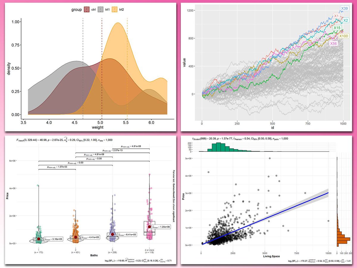
Adding statistical metrics to your plots can transform your visualizations from basic to highly informative. With ggplot2 in R and its versatile extensions, incorporating features like p-values, confidence intervals, and regression lines becomes both straightforward and visually

Adding statistical metrics to your plots can transform your visualizations from basic to highly informative. With ggplot2 in R and its versatile extensions, incorporating features like p-values, confidence intervals, and regression lines becomes both straightforward and visually
Harsha Kumar (@harshakumar666) 's Twitter Profile Photo

Excited to share that some of my PhD research is now up on bioRxiv as a preprint! 🐾❄️ This study explores how high-elevation, cold-adapted pikas from the Trans-Himalayas responded demographically to Pleistocene glaciation events. Nandini Rajamani biorxiv.org/content/10.110…

Joachim Schork (@joachimschork) 's Twitter Profile Photo

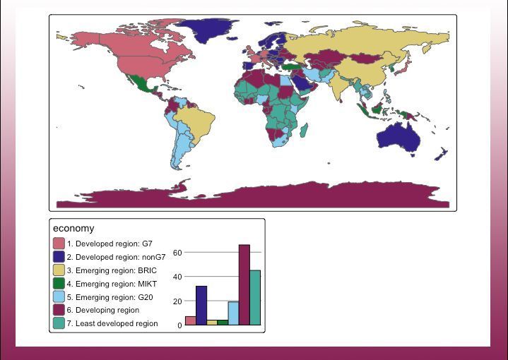
I recently stumbled over the tmap R package and was amazed by its capabilities! With tmap, you can craft dynamic, interactive maps with ease. The package offers a flexible syntax similar to ggplot2, but with a dedicated focus on maps. Key Features: ✅ Interactive Maps: Switch

I recently stumbled over the tmap R package and was amazed by its capabilities! With tmap, you can craft dynamic, interactive maps with ease. The package offers a flexible syntax similar to ggplot2, but with a dedicated focus on maps.

Key Features:

✅ Interactive Maps: Switch
Joachim Schork (@joachimschork) 's Twitter Profile Photo

You can easily export your #tidyplots in various formats by chaining multiple save_plot() functions together. This is a handy trick for efficiently creating and saving visualizations in different file types during your workflow. Thanks for sharing this tip, Jan Broder Engler.

Joachim Schork (@joachimschork) 's Twitter Profile Photo

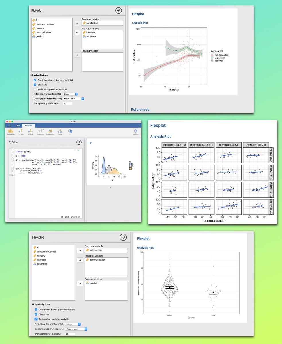
If you want to explore your data visually without spending hours coding, the Jamovi GUI is a game-changer. It offers seamless integration with R, allowing you to combine a simple point-and-click interface with the flexibility of advanced scripting. This makes it easy to spot

If you want to explore your data visually without spending hours coding, the Jamovi GUI is a game-changer. It offers seamless integration with R, allowing you to combine a simple point-and-click interface with the flexibility of advanced scripting. This makes it easy to spot