Kuhu Gupta (@thekuhugupta) 's Twitter Profile
Kuhu Gupta

@thekuhugupta

Data Visualization Engineer and Designer @illumio | From Sketches to JavaScript | I Help Organizations Build Actionable Data-Driven Experiences. 📊

ID: 1015132306330308610

calendar_today06-07-2018 07:16:16

120 Tweet

285 Followers

1,1K Following

Kuhu Gupta (@thekuhugupta) 's Twitter Profile Photo

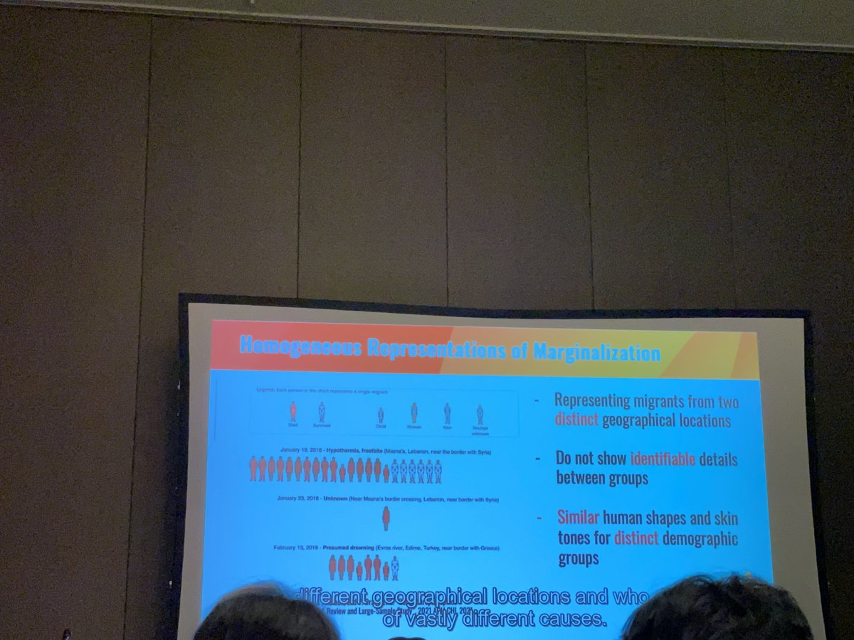
Insightful presentation by @priya_dhawka @vizforsocialgood. What stood out was the need to create a library for more inclusive and diverse icons!

Insightful presentation by @priya_dhawka @vizforsocialgood. What stood out was the need to create a library for more inclusive and diverse icons!
Kuhu Gupta (@thekuhugupta) 's Twitter Profile Photo

Thrilled to share two papers IEEE VIS- 1. Portola: A Hybrid Tree and Network Visualization Technique for Network Segmentation (Wed, Oct 19 @ 11:20) 2. A Taxonomy-Driven Model for Designing Educational Games in Visualization (Thur, Oct 20 @ 14:00) Please join the sessions!

Thrilled to share two papers <a href="/ieeevis/">IEEE VIS</a>-
1. Portola: A Hybrid Tree and Network Visualization Technique for Network Segmentation (Wed, Oct 19 @ 11:20)
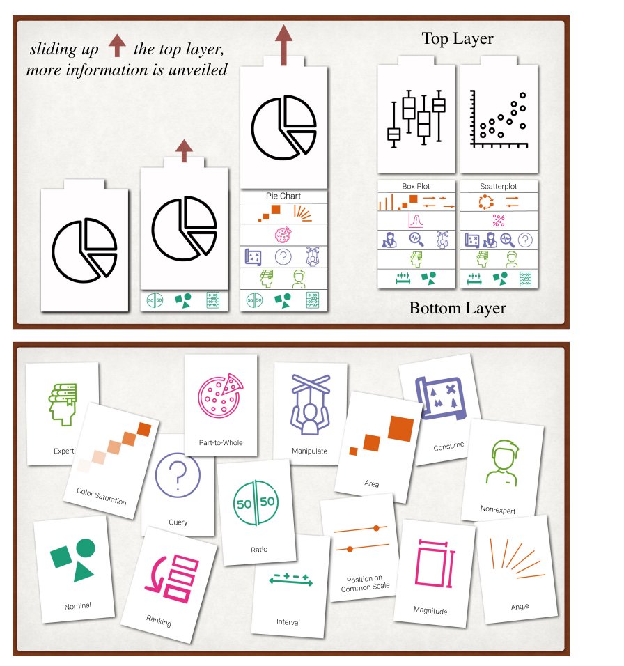
2. A Taxonomy-Driven Model for Designing Educational Games in Visualization (Thur, Oct 20 @ 14:00)
Please join the sessions!
VizSec (@vizsec) 's Twitter Profile Photo

The third paper in this session was presented by Kuhu Gupta "Portola: A Hybrid Tree and Network #Visualization Technique for #Network Segmentation" Starting strong with "You can't protect what you can't see!" #VizSec #ieeevis

The third paper in this session was presented by 
<a href="/thekuhugupta/">Kuhu Gupta</a>

"Portola: A Hybrid Tree and Network #Visualization Technique for #Network Segmentation" 

Starting strong with "You can't protect what you can't see!" 
#VizSec #ieeevis
Çağatay Demiralp (@cagataydemiralp) 's Twitter Profile Photo

Just had a chance to skim over the IEEE VIS program. A lot of interesting work. Still, it might be good for the conf to have a separate industry track, however small it might be. That'd be primarily useful for the academic community to hear about problems in industry #ieeevis.

Kuhu Gupta (@thekuhugupta) 's Twitter Profile Photo

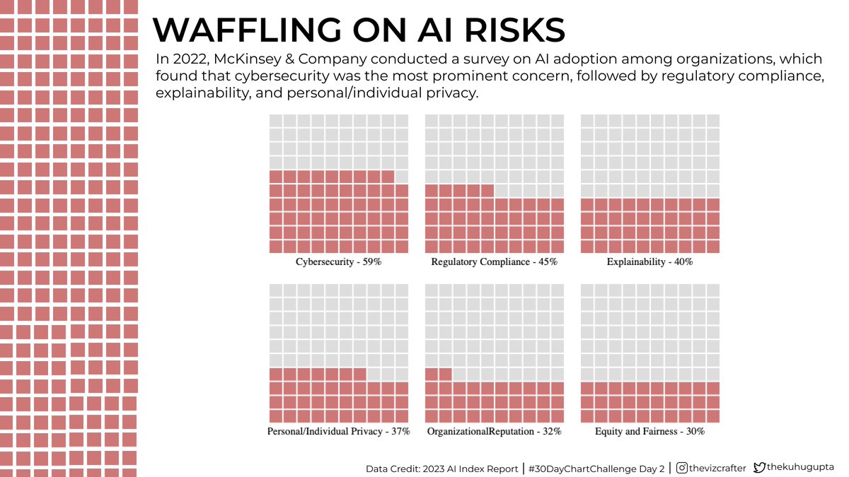
Day 2 of #30DayChartChallenge. Analyzed top concerns of organizations adopting AI from McKinsey & Company's 2021 survey. Cybersecurity leads the way, followed by regulatory compliance, explainability, and personal/individual privacy. #DataVisualization #AI

Day 2 of #30DayChartChallenge. Analyzed top concerns of organizations adopting AI from McKinsey &amp; Company's 2021 survey. Cybersecurity leads the way, followed by regulatory compliance, explainability, and personal/individual privacy. #DataVisualization #AI
Kuhu Gupta (@thekuhugupta) 's Twitter Profile Photo

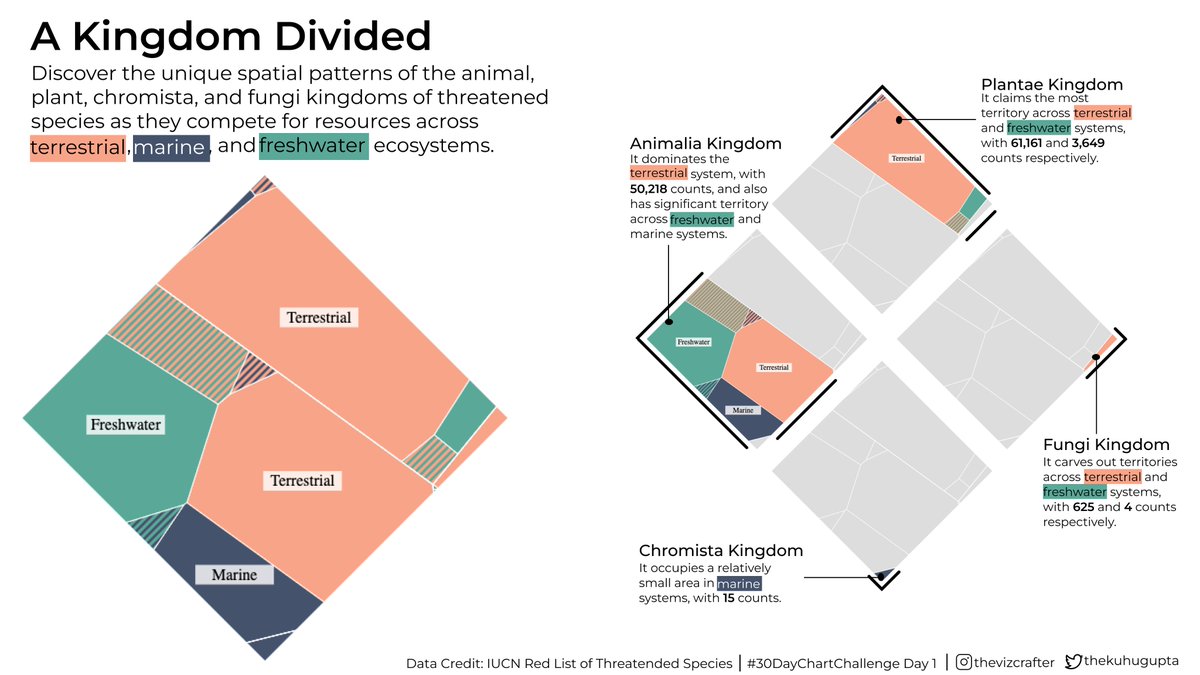
#Day1 of the #30DayChartChallenge, exploring part-to-whole relationships with Voronoi chart of animal, plant, chromista, and fungi kingdoms across terrestrial, marine, and freshwater systems. #DataVisualization

#Day1 of the #30DayChartChallenge, exploring part-to-whole relationships with Voronoi chart of animal, plant, chromista, and fungi kingdoms across terrestrial, marine, and freshwater systems. #DataVisualization
Kuhu Gupta (@thekuhugupta) 's Twitter Profile Photo

Exploring the beats of human genetics with a pulse chart that visualizes chromosome size and gene content differences. #30DayChartChallenge #dataviz #Genetics

Exploring the beats of human genetics with a pulse chart that visualizes chromosome size and gene content differences. #30DayChartChallenge  #dataviz #Genetics
USGS Data Science (@usgs_datasci) 's Twitter Profile Photo

A tale of two winters ❄️ Map of #CONUS coupled with lollipop charts show high snow across much of the West and low snow across the East in February. #Day9 | high/low | #30DayChartChallenge 📅 by Althea Archer #rstats #OpenData from National Snow and Ice Data Center doi.org/10.5067/MODIS/…

A tale of two winters ❄️

Map of #CONUS coupled with lollipop charts show high snow across much of the West and low snow across the East in February.

#Day9 | high/low | #30DayChartChallenge 📅 by Althea Archer #rstats

#OpenData from <a href="/NSIDC/">National Snow and Ice Data Center</a> doi.org/10.5067/MODIS/…
Kuhu Gupta (@thekuhugupta) 's Twitter Profile Photo

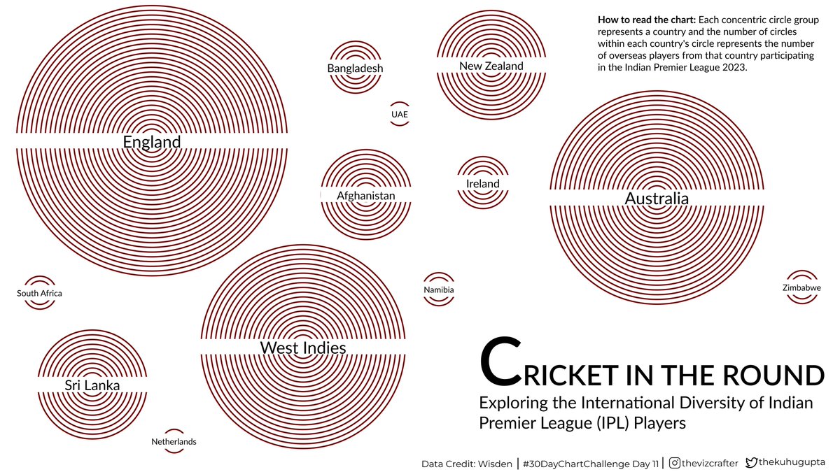
#Day11 of the #30DayChartChallenge: Circular theme! Check out my chart of international players in IPL 2023 using concentric circles that resemble a cricket ball. #dataviz #cricket #IPL2023 #IPL23

#Day11 of the #30DayChartChallenge: Circular theme! Check out my chart of international players in IPL 2023 using concentric circles that resemble a cricket ball. #dataviz #cricket #IPL2023 #IPL23
Kuhu Gupta (@thekuhugupta) 's Twitter Profile Photo

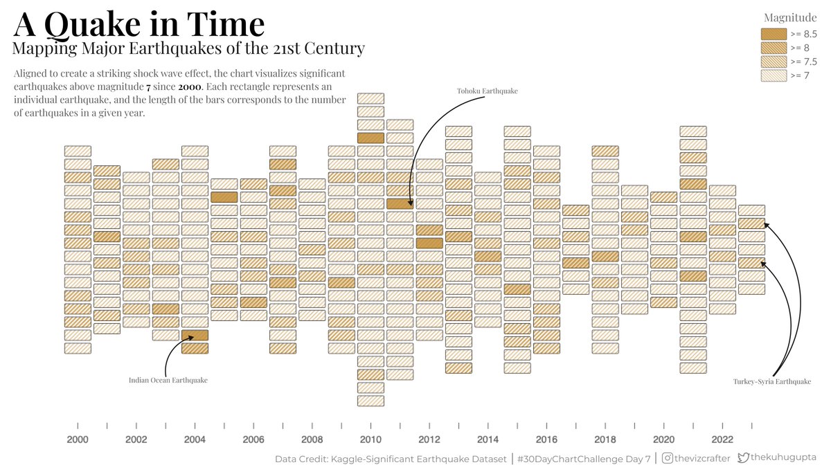
For #Day 7 of the #30DayChartChallenge, I'm exploring the theme of Hazards with a shock wave bar chart! The chart visualizes significant earthquakes above magnitude 7 since 2000, with each rectangle representing an individual earthquake. #dataviz #earthquakes

For #Day 7 of the #30DayChartChallenge, I'm exploring the theme of Hazards with a shock wave bar chart! The chart visualizes significant earthquakes above magnitude 7 since 2000, with each rectangle representing an individual earthquake. #dataviz #earthquakes
Kuhu Gupta (@thekuhugupta) 's Twitter Profile Photo

📊 #Day6 of the #30DayChartChallenge: Check out our streamgraph showing the changing landscape of AI collaboration over time based on data from Our World in Data. It's fascinating to see the rise of industry involvement in recent years! #dataviz #AIResearch #OWID #Collaboration

📊 #Day6 of the #30DayChartChallenge:

Check out our streamgraph showing the changing landscape of AI collaboration over time based on data from <a href="/OurWorldInData/">Our World in Data</a>. It's fascinating to see the rise of industry involvement in recent years! #dataviz #AIResearch #OWID #Collaboration