Dataviz Catalogue (@dataviz_catalog) 's Twitter Profile
Dataviz Catalogue

@dataviz_catalog

The Data Visualisation Catalogue: A library of information visualisation methods.

ID: 2263478022

linkhttp://datavizcatalogue.com calendar_today26-12-2013 23:45:43

1,1K Tweet

6,6K Followers

704 Following

Dataviz Catalogue (@dataviz_catalog) 's Twitter Profile Photo

New Post: Jitter plots A Strip Plot variation that provides a better view of any overlapping data points by adding a small amount of random shifting to the position of plotted dots. datavizcatalogue.com/blog/chart-sna… #Dataviz #DataVisualization #DataAnalysis #Datascience #Data

New Post: Jitter plots
A Strip Plot variation that provides a better view of any overlapping data points by adding a small amount of random shifting to the position of plotted dots.

datavizcatalogue.com/blog/chart-sna…

#Dataviz #DataVisualization #DataAnalysis #Datascience #Data
Dataviz Catalogue (@dataviz_catalog) 's Twitter Profile Photo

New Post: Cycle Plots A Graph used to visualise and analyse seasonal patterns within time series data. datavizcatalogue.com/blog/chart-sna… #Dataviz #DataVisualization #DataAnalysis #Datascience #Data

New Post: Cycle Plots
A Graph used to visualise and analyse seasonal patterns within time series data.
datavizcatalogue.com/blog/chart-sna…

#Dataviz #DataVisualization #DataAnalysis #Datascience #Data
Dataviz Catalogue (@dataviz_catalog) 's Twitter Profile Photo

New Post: Dendrograms A variation of a Tree Diagram that illustrates the arrangement of clusters formed by hierarchical clustering. datavizcatalogue.com/blog/chart-sna… #Dataviz #DataVisualization #DataAnalysis #Science #Data

New Post: Dendrograms
A variation of a Tree Diagram that illustrates the arrangement of clusters formed by hierarchical clustering.
datavizcatalogue.com/blog/chart-sna…

#Dataviz #DataVisualization #DataAnalysis #Science #Data
Dataviz Catalogue (@dataviz_catalog) 's Twitter Profile Photo

Looking to make dataviz education fun and engaging? Get 20% off The Graphic Continuum: Match It Game this September! datavizcatalogue.com/store/product/… #dataviz #datavisualisation

Looking to make dataviz education fun and engaging? Get 20% off The Graphic Continuum: Match It Game this September!
datavizcatalogue.com/store/product/…

#dataviz #datavisualisation
Dataviz Catalogue (@dataviz_catalog) 's Twitter Profile Photo

🎉 September Sale Alert! Get 20% off The Graphic Continuum: Match It Game! Perfect for #dataviz pros and educators. datavizcatalogue.com/store/product/… #datavisualisation #dobble #education #funlearning

Dataviz Catalogue (@dataviz_catalog) 's Twitter Profile Photo

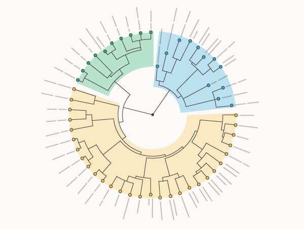
NEW POST: Circular Dendrograms A variation of a Dendrogram that visualises hierarchical clustering on a polar layout. datavizcatalogue.com/blog/chart-sna… #Dataviz #DataVisualization #Phylogenetics #PhylogeneticTree #Evolution #Biology #Taxonomy

NEW POST:
Circular Dendrograms

A variation of a Dendrogram that visualises hierarchical clustering on a polar layout.
datavizcatalogue.com/blog/chart-sna…

#Dataviz #DataVisualization #Phylogenetics #PhylogeneticTree #Evolution #Biology #Taxonomy
Dataviz Catalogue (@dataviz_catalog) 's Twitter Profile Photo

❗️NEW POST❗️ 📊 Tanglegrams A chart with two Dendrograms displayed side-by-side to show the concordance between two sets of hierarchical clustering. datavizcatalogue.com/blog/chart-sna… #Dataviz #DataVisualization #Tanglegram #Evolution #Biology #Taxonomy #Phylogenetics

❗️NEW POST❗️

📊 Tanglegrams

A chart with two Dendrograms displayed side-by-side to show the concordance between two sets of hierarchical clustering.
datavizcatalogue.com/blog/chart-sna…

#Dataviz #DataVisualization #Tanglegram #Evolution #Biology #Taxonomy #Phylogenetics
Dataviz Catalogue (@dataviz_catalog) 's Twitter Profile Photo

❗️NEW POST❗️ 📊 DocuBurst A chart that attempts to answer ‘what is this document about?’ through visualising the text-based content with a Sunburst Diagram. datavizcatalogue.com/blog/chart-sna… #DataViz #DataVisualization #Analysis #Documents #Sunburst

❗️NEW POST❗️

📊 DocuBurst

A chart that attempts to answer ‘what is this document about?’ through visualising the text-based content with a Sunburst Diagram.
datavizcatalogue.com/blog/chart-sna…

#DataViz #DataVisualization #Analysis #Documents #Sunburst
data.europa.eu (@eu_opendata) 's Twitter Profile Photo

DataViz pros! Would you like to share your work on successful projects, innovative tools, technologies, and trends in data visualisation?👩‍💻👨‍💻 Take the floor at #EUOpenDataDays2025. Submit your proposal by 22 October: europa.eu/!dyR7KW

Dataviz Catalogue (@dataviz_catalog) 's Twitter Profile Photo

❗️NEW POST❗️ - 📊 Fan Charts A visualisation tool used in time series analysis to display forecasts and associated uncertainties. datavizcatalogue.com/blog/chart-sna… #Dataviz #DataVisualization #Analytics #Finance #Inflation #Data #Forecast #DataAnalytics

❗️NEW POST❗️ - 📊 Fan Charts

A visualisation tool used in time series analysis to display forecasts and associated uncertainties.
datavizcatalogue.com/blog/chart-sna…

#Dataviz #DataVisualization #Analytics #Finance #Inflation #Data #Forecast #DataAnalytics
Dataviz Catalogue (@dataviz_catalog) 's Twitter Profile Photo

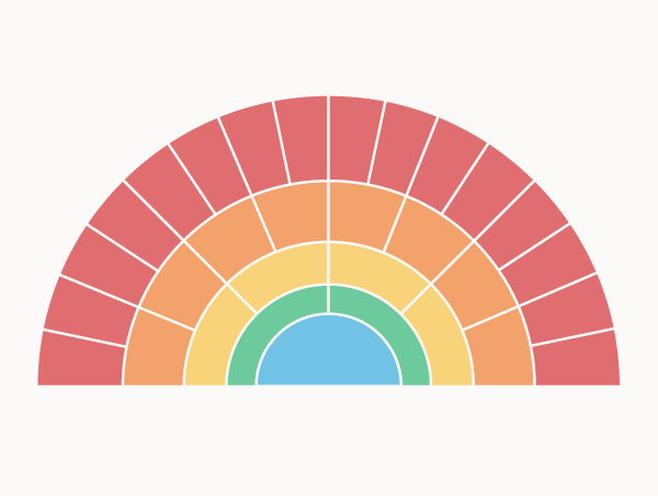
❗️NEW POST❗️-- 🪭 Genealogy Fan Charts 🪭 A diagram that visualises a hierarchical tree structure using a semi-circle format. datavizcatalogue.com/blog/chart-sna… #DataViz #DataVisualization #Genealogy #FamilyTree #ancestors #ancestry #diagram

❗️NEW POST❗️-- 🪭 Genealogy Fan Charts 🪭

A diagram that visualises a hierarchical tree structure using a semi-circle format.
datavizcatalogue.com/blog/chart-sna…

#DataViz #DataVisualization #Genealogy #FamilyTree #ancestors #ancestry #diagram
Mitchell B. Slapik (@mslapik) 's Twitter Profile Photo

According to dynamical systems, psychiatric disorders can be seen as energy landscapes with peaks and valleys. OCD has deep valleys where neural activity gets stuck, while schizophrenia has shallow valleys that let neural activity roam too freely, connecting unrelated ideas.

Dataviz Catalogue (@dataviz_catalog) 's Twitter Profile Photo

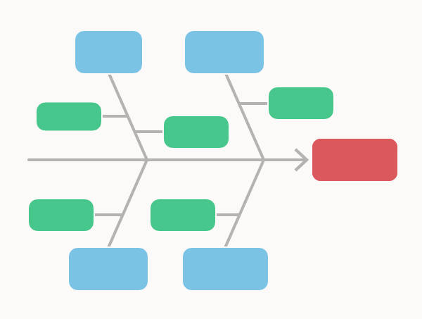
❗️NEW POST:❗️ 🐟 Fishbone Diagrams 🐟 A visual tool 🔧 used to systematically explore🔬the potential causes of a problem or effect. datavizcatalogue.com/blog/chart-sna… #DataViz #DataVisualization #Ishikawa #DataAnalytics #manufacturer

❗️NEW POST:❗️
🐟 Fishbone Diagrams 🐟

A visual tool 🔧 used to systematically explore🔬the potential causes of a problem or effect.
datavizcatalogue.com/blog/chart-sna…

#DataViz #DataVisualization #Ishikawa #DataAnalytics #manufacturer
Dataviz Catalogue (@dataviz_catalog) 's Twitter Profile Photo

The commenting feature on the blog has been removed because Disqus now displays ads and there’s rarely any comments on the blog anyway. It’s not worth to have atm.

Becker Friedman Institute for Economics (@beckerfriedman) 's Twitter Profile Photo

(1/2) Measuring global GDP is challenging, especially in middle- and low-income countries where reliable statistics are scarce. In new research, Esteban Rossi-Hansberg combines nighttime lights, land use, emissions, and a random forest model to estimate subnational GDP.

(1/2) Measuring global GDP is challenging, especially in middle- and low-income countries where reliable statistics are scarce.

In new research, <a href="/HansbergRossi/">Esteban Rossi-Hansberg</a> combines nighttime lights, land use, emissions, and a random forest model to estimate subnational GDP.