Jim Zarkadas (@jimzarkadas) 's Twitter Profile
Jim Zarkadas

@jimzarkadas

I help B2B PLG SaaS companies like @zenmaid and @knowledge_owl, grow their ARR through Design & CRO · Sharing daily real-life examples of how we do it!

ID: 16912284

linkhttps://loveatfirsttry.io/?utm_source=twitter&utm_medium=profileLink&utm_campaign=DesignKit calendar_today22-10-2008 20:40:37

5,5K Tweet

2,2K Takipçi

1,1K Takip Edilen

Jim Zarkadas (@jimzarkadas) 's Twitter Profile Photo

I usually roll my eyes at LinkedIn hypes but ChatGPT’s image-generation feature might have just converted me. I usually prefer to take the time to develop my own perspective, but curiosity got the best of me. And honestly, as a designer, I’m impressed (and excited). My team and

I usually roll my eyes at LinkedIn hypes but ChatGPT’s image-generation feature might have just converted me.

I usually prefer to take the time to develop my own perspective, but curiosity got the best of me. And honestly, as a designer, I’m impressed (and excited).

My team and
Jim Zarkadas (@jimzarkadas) 's Twitter Profile Photo

A design pattern we use in almost every account setup flow: adding an avatar of a team member in the form. It instantly shifts the experience from filling out a boring form to having a conversation. When users see the face of your team member, it feels like someone is guiding

A design pattern we use in almost every account setup flow: adding an avatar of a team member in the form.

It instantly shifts the experience from filling out a boring form to having a conversation. When users see the face of your team member, it feels like someone is guiding
Jim Zarkadas (@jimzarkadas) 's Twitter Profile Photo

I almost gave up on kitesurfing before I even started. Not because I didn’t want it. But because I was scared to start. Kitesurfing is one of those sports that looks fun once you’re flying across the water. But before that... you need to set up your kite and launch it. As a

Jim Zarkadas (@jimzarkadas) 's Twitter Profile Photo

Good design isn’t just about looking good. When we work with B2B SaaS companies, we follow a simple strategy: 1️⃣ Design for value and growth – conversions and usability come first. 2️⃣ Then design for delight – we create a brand and experience that feels anything but boring.

Jim Zarkadas (@jimzarkadas) 's Twitter Profile Photo

High conversion rates don't always mean you're winning. When I started working with ZenMaid Software I was laser-focused on driving as many signups as possible. I was so focused on quantity and wasn’t paying enough attention to the quality of signups. But high conversion rates don’t

Jim Zarkadas (@jimzarkadas) 's Twitter Profile Photo

Love at First Try got its name almost by accident. A few years ago, I started offering UX audits and I needed a catchy way to describe what I was selling. I was reviewing onboarding flows, and one day it came to me: “I’ll show you how to make users fall in love with your

Jim Zarkadas (@jimzarkadas) 's Twitter Profile Photo

Would you like to get an onboarding and UX review of your SaaS product by a UX design expert? (aka me 😃) If you've noticed users signing up but leaving quickly, or you're just not sure if your onboarding is good enough, keep reading. A few years ago, I posted on X about doing

Would you like to get an onboarding and UX review of your SaaS product by a UX design expert? (aka me 😃)

If you've noticed users signing up but leaving quickly, or you're just not sure if your onboarding is good enough, keep reading.

A few years ago, I posted on X about doing
Jim Zarkadas (@jimzarkadas) 's Twitter Profile Photo

You’re NOT the user of your product. Stop pretending you are. I’ve seen too many SaaS teams sign up for their own tools and go: “Well, this seems easy enough.” I get it. You built the product and you know it inside-out. But that’s exactly why you can’t audit your own

Jim Zarkadas (@jimzarkadas) 's Twitter Profile Photo

Playing the long-term game has been one of the biggest mindset shifts for me. On LinkedIn, we often hear stories about how people start a company, grow to millions of ARR super fast, and then sell it in a big exit. That’s the dream, right? I used to think so when I started Love

Jim Zarkadas (@jimzarkadas) 's Twitter Profile Photo

The #1 thing I look for when hiring someone? How they handle feedback. Not their resume, their past results or even their potential. I want to know: Can we talk openly about what’s not working... without their ego getting in the way? Because when someone gets defensive, it

Jim Zarkadas (@jimzarkadas) 's Twitter Profile Photo

People don’t have short attention spans. They have short consideration spans. Same goes for product design. 👉 Will users scroll through your landing page? Yes, if the hero section gives them a reason to. 👉 Will they complete a long signup flow? Yes, if they're convinced

People don’t have short attention spans. They have short consideration spans.

Same goes for product design.

👉 Will users scroll through your landing page?

Yes, if the hero section gives them a reason to.

👉 Will they complete a long signup flow?

Yes, if they're convinced
Jim Zarkadas (@jimzarkadas) 's Twitter Profile Photo

The best insights don’t come from analytics or dashboards. They come from watching a real person use your product. A few years ago, I started working with a new SaaS client. The first thing I did was click “Sign up” and followed the next steps. About 3 minutes in, I landed on

Jim Zarkadas (@jimzarkadas) 's Twitter Profile Photo

How do I tell if my SaaS product is easy to use? At Love at First Try, we ask ourselves this every time we design a new feature. Here’s the 3-step process we use to test intuitiveness. 1️⃣ Test with up to 5 people (no need for more) You don’t need 30 people. You don’t even need

Jim Zarkadas (@jimzarkadas) 's Twitter Profile Photo

Small UX copy changes can do more for usability than entire redesigns. This design tweak we made at ZenMaid Software is the perfect example 👇 The original question wasn’t bad: “Do cleaners need to pick up a key from your office to get in?” But it didn’t tell the user what would

Small UX copy changes can do more for usability than entire redesigns.

This design tweak we made at <a href="/ZenMaid/">ZenMaid Software</a> is the perfect example 👇

The original question wasn’t bad:

“Do cleaners need to pick up a key from your office to get in?”

But it didn’t tell the user what would
Jim Zarkadas (@jimzarkadas) 's Twitter Profile Photo

One of my favorite people to follow in the marketing world is Harry Dry from Marketing Examples. Here’s why. Harry is the kind of person who’s genuinely obsessed with his craft. You can just tell he loves copywriting and is completely invested in mastering it. He’s been creating

Jim Zarkadas (@jimzarkadas) 's Twitter Profile Photo

This is the best business advice I've ever gotten. Sell them what they want. Give them what they need. Most customers won’t tell you: “I want better UX,” or “I need more strategic branding.” They’ll say: “I want a product that looks great and feels easy to use.” That’s the

Jim Zarkadas (@jimzarkadas) 's Twitter Profile Photo

I love Today in Design™ but seriously guys... you can do better than that - clickbate works for the numbers but is this real design taste over here? wtf is wrong with everybody nowadays designing viral bullshit to just get clicks online - why not show value and inspire instead
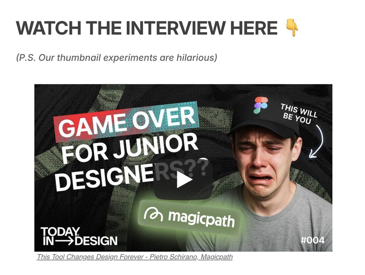
I love <a href="/todayindesign_/">Today in Design™</a>  but seriously guys... you can do better than that - clickbate works for the numbers but is this real design taste over here?

wtf is wrong with everybody nowadays designing viral bullshit to just get clicks online - why not show value and inspire instead