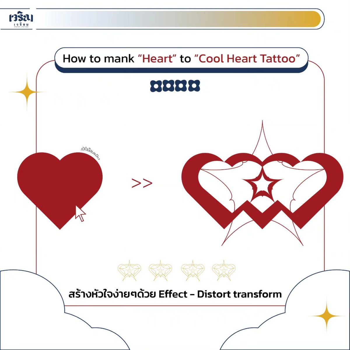
Ai 101: สร้างหัวใจง่าย (รึป่ะ?)
ฉบับ 'เจรียน'
เพราะเรียนแล้วจะ 'เจริญ'
ต้องเรียนกับ 'เจรียน'
ว่าแล้ว สาธุ สาธุ สาธุ 🙏🏻✨
----------------------------
Design by: charoen_chariean
#designtip s #designtip

Design tips from our creative team 🎨
It’s important to use customization tools to enhance the visual symmetry of a specific word and bring extra emphasis to a line of text for your target audience to see. Stay tuned for more design tips! #designtip #agencylife #portjervisny


Know what style suites you best. If rustic is more your vibe, Lakeville has an assortment of styles and colors to fit your needs. Come down and see!
#lakevillekitchenandbath #designtip #interiordesign #rustickitchen


LOOK Design Tip 89: There’s lots of room overhead; the ceiling is a platform #LOOKdesign #designtip #kevinkelly


LOOK Design Tip 93: The glowing red of neon signals warm alertness #LOOKdesign #designtip #kevinkelly


Design Tip:
The warmest finish for interiors? It’s wood that beats others hands down. 🛌
#designtip #homedecor #designlikeapro #designideas #wood #warmth #featuresandfurniture


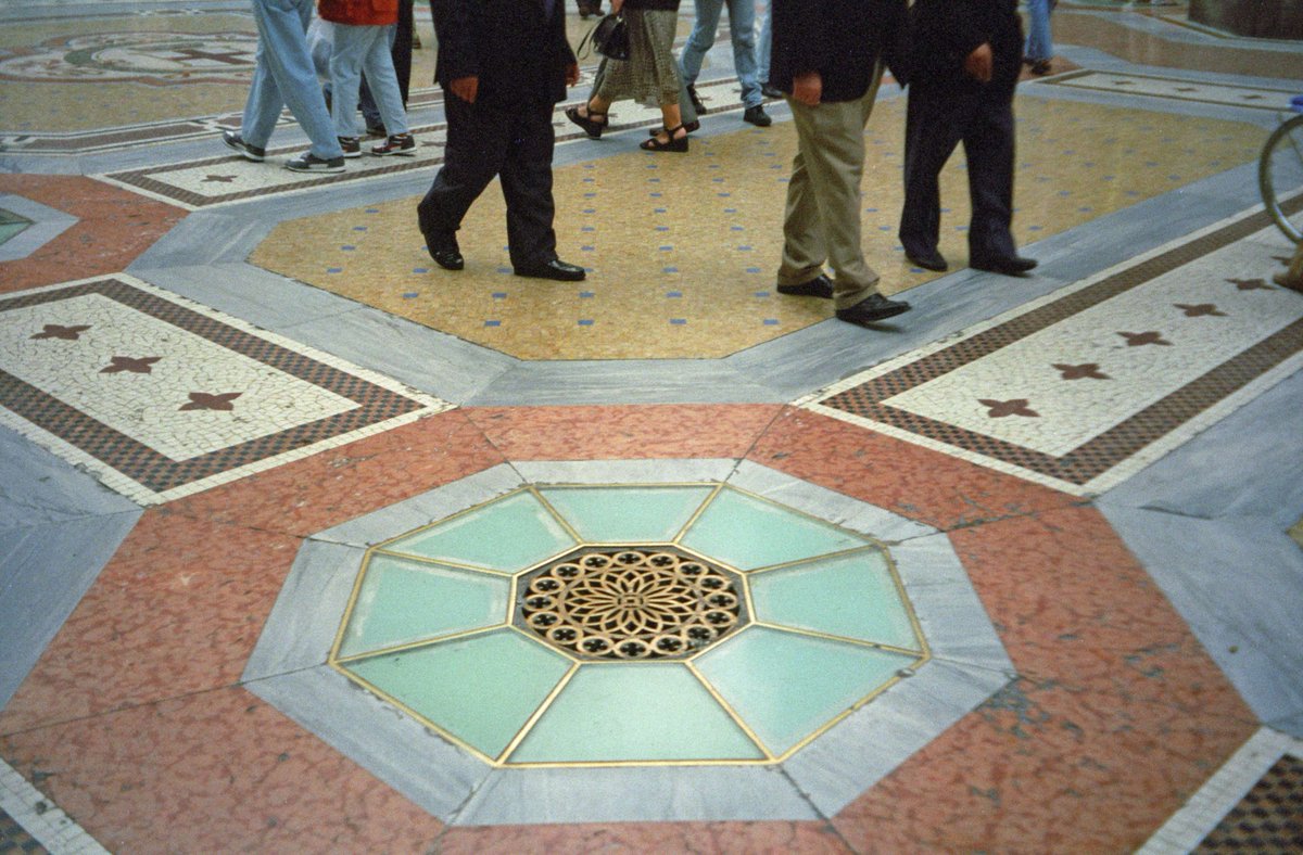
LOOK Design Tip 91: Floors are a blank canvas that don’t need to be boring #LOOKdesign #designtip #kevinkelly

How much you know about the color theory?
In color theory, a color scheme is the choice of colors used in various artistic and design contexts. 🎨
#colorschememagic #designtip #dominantcolor #secondarycolor #accentcolor #protip


Tip of the week: If you find yourself struggling to come up with design ideas, use Adobe Stock for inspiration and quick help!
#CalPolyGrC #CalPolySLO #DesignTip


Underrated Design Tip:
Don't overlook text spacing! Proper gaps between words and lines make content easier to read, especially on different devices. Keep it readable, prevent overlaps, and watch your design shine.
#DesignTip #uiuxdesign #indiehackers

Underrated Design Tip:
Double the vertical padding for horizontal padding to keep things balanced! For example, a button with 12px top and bottom padding should have 24px padding on the right and left.
#DesignTip #uiuxdesign #indiehackers


🌞 Good morning, everyone! 🌟
Looking for a design tip to kickstart your day? Here's one:
'Embrace white space 💫'
#DesignTip #WhiteSpace #CreativeMornings
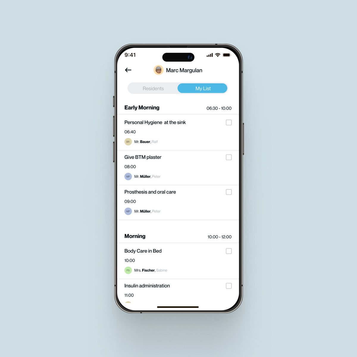

Underrated Design Tip:
When putting a square & circle side by side, make sure they look aligned! Adjust their positions so they match up visually, even if not perfectly centered. Keep it looking sharp!
#DesignTip #uiuxdesign #indiehackers

Underrated Design Tip:
When making a carousel, let a bit of the next or previous card show near the edge. This helps users see what's coming next and makes swiping feel smoother!
#DesignTip #uiuxdesign #indiehackers

Underrated Design Tip:
Use the same style for your icons! Mixing simple with complex or outlined with filled can make your design messy. Keep it clean and pro by sticking to one style!
#DesignTip #uiuxdesign #indiehackers
