Rodolpho Henrique (@rodhzz) 's Twitter Profile
Rodolpho Henrique

@rodhzz

Designer at @Google. Previously at @McKinsey, @Fjord

ID: 59333673

linkhttp://www.rodolphohenrique.com calendar_today23-07-2009 02:28:23

20,20K Tweet

555 Followers

324 Following

Rodolpho Henrique (@rodhzz) 's Twitter Profile Photo

Extremely valuable article about customer obsession - What working at Figma taught me about customer obsession open.substack.com/pub/lenny/p/wh…

Rodolpho Henrique (@rodhzz) 's Twitter Profile Photo

rauno.me/craft/interact… "Interaction design is an art form to make experiences that fluidly respond to human intent. When does a swipe trigger an action? What happens if a finger is covering content? How can we predict intent based on context?"

Rodolpho Henrique (@rodhzz) 's Twitter Profile Photo

"Relationships are worth more than everything. Brands, companies, and the creative work we do is just something minor. The people involved are the most crucial part. " I had a wonderful time talking about my career/life learnings with CanvasRebel. canvasrebel.com/meet-rodolpho-…

Rodolpho Henrique (@rodhzz) 's Twitter Profile Photo

I had a wonderful time sharing my thoughts about the democratization of the web and the advancement of no-code tools in the new book ‘Hot Right Now Vol. 5’ published by the talented folks from awwwards. awwwards.com/hot-right-now-…

Rodolpho Henrique (@rodhzz) 's Twitter Profile Photo

Useful and important thoughts about Dark Mode on digital products — Dark Mode: How Users Think About It and Issues to Avoid nngroup.com/articles/dark-… via @nngroup

Rodolpho Henrique (@rodhzz) 's Twitter Profile Photo

A fantastic guide for choosing colors for UI written by my dearest friend (and one of the best designers I've ever worked with), Jader Rubini - 7 practical tips for choosing colors for your next design project by Jader Rubini bootcamp.uxdesign.cc/7-practical-ti…

Rodolpho Henrique (@rodhzz) 's Twitter Profile Photo

Clear and concise considerations on accessibility for colors on UI from the fantastic folks at Wise design team - Accessible but never boring (Part 1) by Stephanie Smith link.medium.com/xUKHBsUYCDb

Rodolpho Henrique (@rodhzz) 's Twitter Profile Photo

A brilliant piece about animations for digital products. — Transition animations: a practical guide by Dongkyu Lee in UX Collective uxdesign.cc/transition-ani…

Rodolpho Henrique (@rodhzz) 's Twitter Profile Photo

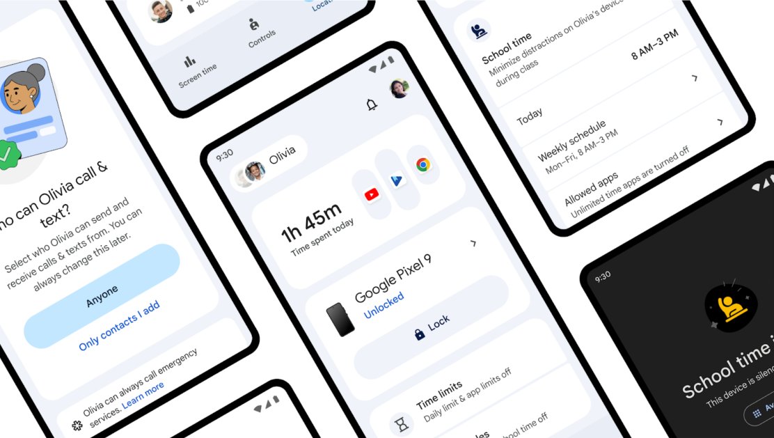
This week, my team and I introduced a bunch of new features we've been working on for a while. A completely visual overhaul in the Family Link app and some new features, such as School Time for kids - I'm so proud of this.

This week, my team and I introduced a bunch of new features we've been working on for a while. A completely visual overhaul in the Family Link app and some new features, such as School Time for kids - I'm so proud of this.
Rodolpho Henrique (@rodhzz) 's Twitter Profile Photo

What makes an interface accessible? And how can designers create experiences that work for all users? This guide answers all your burning questions about accessibility—like how to design for everyone, even those juggling a hot coffee and a pet hamster. designbeyondbarriers.com