QGIS Maps (@qgismaps) 's Twitter Profile
QGIS Maps

@qgismaps

Showcasing some of the great maps that have been made using QGIS from the community. Header image: flickr.com/photos/9585676…

ID: 1144801662982168576

linkhttps://www.flickr.com/groups/qgis/pool/ calendar_today29-06-2019 02:56:00

266 Tweet

1,1K Takipçi

0 Takip Edilen

Fabian Neugirg (@curious_fabian) 's Twitter Profile Photo

Day 14 of #30DayMapChallenge - Hexagons Trying new things and following John Nelson tutorial on color coded hexagons in varying sizes. All done #QGIS

Day 14 of #30DayMapChallenge - Hexagons

Trying new things and following <a href="/John_M_Nelson/">John Nelson</a> tutorial on color coded hexagons in varying sizes. All done #QGIS
Vanessa Tebbitt (@vanessatebbitt) 's Twitter Profile Photo

Geology of the globe in 80s style colour palette! Day 19 - Globe #30DayMapChallenge Made in #QGIS using the Globe Builder plugin. Was almost not going to make a map for today but...gotta..keep...going....😅🤣

Geology of the globe in 80s style colour palette!

Day 19 - Globe #30DayMapChallenge 

Made in #QGIS using the Globe Builder plugin.

Was almost not going to make a map for today but...gotta..keep...going....😅🤣
Kirsten Reilly (@_penguin_runner) 's Twitter Profile Photo

#30DayMapChallenge Day 19 - Globe A different view of the World than I usally do. Using #NaturalEarth Data and the Globe Builder Plugin #QGIS

#30DayMapChallenge Day 19 - Globe

A different view of the World than I usally do. Using #NaturalEarth Data and the Globe Builder Plugin #QGIS
MapTheClouds (@maptheclouds) 's Twitter Profile Photo

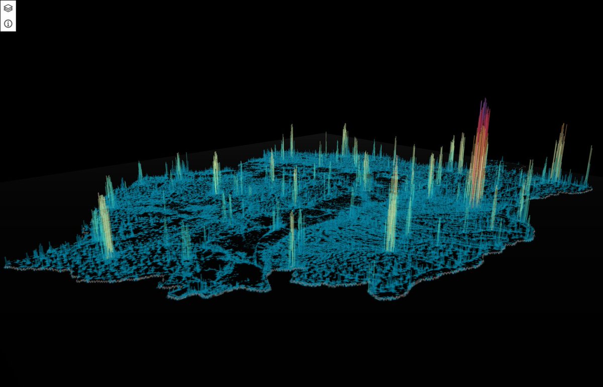
#30DayMapChallenge Day 21. Data - Kontur Population Dataset => 2/2 And some more detailed images. 'Romania - Population Density' #Qgis2threejs #QGIS

#30DayMapChallenge Day 21. Data - Kontur Population Dataset =&gt; 2/2

And some more detailed images.

'Romania - Population Density'

#Qgis2threejs #QGIS
Kartoza (@kartozageo) 's Twitter Profile Photo

#30DayMapChallenge Day 24: Fantasy Thiasha Vythilingam made this wonderful fantasy map using the Azgaar fantasy map generator and #QGIS. #kartozageo #fantasy #staffmaps #Map
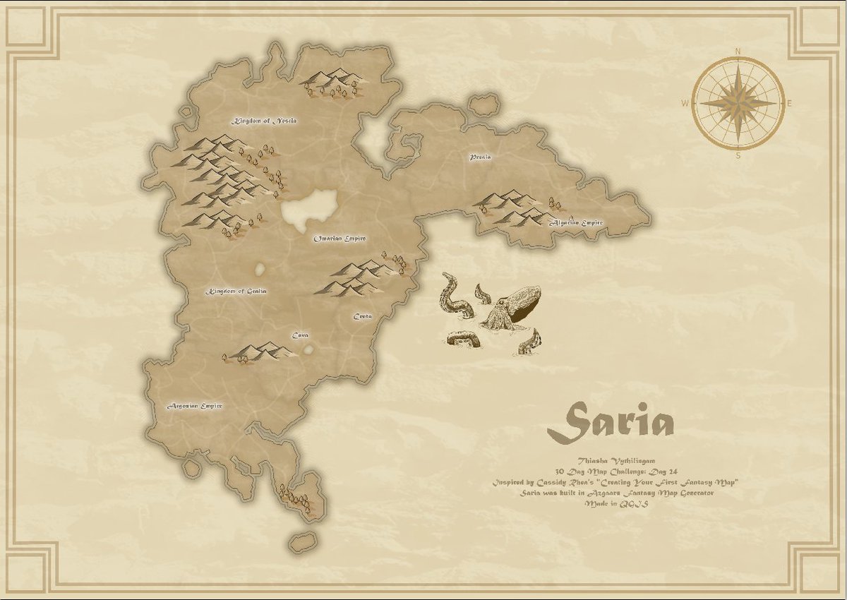
#30DayMapChallenge Day 24: Fantasy

<a href="/Thithi1812/">Thiasha Vythilingam</a> made this wonderful fantasy map using the Azgaar fantasy map generator and #QGIS. 

#kartozageo #fantasy
#staffmaps #Map
Kirsten Reilly (@_penguin_runner) 's Twitter Profile Photo

#30DayMapChallenge Day 24 - Fantasy I love a book that has its own map, sadly the Witcher books don't have maps in the front, so I attempted to create one...this is what I came up with, not sure I've got enverything in the right place! #TheWitcher #QGIS

#30DayMapChallenge Day 24 - Fantasy

I love a book that has its own map, sadly the Witcher books don't have maps in the front, so I attempted to create one...this is what I came up with, not sure I've got enverything in the right place!

#TheWitcher  #QGIS
Jelmer Visser (@dietukkerfries) 's Twitter Profile Photo

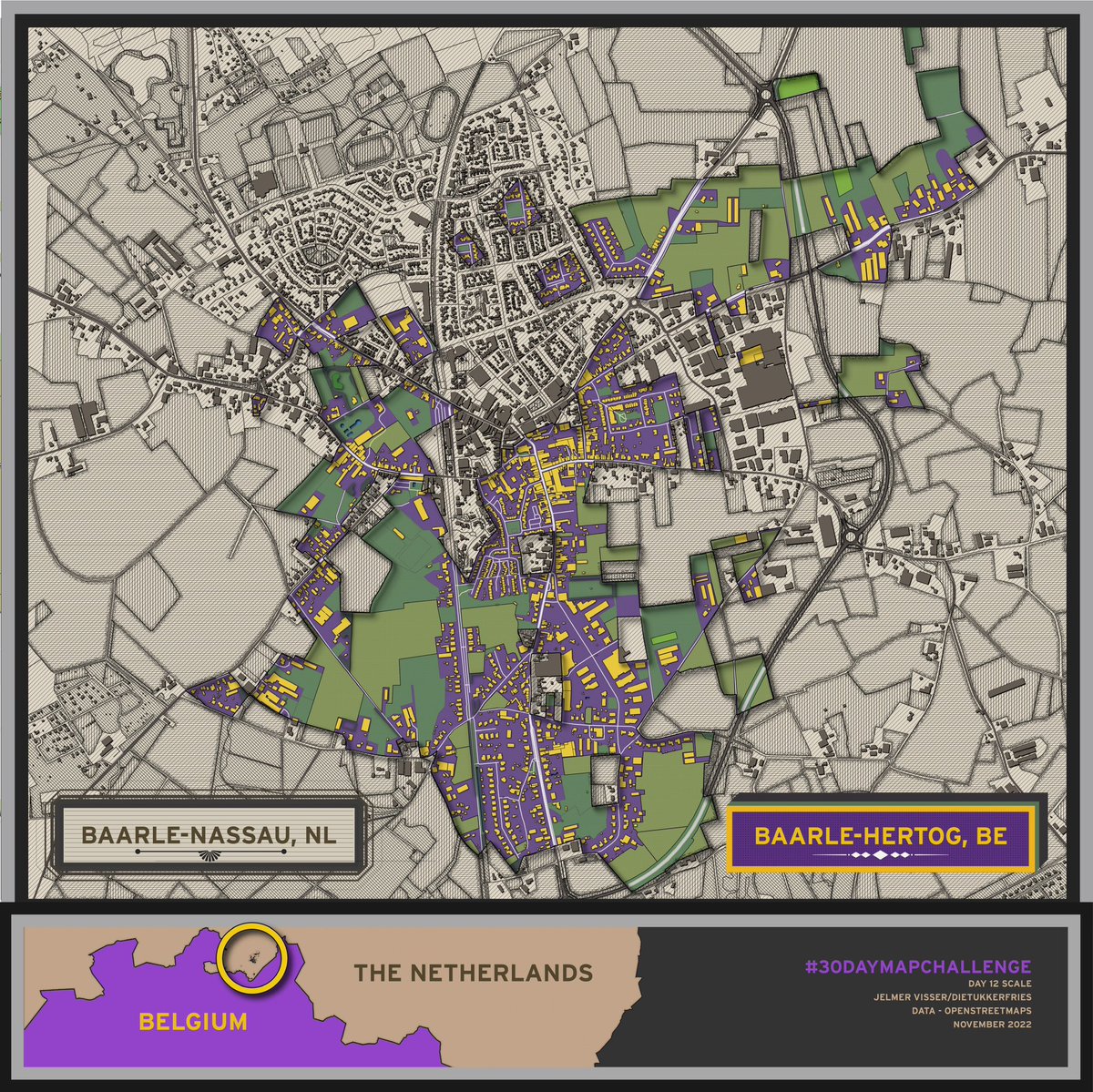
Bij elke kaart die ik maak, kies ik 1 van deze 2 finishing touch-methodes. 1 - na inladen/inkleuren vanuit QGIS exporteren naar Illustrator om een design ‘om’ de kaart heen te maken. 2 - door in QGIS om de individuele elementen/vlakken te tweaken (in AI zo goed als onmogelijk)

Bij elke kaart die ik maak, kies ik 1 van deze 2 finishing touch-methodes.

1 - na inladen/inkleuren vanuit QGIS exporteren naar Illustrator om een design ‘om’ de kaart heen te maken. 

2 - door in QGIS om de individuele elementen/vlakken te tweaken (in AI zo goed als onmogelijk)
Juan Velasco (@juanvelasco) 's Twitter Profile Photo

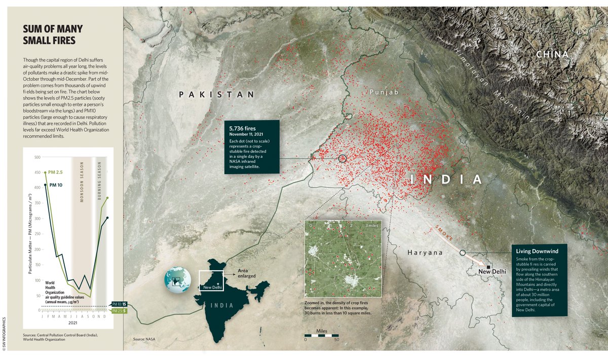
Every year from Oct. through Dec., smoke from crop-stubble fires is carried by winds along the Himalayas and into Delhi, worsening the already severe air pollution. For Nature Conservancy magazine. Illustrator, Photoshop, QGIS. nature.org/en-us/magazine… #infographics #maps #delhi

Every year from Oct. through Dec., smoke from crop-stubble fires is carried by winds along the Himalayas and into Delhi, worsening the already severe air pollution. For Nature Conservancy magazine. Illustrator, Photoshop, QGIS.
nature.org/en-us/magazine…
#infographics #maps #delhi
Hans van der Kwast @hansakwast@fosstodon.org (@hansakwast) 's Twitter Profile Photo

Yesterday we had a nice #QGISOpenDay session where IHE Delft 💧 Institute for Water Education MSc students in Water & Sustainable Development got useful tips to improve their catchment maps for the course Water Quality Assessment & Management. #qgis #qgishydro youtu.be/UbdxB3mjpZo

QGIS Maps (@qgismaps) 's Twitter Profile Photo

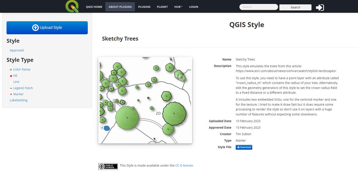
Wanna give @timlinux's map style x.com/timlinux/statu… a try yourself? Nothing easier than that. Tim has shared his style on plugins.qgis.org/styles/149/ #gischat #cartography #qgis

Wanna give @timlinux's map style x.com/timlinux/statu… a try yourself? 

Nothing easier than that. Tim has shared his style on plugins.qgis.org/styles/149/

#gischat #cartography #qgis
Boris Mericskay (@borismericskay) 's Twitter Profile Photo

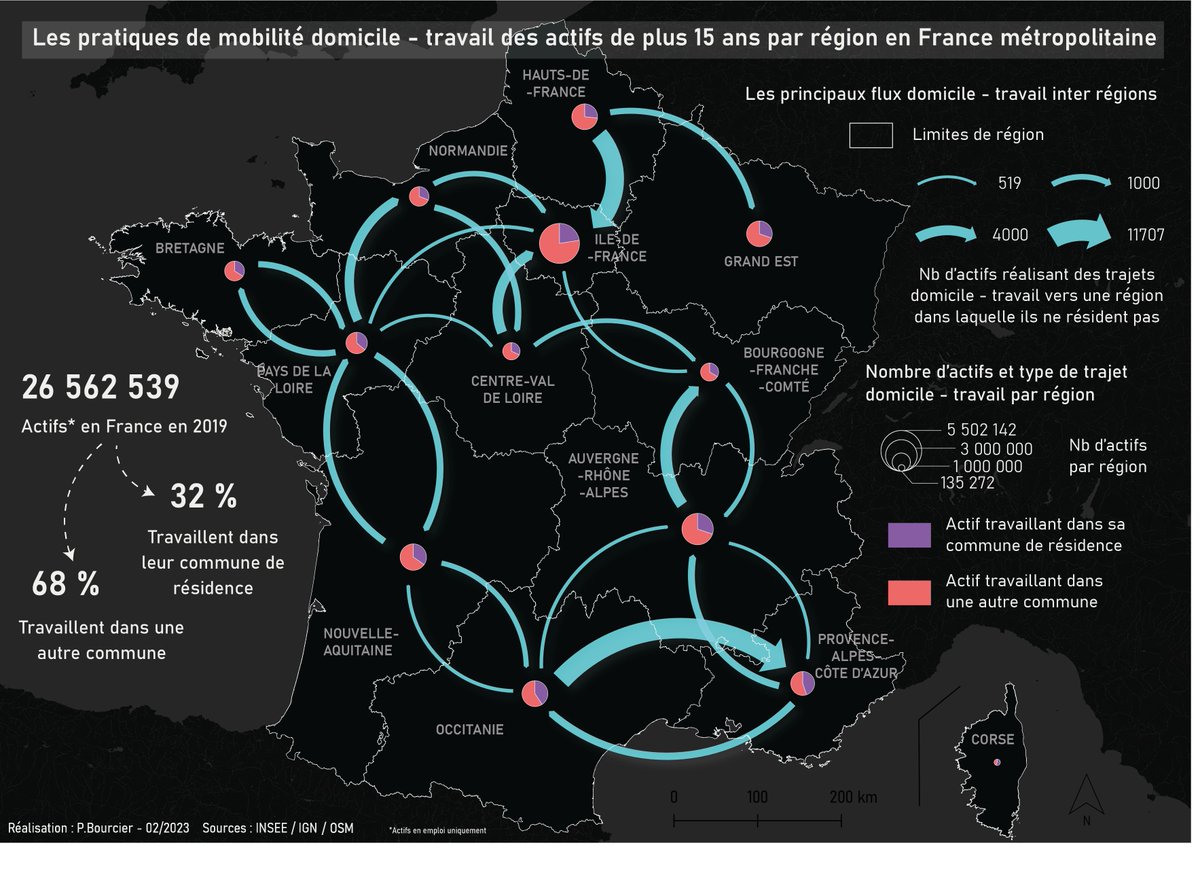
🎇Au master Master SIGAT , on aime les données de mobilités professionnelles de Insee et les #cartes de flux ! ➡Petite sélection subjective de cartes réalisées par les étudiants du M1 avec QGIS 😍

🎇Au master <a href="/E_Sigat/">Master SIGAT</a> , on aime les données de mobilités professionnelles de <a href="/InseeFr/">Insee</a>  et les #cartes de flux !

➡Petite sélection subjective de cartes réalisées par les étudiants du M1 avec <a href="/qgis/">QGIS</a>  😍
Patrycja Krajczyńska (@mapsbyp) 's Twitter Profile Photo

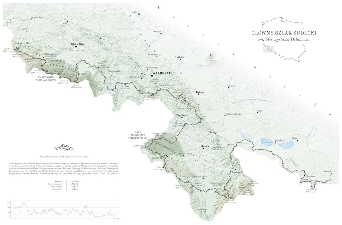
One of the most famous hiking 🥾 trail in Poland - The Main Sudetes Trail ( GSS Główny Szlak Sudecki ) made in #qgis data: geoportal.gov.pl

One of the most famous hiking 🥾 trail in Poland - The Main Sudetes Trail  ( GSS Główny Szlak Sudecki )
made in #qgis 
data: geoportal.gov.pl
Gisact Indonesia (@gisact_org) 's Twitter Profile Photo

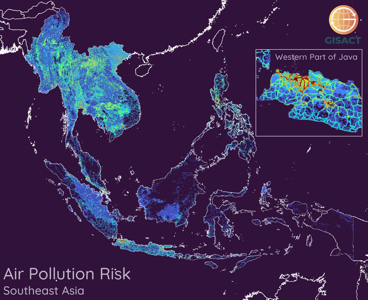
#ClimateChange #Vulnerability - #AirPollution in #SoutheastAsia - A map of air pollution risk, purple-green-red is low-moderate-high risk. Paper: doi.org/10.1016/j.scit… Geoplatform: gisact.org/geoplatform/mu… #MapPromptMonday #QGIS #DataViz

#ClimateChange #Vulnerability - #AirPollution in #SoutheastAsia - A map of air pollution risk, purple-green-red is low-moderate-high risk.
Paper: doi.org/10.1016/j.scit…
Geoplatform: gisact.org/geoplatform/mu…
#MapPromptMonday #QGIS #DataViz