Munjurul Ahsan Munna (@munjurul_ahsan) 's Twitter Profile
Munjurul Ahsan Munna

@munjurul_ahsan

UI/UX Designer | Crafting intuitive, high-converting Web & App experiences | DM for collab

Accepting New Projects → [email protected]

ID: 608937761

linkhttps://www.fiverr.com/munjurul420 calendar_today15-06-2012 09:31:22

107 Tweet

60 Takipçi

287 Takip Edilen

Munjurul Ahsan Munna (@munjurul_ahsan) 's Twitter Profile Photo

🎁 Attention Designers & Agencies! Giving away WittyFox – my premium Framer template ($49) for FREE! ⚡️ Clean, modern UI. Fully responsive. Perfect for creatives & startups. Want it? 👉 Like, Follow & Comment “WITTYFOX” ⬇️ ⏳ 24H only! #Framer #UIDesign #WebDesign

🎁 Attention Designers & Agencies!
Giving away WittyFox – my premium Framer template ($49) for FREE! ⚡️
Clean, modern UI.
Fully responsive.
Perfect for creatives & startups.

Want it?
👉 Like, Follow & Comment “WITTYFOX” ⬇️
⏳ 24H only!

#Framer #UIDesign #WebDesign
Shakib chowdhury (@shakib3483) 's Twitter Profile Photo

Currently building this website in Framer – focusing on smooth interactions, clean design, and a seamless user experience. Still a work in progress, but excited about how it’s coming together! #Framer #WebDesign #UIUX #InteractiveDesign #WIP #ShakibDesigns

Munjurul Ahsan Munna (@munjurul_ahsan) 's Twitter Profile Photo

UX Notes Matter Design isn’t just about looking pretty — it’s about being understood. Adding small notes like these: ✅ Speeds up dev handoff ✅ Aligns stakeholders ✅ Explains why each element exists Clear design = better products. #UXDesign #UIDesign #ProductDesign #UXTips

UX Notes Matter

Design isn’t just about looking pretty — it’s about being understood.

Adding small notes like these:
✅ Speeds up dev handoff
✅ Aligns stakeholders
✅ Explains why each element exists
Clear design = better products.
#UXDesign #UIDesign #ProductDesign #UXTips
Munjurul Ahsan Munna (@munjurul_ahsan) 's Twitter Profile Photo

Launch Alert: Aivana is here! The smart automation & business growth template powered by Framer. ⚡️ Workflow automation ⚡️ Seamless system integration ⚡️ Real-time data tracking 👀 Live: aivana.framer.website 🛒 Get it: techfynite.lemonsqueezy.com/buy/8fe01c5c-4… #Aivana #Framer #WebDesign

Launch Alert: Aivana is here!
The smart automation & business growth template powered by Framer.
⚡️ Workflow automation
⚡️ Seamless system integration
⚡️ Real-time data tracking

👀 Live: aivana.framer.website
🛒 Get it: techfynite.lemonsqueezy.com/buy/8fe01c5c-4…

#Aivana #Framer #WebDesign
Shakib chowdhury (@shakib3483) 's Twitter Profile Photo

Excited to Launch Aivana Website Template on Framer! Proud to unveil Aivana, a sleek and modern AI SaaS website template designed to help businesses showcase their AI-driven products with clarity, professionalism, and impact. ✅ Clean UI/UX ✅ Fully responsive ✅ Built for

Excited to Launch Aivana Website Template on Framer!

Proud to unveil Aivana, a sleek and modern AI SaaS website template designed to help businesses showcase their AI-driven products with clarity, professionalism, and impact.

✅ Clean UI/UX
✅ Fully responsive
✅ Built for
Munjurul Ahsan Munna (@munjurul_ahsan) 's Twitter Profile Photo

Design on demand. No delays. World-class visuals delivered exactly when you need them. Tailored for startups, creators, and growing teams. Would a solution like this elevate your brand? 📧 Contact us: [email protected] #UIDesign #UXDesign #DesignOnDemand #Branding #WebDesign
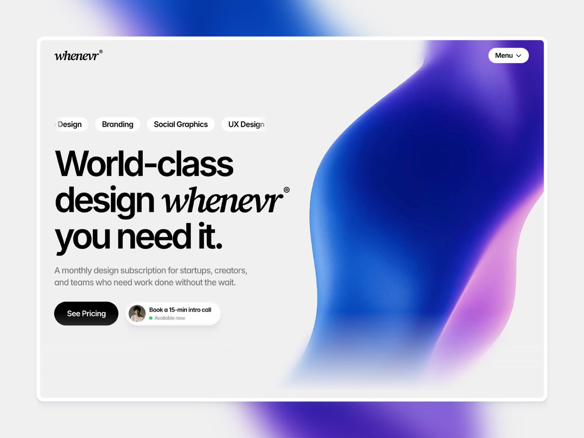
Design on demand. No delays.
World-class visuals delivered exactly when you need them.
Tailored for startups, creators, and growing teams.
Would a solution like this elevate your brand?
📧 Contact us: techfynite@gmail.com

#UIDesign #UXDesign #DesignOnDemand #Branding #WebDesign
Munjurul Ahsan Munna (@munjurul_ahsan) 's Twitter Profile Photo

Build boldly. Launch smarter. We create platforms that move fast, feel great & convert. Schedule your call today. 📩 [email protected] #DesignOnDemand #UIUX #Startups #BrandLaunch #Techfynite #UI #UX #Framer

Build boldly. Launch smarter.
We create platforms that move fast, feel great & convert.
Schedule your call today.

📩 techfynite@gmail.com

#DesignOnDemand #UIUX #Startups #BrandLaunch #Techfynite #UI #UX #Framer
Munjurul Ahsan Munna (@munjurul_ahsan) 's Twitter Profile Photo

Clean. Functional. Smart. Just wrapped up a user-centric dashboard for Loopback where feedback fuels growth. ✅ SaaS-ready ✅ Intuitive insights ✅ Designed to perform 📩 [email protected] #UI #UX #Figma #SaaSDesign #ProductDesign #Techfynite

Clean. Functional. Smart.
Just wrapped up a user-centric dashboard for Loopback  where feedback fuels growth.
✅ SaaS-ready
✅ Intuitive insights
✅ Designed to perform

📩 techfynite@gmail.com

#UI #UX #Figma #SaaSDesign #ProductDesign #Techfynite
Munjurul Ahsan Munna (@munjurul_ahsan) 's Twitter Profile Photo

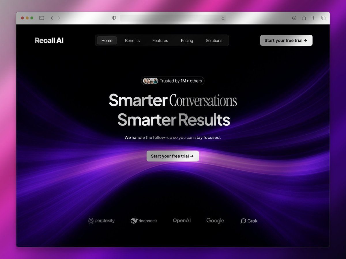
Designing AI tools like Recall AI isn’t just about automation, it’s about reducing cognitive load and building trust through clarity. This concept focuses on: ✅ Dark, focused visuals ✅ Calm messaging hierarchy ✅ Clarity that builds trust ✅ Minimal UI, maximum usability More

Designing AI tools like Recall AI isn’t just about automation, it’s about reducing cognitive load and building trust through clarity.

This concept focuses on:
✅ Dark, focused visuals
✅ Calm messaging hierarchy
✅ Clarity that builds trust
✅ Minimal UI, maximum usability
More
Munjurul Ahsan Munna (@munjurul_ahsan) 's Twitter Profile Photo

Designed this concept for NexusAI a smart assistant built for solopreneurs & small teams to stay organized and scale faster. ✅ Focused UI ✅ Smart inbox, task & meeting overview ✅ Clean layout, soft gradients ✅ Built in Figma 📩 [email protected] #UXDesign #UIDesign

Designed this concept for NexusAI  a smart assistant built for solopreneurs & small teams to stay organized and scale faster.

✅ Focused UI
✅ Smart inbox, task & meeting overview
✅ Clean layout, soft gradients
✅ Built in Figma

📩 techfynite@gmail.com

#UXDesign #UIDesign
Munjurul Ahsan Munna (@munjurul_ahsan) 's Twitter Profile Photo

A high-performing landing page isn’t just visually appealing It’s strategic. 🔹 Bold typography that drives focus 🔹 Clear messaging for the target audience 🔹 Thoughtfully placed CTAs that guide action 🔹 Sleek UI with purpose-built aesthetics Zentro’s hero section is a strong

A high-performing landing page isn’t just visually appealing 
It’s strategic.
🔹 Bold typography that drives focus
🔹 Clear messaging for the target audience
🔹 Thoughtfully placed CTAs that guide action
🔹 Sleek UI with purpose-built aesthetics

Zentro’s hero section is a strong
Munjurul Ahsan Munna (@munjurul_ahsan) 's Twitter Profile Photo

Clean UI starts with consistency. Mixing filled & outline icons? ❌ Don’t. ✅ Stick to one style ✅ Use filled icons for focus ✅ Outline for secondary actions ✅ Keep nav consistent Design smart. Design clean. #UIDesign #UXTips #DesignSystems #WebDesign #Accessibility

Clean UI starts with consistency.

Mixing filled & outline icons? ❌ Don’t.

✅ Stick to one style
✅ Use filled icons for focus
✅ Outline for secondary actions
✅ Keep nav consistent
Design smart. Design clean.
#UIDesign #UXTips #DesignSystems #WebDesign #Accessibility
Munjurul Ahsan Munna (@munjurul_ahsan) 's Twitter Profile Photo

What Your Task Status Really Means: 🟢 Open – Created, not started 🟡 Pending – Waiting or on hold 🔵 In Progress – Actively being worked on ✅ Completed – Done ❌ Cancelled – Stopped Small UX details = better user experience. #UXTips #UIDesign #MicroUX #TaskManagement

What Your Task Status Really Means:

🟢 Open – Created, not started
🟡 Pending – Waiting or on hold
🔵 In Progress – Actively being worked on
✅ Completed – Done
❌ Cancelled – Stopped

Small UX details = better user experience.
#UXTips #UIDesign #MicroUX #TaskManagement
Munjurul Ahsan Munna (@munjurul_ahsan) 's Twitter Profile Photo

Clean shadows = Clean UI Most beginner UIs fall into the same trap: harsh, dark shadows that scream for attention. Try this instead: ✅ Lower opacity (10%) ✅ Higher blur (12px) The result? Soft, modern depth that feels natural. Good shadows guide. Great ones disappear.

Clean shadows = Clean UI
Most beginner UIs fall into the same trap: harsh, dark shadows that scream for attention.

Try this instead:
✅ Lower opacity (10%)
✅ Higher blur (12px)
The result? Soft, modern depth that feels natural.

Good shadows guide. Great ones disappear.
Munjurul Ahsan Munna (@munjurul_ahsan) 's Twitter Profile Photo

Good UI/UX designers know how to design. Great ones know why they’re designing. Where most go wrong: ❶ Jump into Figma too fast ❷ Copy trends off Dribbble ❸ Prioritize looks over usability But the top 1%? They slow down before speeding up. They ask: → Who is this for? →

Good UI/UX designers know how to design.
Great ones know why they’re designing.
Where most go wrong:

❶ Jump into Figma too fast
❷ Copy trends off Dribbble
❸ Prioritize looks over usability

But the top 1%?
They slow down before speeding up.
They ask:
→ Who is this for?
→
Munjurul Ahsan Munna (@munjurul_ahsan) 's Twitter Profile Photo

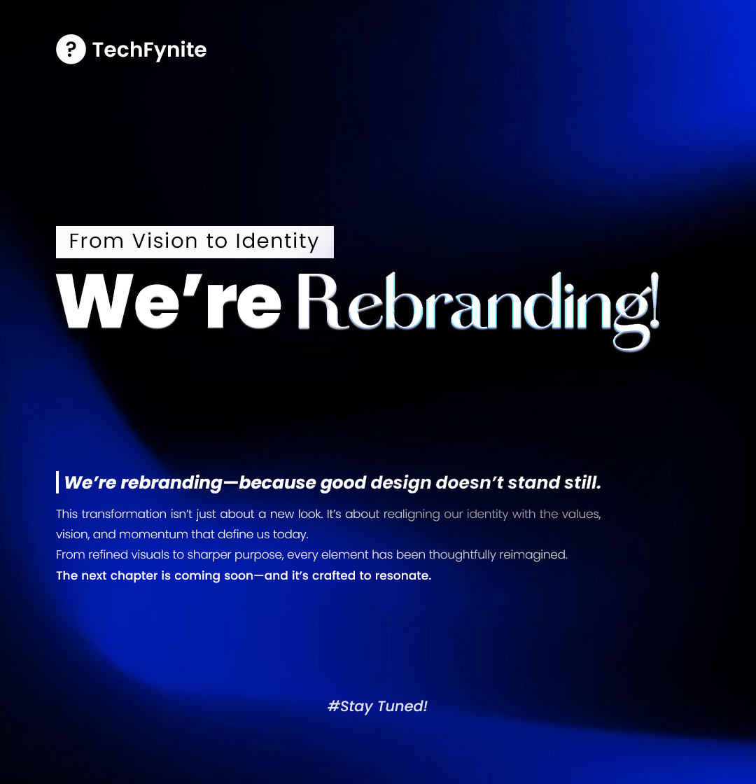
We’re Rebranding From Vision to Identity BeTechFynite design doesn’t stand still. At TechFynite, we believe that transformation is not just about aesthetics it’s about purpose, clarity, and alignment. This rebrand is our step toward a stronger identity that reflects our

We’re Rebranding  From Vision to Identity
BeTechFynite design doesn’t stand still.

At TechFynite, we believe that transformation is not just about aesthetics  it’s about purpose, clarity, and alignment. This rebrand is our step toward a stronger identity that reflects our
Munjurul Ahsan Munna (@munjurul_ahsan) 's Twitter Profile Photo

Great UI isn’t just about layouts or color palettes it’s about the micro-decisions that shape the user experience. One of the most common mistakes? ↳ Inconsistent or poorly sized icons. Here’s a quick breakdown of what works and what doesn’t: → 16×16px - Too small,

Great UI isn’t just about layouts or color palettes  it’s about the micro-decisions that shape the user experience.

One of the most common mistakes?

 ↳ Inconsistent or poorly sized icons.

Here’s a quick breakdown of what works and what doesn’t:

→  16×16px  - Too small,
Munjurul Ahsan Munna (@munjurul_ahsan) 's Twitter Profile Photo

Bad navigation = lost users. Good navigation? It feels invisible. Most products don’t fail because they look bad ↳ They fail because users can’t find what they need. Here’s what great designers do differently: ✅ Bottom nav for mobile ✅ Sidebars for dashboards ✅ Tabs for

Bad navigation = lost users.
Good navigation? It feels invisible.
Most products don’t fail because they look bad 
↳ They fail because users can’t find what they need.

Here’s what great designers do differently:
✅ Bottom nav for mobile
✅ Sidebars for dashboards
✅ Tabs for
Munjurul Ahsan Munna (@munjurul_ahsan) 's Twitter Profile Photo

Great designers don’t just build screens they craft seamless user flows. Poor navigation leads to friction. Clarity leads to retention. ✅ Choose patterns with purpose ✅ Guide users effortlessly ✅ Make structure intuitive, not intrusive #UXDesign #ProductDesign #NavigationUX

Great designers don’t just build screens they craft seamless user flows.

Poor navigation leads to friction.
Clarity leads to retention.
✅ Choose patterns with purpose
✅ Guide users effortlessly
✅ Make structure intuitive, not intrusive

#UXDesign #ProductDesign #NavigationUX