Inclusive Reading Technologies (@a11yreadtech) 's Twitter Profile
Inclusive Reading Technologies

@a11yreadtech

📚 Let's Make Reading Fun Again 📖👓

We are a non-profit focused on research with the aim of improving accessibility and visually enhanced readability for all.

ID: 1622452631120789504

linkhttps://readtech.org calendar_today06-02-2023 04:30:40

58 Tweet

373 Takipçi

1,1K Takip Edilen

@sitnik_en@mastodon.social (@sitnikcode) 's Twitter Profile Photo

Great graph by Myndex: contrast depends on letter size in a very non-linear way. This is why we should use APCA metric for contrast instead of WCAG.

Great graph by <a href="/MyndexResearch/">Myndex</a>: contrast depends on letter size in a very non-linear way.

This is why we should use APCA metric for contrast instead of WCAG.
Thalion (@thalion_pb) 's Twitter Profile Photo

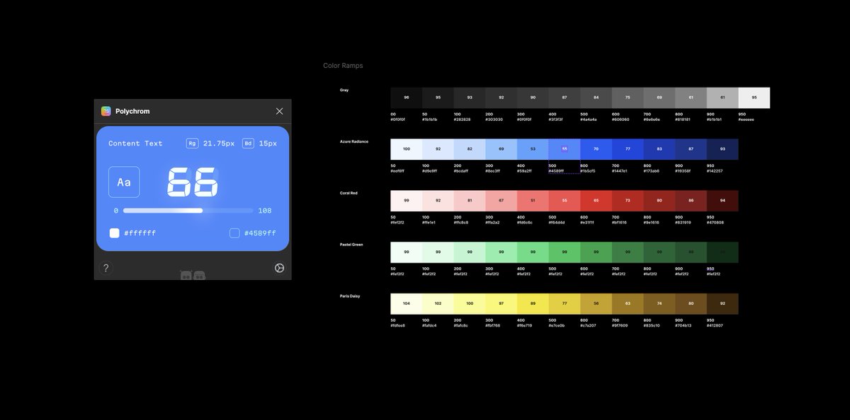
Some late night color adjustments for Prime Design System Kit. ✅ Figms variables (dark & light), ✅ Styles, ✅ Token names, ✅ APCA contrast It’s never too late (hour) to make some uplifts, if they are gonna make things right 💪 #uidesign #designsystem
Myndex (@myndexresearch) 's Twitter Profile Photo

Emjaye Owen If you like that, then you might like this slightly deeper dive, with lots of visual examples—it’s my favorite comprehensive article on color/contrast: smashingmagazine.com/2022/09/realit… #a11y #accessibility #color #webdev #Webdesign #colour #contrast #wcag #apca #en301 #usab508

Myndex (@myndexresearch) 's Twitter Profile Photo

My brief proposal for a 10bit-per-channel png file that is both backwards compatible and compression efficient. #png #webdevelopment #images #network #HDR #SDR #whereeverDR github.com/Myndex/10bit-p…

Myndex (@myndexresearch) 's Twitter Profile Photo

Do standards and guidelines lag emerging technology? Yes. Can this be helped? Also yes. A brief article posted on Linkedin: #a11y #Webdesign #WCAG #APCA #accessibility #Standards linkedin.com/posts/andrew-m…

Myndex (@myndexresearch) 's Twitter Profile Photo

APCA is an algorithm that predicts lightness contrast of high spatial stimuli on a self-illuminated display. The guidelines are separate. APCA math is perfectly capable of backwards compatibility with WrongCAG2. It’s about guidelines for supporting backwards compatibility+++

Myndex (@myndexresearch) 's Twitter Profile Photo

Great demo of additive and subtractive color with this video by Peter on his TikTok ! color.nerd #color #colour #TikTok tiktok.com/t/ZTLrUsQoe/

AI Archive (@ai_archive_) 's Twitter Profile Photo

Question authority. No idea is true just because someone says so. Test ideas by the evidence gained from observation and experiment! If a favorite idea fails a well-designed test, it's wrong!

Myndex (@myndexresearch) 's Twitter Profile Photo

Kevin Muldoon Like WCAG 2 contrast, L* overvalues darker colors, and undervalues lighter ones. Remember it is based on diffuse reflecting tiles, in a very controlled environment for adaptation (Munsell), where nothing can be 100 (there is no real-world, perfect, lambertian reflector.)

Myndex (@myndexresearch) 's Twitter Profile Photo

Jono Ignore the results of WCAG 2 for dark colors. WCAG 2 is not accurate, especially when BG is darker than #ccc. #88b971 is equivalent to #acacac, close to perceptual middle #a0a0a0. #88b971 is too dark for columns of body text—okay for buttons when used with a bold enough font.

Dr Lea Verou (@leaverou) 's Twitter Profile Photo

🔥 New blog post! 🔥 “On compliance vs readability: Generating text colors with CSS” lea.verou.me/blog/2024/cont… This post uses Relative Colors in a creative way, to solve a big CSS pain point: automatically computing a text color that is legible on an arbitrary background.

Myndex (@myndexresearch) 's Twitter Profile Photo

Lloyd Kupchanko Lea Verou, PhD Green makes up the vast majority of luminance. I.e. white is 71% green. (Red 22%, blue 7%). Implication: saturated greens should often be the brightest color, and saturated reds and blues should usually be the darkest of a pair.

Myndex (@myndexresearch) 's Twitter Profile Photo

Thank you to Pablo Stanley and the team at Sketch Together for having me as a guest on their show this morning! We discussed the importance of accessibility in visual design, best practices for contrast and color, and much more in Q&A! #a11y #accessibility youtube.com/live/eKIEQjfSt…