Max Graze
@max_graze
Using data viz to tie all my interests and experiences together.
Data Visualization Engineer at MURAL, but all ideas are my own. 🚀
ID: 32532729
http://datagrazing.com/ 17-04-2009 19:25:49
419 Tweet
636 Followers
444 Following

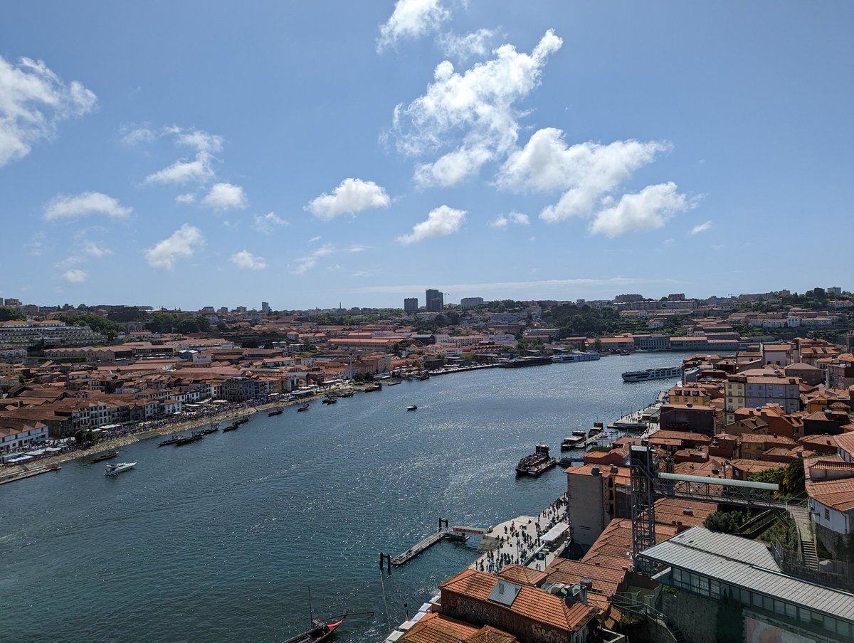
Wrapped up OutlierConf with a beautiful day in lovely Porto. It's been delightful to meet so many great people, learn a bunch and get inspired. The dataviz community lives up to the hype 💜 #outlier2023


Can't make it to #TC23 but still want to be part of Data Suffragettes’s interactive scatter plot? We've got you covered. Join the community by adding your own data point to the springtime prompt! 📈🌸 shorturl.at/dnHQ6


It's been a while, but Jon Schwabish, @amycesal, Alan Wilson, and I have published the next installment of the "Guide to Making a Data Visualization Style Guide" => datavizstyleguide.com/getting-started This guide is a WIP, so we'd appreciate any feedback you can give us - help us help you!


"On the surface, establishing standards for color can seem daunting, but approaching it through a utilitarian lens, the task becomes much more manageable. Color in data visualizations usually takes one of three forms—categorical, sequential, or diverging." datavizstyleguide.com/getting-started


Most articles about dataviz style guides will emphasize that they are living documents. But how can you tweak and assess them? This article serves as a starting point for creating surveys to improve your own style guides. Jon Schwabish Alan Wilson @AmyCesal nightingaledvs.com/developing-ann…

