Inga Plönnigs
@ingaploennigs
Independent type designer
Zetkin and Messer are available via @futurefonts
Magnet is available via @frerejones
she/her.
ID: 2283778766
http://ingaploennigs.com 09-01-2014 16:02:45
319 Tweet
1,1K Followers
203 Following

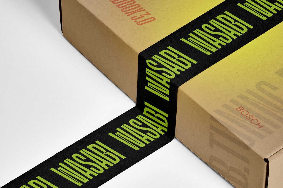
Young Czech branding agency Meadow Green used Magnet by Inga Plönnigs to great effect for Speedbox Wasabi, a local retailer of ebike tuning accessories: frerejones.com/in-use/speedbo…


Exciting updates for Messer and Messer Condensed by Inga Plönnigs in v2.2, out tomorrow! 👀 futurefonts.xyz/inga-plonnigs/…


✨UPDATE✨ Messer and Messer Condensed v2.2 by Inga Plönnigs are here! Messer has an expanded range of weights, and Messer Condensed now has a higher x-height and contrast. Next up… could Messer Sans be in our future? 🤔 futurefonts.xyz/inga-plonnigs/…


Congrats to greggazdowicz and the whole team! Roboto Serif is great and it was so much fun working with you all! I worked on the Micro Wide weights and broke my arm in the middle of the project but it still worked out time-wise 😅


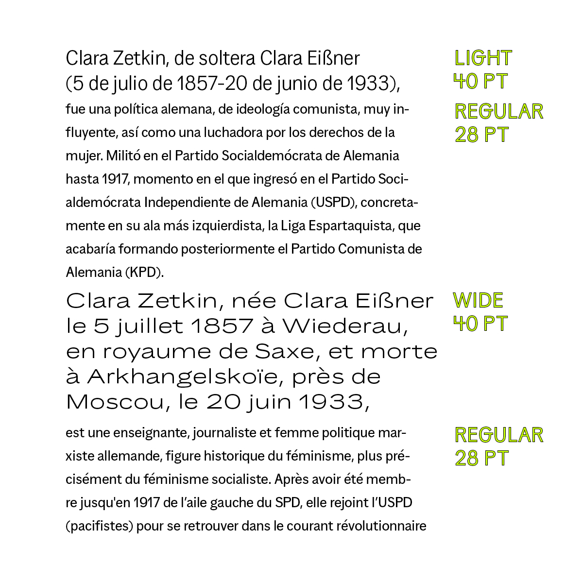
Zetkin v0.6 by Inga Plönnigs has determined diagonals, a strong slant, and extended proportions that make it a confident display typeface. A wide range in weights and styles make it useful for all kinds of uses. futurefonts.xyz/inga-plonnigs/…

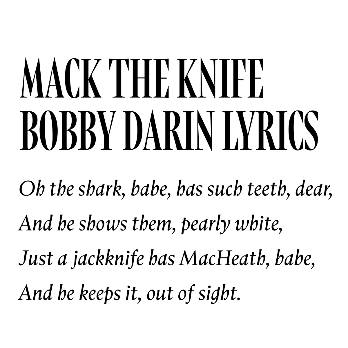
Messer Condensed 2.2 by Inga Plönnigs is a condensed, sharper version of its sister Messer. It boasts an elegant but confident vibe and looks great at large sizes. futurefonts.xyz/inga-plonnigs/…


Type Electives is a new online design school shaping the future of type. 🚀 Co-founded by Juan Villanueva (@juan_kafka) and Lynne Yun (Space Type), we offer courses that go beyond traditional type design education. ✨ Find out more & subscribe at TypeElectives.com

Contraforma 💌 is back!! issue 6 features Inga Plönnigs, Tassiana Nuñez Costa, @franziskaweit, Maria Doreuli, and Phædra Charles! and yes, you probably already guessed the theme. mailchi.mp/de5495261afa/c…

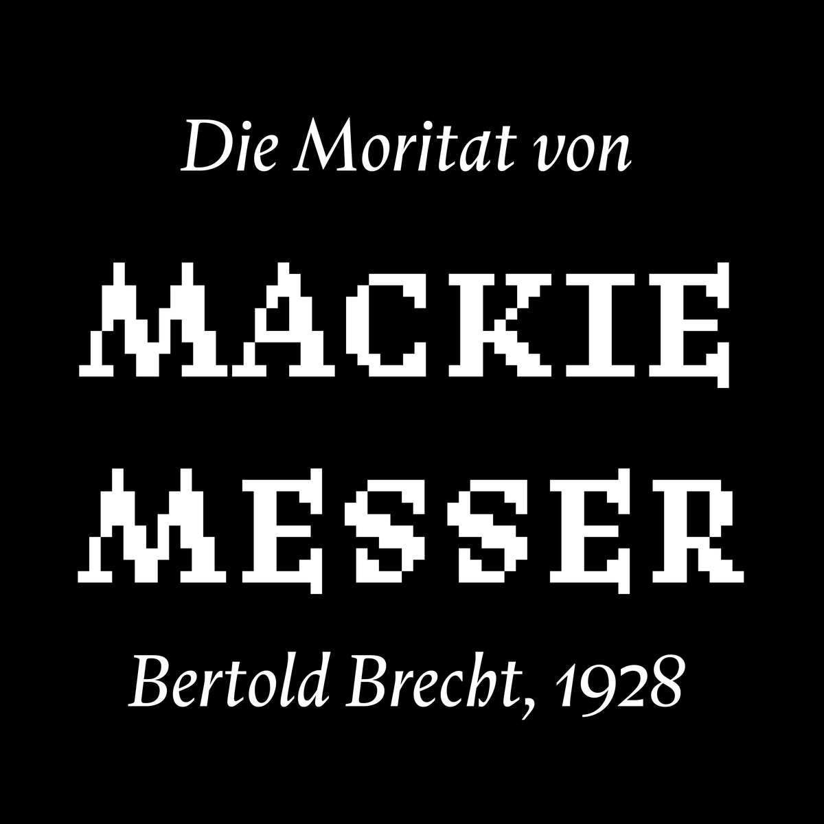
🎉 SPECIAL OFFER: Messer Pixel! 🎉 Until the end of this year, Messer v2.3 by Inga Plönnigs comes with a pixel version in two styles: Upright and Italic. The Messer version stays exactly the same. futurefonts.xyz/inga-plonnigs/…

We don’t normally post these on Twitter, but here’s a treat for all of you going down with the ship Out weekly update featuring: Mestika by Boharat type foundry Zeplin by manictype BRZO by Nuform Type Messer by Inga Plönnigs Gimme by @typearture CoFo Peshka by Contrast Foundry


Mit René Bieder, Lucas de Groot, Christoph ░, Daria Petrova, Inga Plönnigs und Prof. Erik Spiekermann stehen bzw. sitzen euch 6 Expert·innen einen Abend lang Rede und Antwort, schauen auf eure Schriftentwürfe, geben Feedback. #TypeCrit #BerlinTypeFamily #TStT102 #Typostammtisch


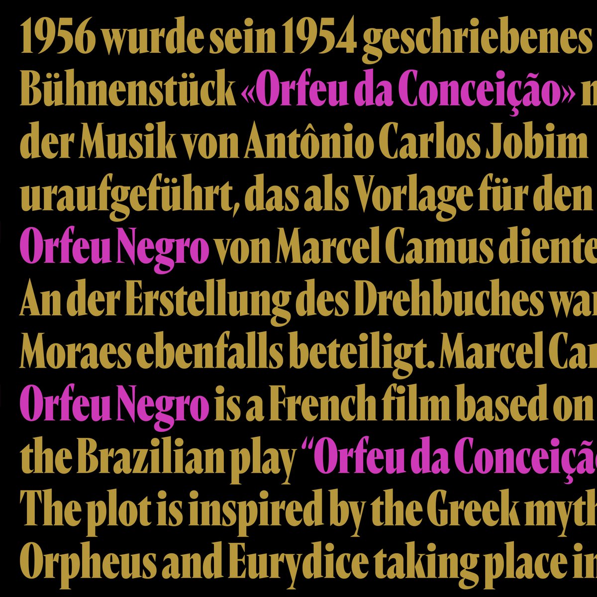
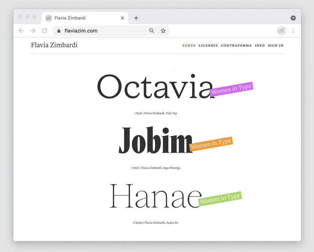
are you ready for the second collab?! say hello to Jobim, a Vendome-inspired display typeface that infuses a vernacular approach based on the lettering from the poster of Orfeu Negro. what Inga Plönnigs and I like to call a Brazilian-German reinterpretation of a French classic.
