Florian (@hardwig) 's Twitter Profile
Florian

@hardwig

Typographer, type writer, researcher. Editor @FontsInUse. Graphic designer at Kaune & Hardwig, Berlin. He/him. Find me here: mastodon.social/@fhardwig

ID: 88988049

linkhttp://florian.hardwig.com calendar_today10-11-2009 18:25:04

6,6K Tweet

6,6K Followers

927 Following

David Jonathan Ross (@djrrb) 's Twitter Profile Photo

August’s Font of the Month Club is GLYPTIC DJR, a revival of Herman Ihlenburg’s ornamental serif. My interpretation leans into its chaotic energy, emphasizing the angularity of the wedge serifs and contrasting them against delicate curlicues. Now available at fontofthemonth.club!
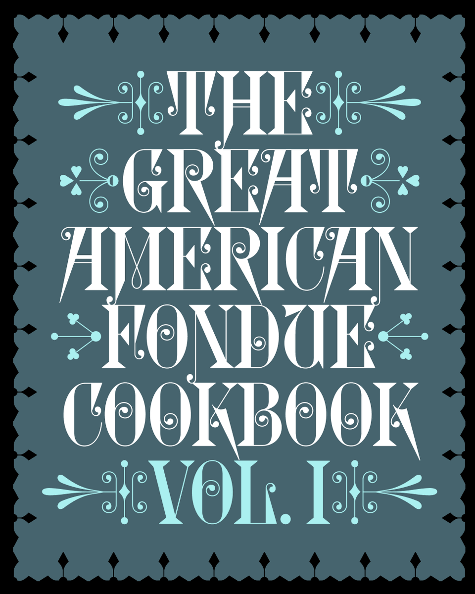
August’s <a href="/fontofthemonth/">Font of the Month Club</a> is GLYPTIC DJR, a revival of Herman Ihlenburg’s ornamental serif. My interpretation leans into its chaotic energy, emphasizing the angularity of the wedge serifs and contrasting them against delicate curlicues.

Now available at fontofthemonth.club!
Fonts In Use (@fontsinuse) 's Twitter Profile Photo

fontsinuse.com is dominated by Latin-script typography. All the more we’re delighted to see more contributions with text using other scripts. Today alone we added projects featuring Cyrillic, Devanagari, Hangul, and Japanese …

fontsinuse.com is dominated by Latin-script typography. All the more we’re delighted to see more contributions with text using other scripts. Today alone we added projects featuring Cyrillic, Devanagari, Hangul, and Japanese …
Letterform Archive (@lett_arc) 's Twitter Profile Photo

Jean Midolle, Alphabet Lapidaire Monstre, 1835 (1) and Ivan Chermayeff, Mozart Violinkonzerte album cover, Musical Masterpiece Society, ca. 1958 (2). Read more about these two on Fonts In Use: fontsinuse.com/uses/21615/moz…

Jean Midolle, Alphabet Lapidaire Monstre, 1835 (1) and Ivan Chermayeff, Mozart Violinkonzerte album cover, Musical Masterpiece Society, ca. 1958 (2). 

Read more about these two on <a href="/FontsInUse/">Fonts In Use</a>: fontsinuse.com/uses/21615/moz…
Swiss Typefaces (@swisstypefaces) 's Twitter Profile Photo

🪶 What would a true Swiss Typefaces script look like? Raskal Oner Write is the answer. Discover today the result of a decade-long process of questioning the role, aspect, process of a script font born in a digital world: swisstypefaces.com/lab/#Raskal%20…

🪶 What would a true Swiss Typefaces script look like? Raskal Oner Write is the answer. Discover today the result of a decade-long process of questioning the role, aspect, process of a script font born in a digital world:  swisstypefaces.com/lab/#Raskal%20…
Swiss Typefaces (@swisstypefaces) 's Twitter Profile Photo

To properly tell the whole story behind Raskal’s design, we collaborated with type nerd and scholar Dan Reynolds With great care and patience, Dan put the words to narrate the 10 years-long process that lead to the first Swiss Typefaces script font: swisstypefaces.com/read/raskal/
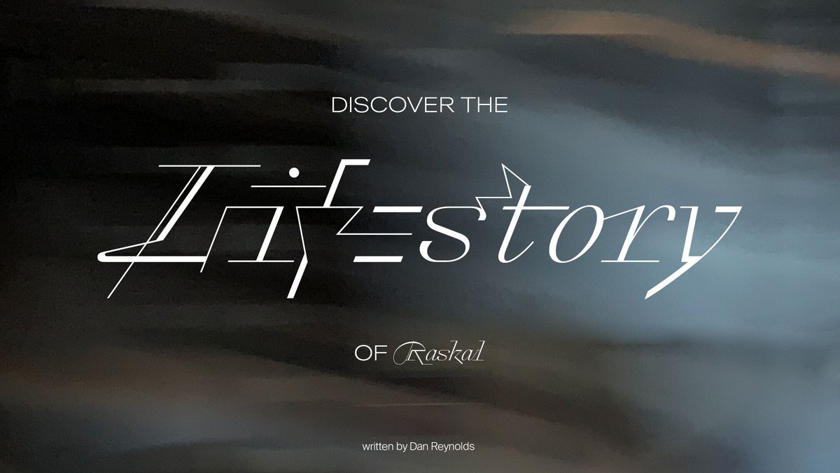
To properly tell the whole story behind Raskal’s design, we collaborated with type nerd and scholar <a href="/typeoff/">Dan Reynolds</a>  With great care and patience, Dan put the words to narrate the 10 years-long process that lead to the first Swiss Typefaces script font:
swisstypefaces.com/read/raskal/
Fonts In Use (@fontsinuse) 's Twitter Profile Photo

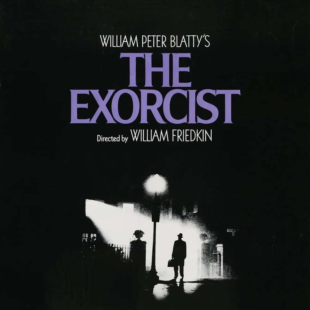
Contributor Patrick Concannon kicks off October 🎃 with a thorough look at the typography of The Exorcist – both of the 1971 novel and the 1973 movie adaptation: fontsinuse.com/tags/34697/the…

Contributor Patrick Concannon kicks off October 🎃 with a thorough look at the typography of The Exorcist – both of the 1971 novel and the 1973 movie adaptation:
fontsinuse.com/tags/34697/the…
Fonts In Use (@fontsinuse) 's Twitter Profile Photo

♀🇬🇷 New on the Blog: Reclaiming the City, Reclaiming Words Maria Paganopoulou looks back on Πόλη Γυναικών (Póli Gynaikón – City of Women), the Greek feminist periodical from the 1980s: fontsinuse.com/uses/44785/rec…
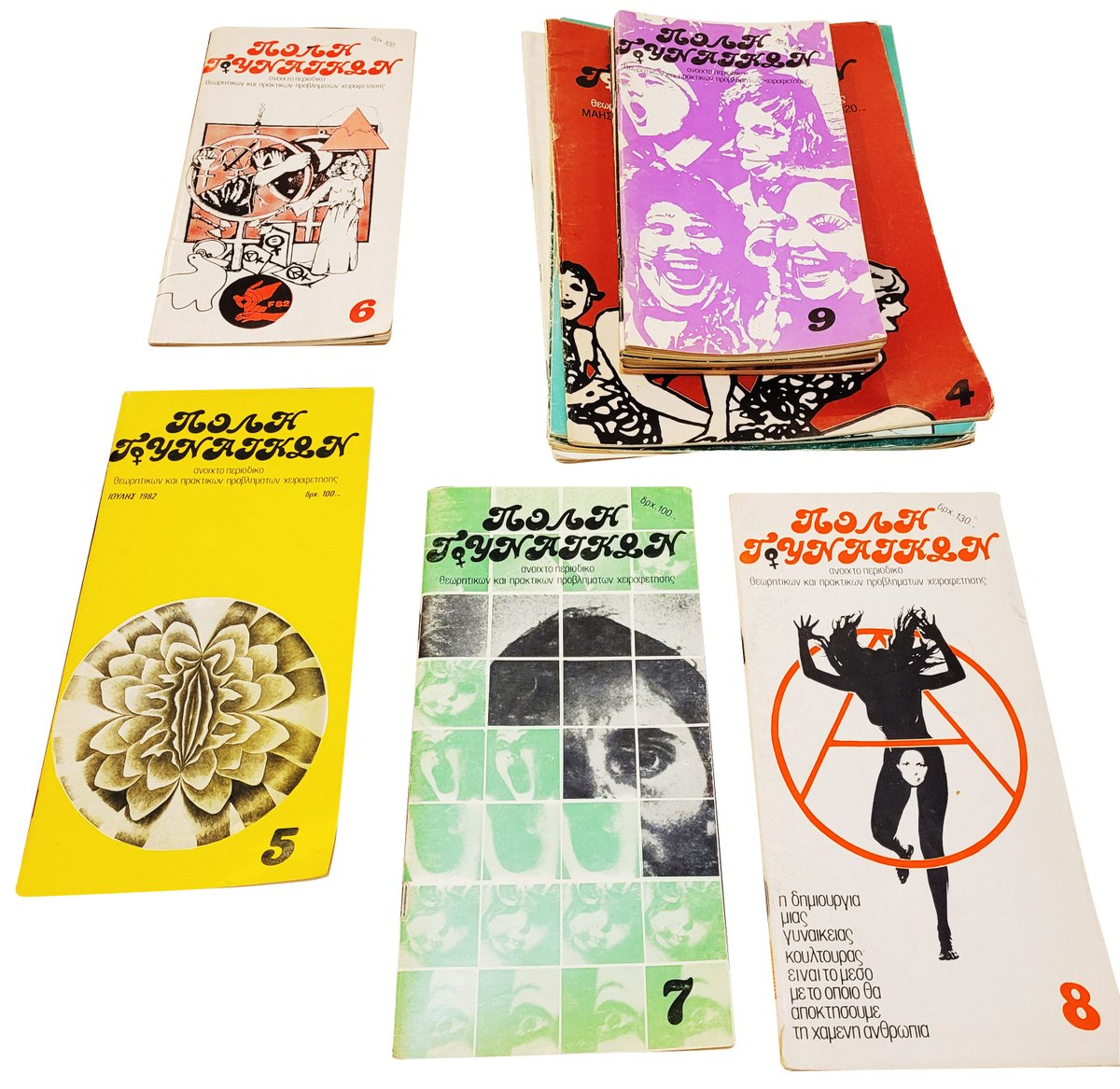
♀🇬🇷 New on the Blog: Reclaiming the City, Reclaiming Words
<a href="/MPaganopoulou/">Maria Paganopoulou</a> looks back on Πόλη Γυναικών (Póli Gynaikón – City of Women), the Greek feminist periodical from the 1980s:
fontsinuse.com/uses/44785/rec…
Nick Sherman (@nicksherman) 's Twitter Profile Photo

I’m giving a free talk next week about all things Franklin Gothic as part of Type@Cooper & Lubalin Center’s Herb Lubalin Lecture Series. The event will be live in person at The Cooper Union and also streaming online. RSVP for free: coopertype.org/event/franklin…
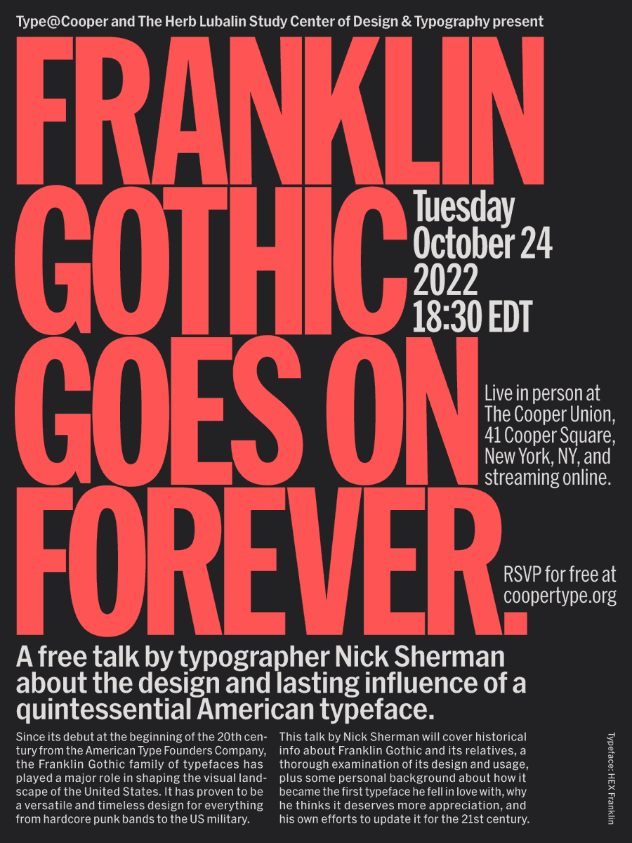
I’m giving a free talk next week about all things Franklin Gothic as part of <a href="/CooperType/">Type@Cooper</a> &amp; <a href="/lubalincenter/">Lubalin Center</a>’s Herb Lubalin Lecture Series.

The event will be live in person at <a href="/cooperunion/">The Cooper Union</a> and also streaming online. RSVP for free: coopertype.org/event/franklin…
astypefonts (@astypefonts) 's Twitter Profile Photo

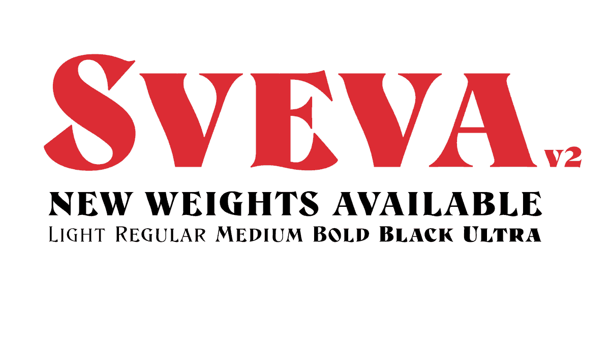
New Sveva fonts available. 40% discount until the end of October. More info: astype.de/sveva #astypefonts #fonts #typography #typedesign #artoftype #sansserif #graphicdesign #字体设计 #書体

New Sveva fonts available. 40% discount until the end of October. More info: astype.de/sveva

#astypefonts #fonts #typography #typedesign #artoftype #sansserif #graphicdesign #字体设计 #書体
Florian (@hardwig) 's Twitter Profile Photo

Lots of typefaces with a soft warm feel and 1970s overtones came out in recent years (see fontsinuse.com/sets/10475/sof…) Sirenia by Felix Braden is a mature addition, with cursive details, lots of swash alternates, and a look reminiscent of melting chocolate. floodfonts.com/sirenia/
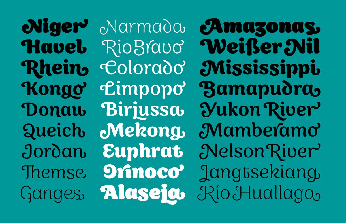
Lots of typefaces with a soft warm feel and 1970s overtones came out in recent years (see
fontsinuse.com/sets/10475/sof…)
Sirenia by <a href="/Floodfonts/">Felix Braden</a> is a mature addition, with cursive details, lots of swash alternates, and a look reminiscent of melting chocolate. floodfonts.com/sirenia/
Florian (@hardwig) 's Twitter Profile Photo

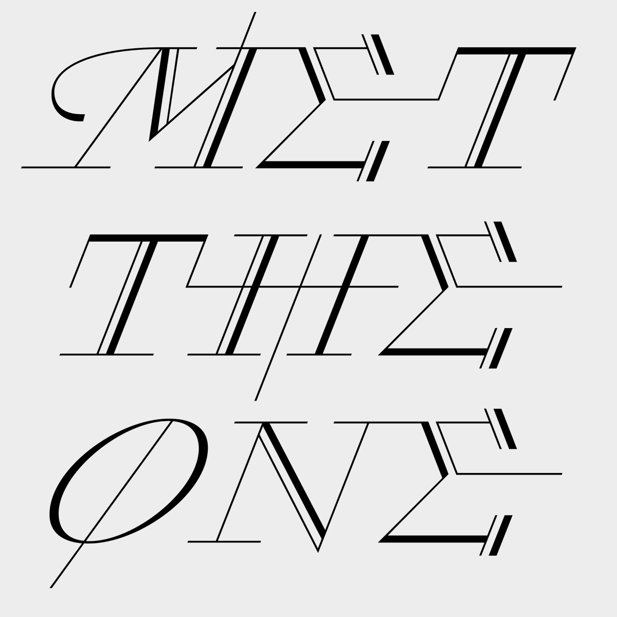
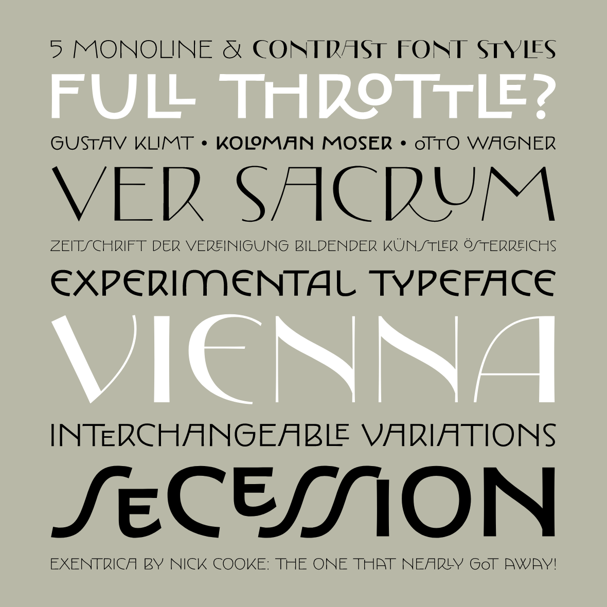
Nick Cooke of G-Type released a gem of an Art Nouveau typeface. Exentrica is a medley of lettering styles used by Vienna Secession artists like K. Moser and G. Klimt. It comes in Monoline and Contrast variants, each in 5 weights with oodles of alts. g-type.com/fonts/exentrica

Nick Cooke of <a href="/gtypefoundry/">G-Type</a> released a gem of an Art Nouveau typeface. Exentrica is a medley of lettering styles used by Vienna Secession artists like K. Moser and G. Klimt. It comes in Monoline and Contrast variants, each in 5 weights with oodles of alts.
g-type.com/fonts/exentrica
Lineto (@lineto_com) 's Twitter Profile Photo

Welcome back to Lineto 1.1: LL BIFF, LL Plot, LL Tablettenschrift, and LL Cobra out now on Lineto.com There’s also a most useful update on last year’s LL DMT, to which we added a new weight axis.

Elizabeth Goodspeed (@domesticetch) 's Twitter Profile Photo

A little belated, but I'm so honored to have been asked to write the release essay for Frere-Jones Type’s incredible new type family Community Gothic that came out earlier this week! Also excited to use the typefaces in some design projects myself soon too... frerejones.com/blog/grit-and-…

Fonts In Use (@fontsinuse) 's Twitter Profile Photo

The Fonts In Use team unanimously condemns the assault on safety, security, and basic humanity continually displayed by Twitter’s new ownership. We loved it here, but can no longer justify engaging in this platform. Find us at typo.social/@FontsInUse and fontsinuse.com.

The Fonts In Use team unanimously condemns the assault on safety, security, and basic humanity continually displayed by Twitter’s new ownership. We loved it here, but can no longer justify engaging in this platform. Find us at typo.social/@FontsInUse and fontsinuse.com.