Sara Choi
@sarachoi_
bio x data, b2b saas investor @wing_vc, recovering founder
ID: 1281333584754704384
09-07-2020 21:05:14
7 Tweet
448 Followers
789 Following


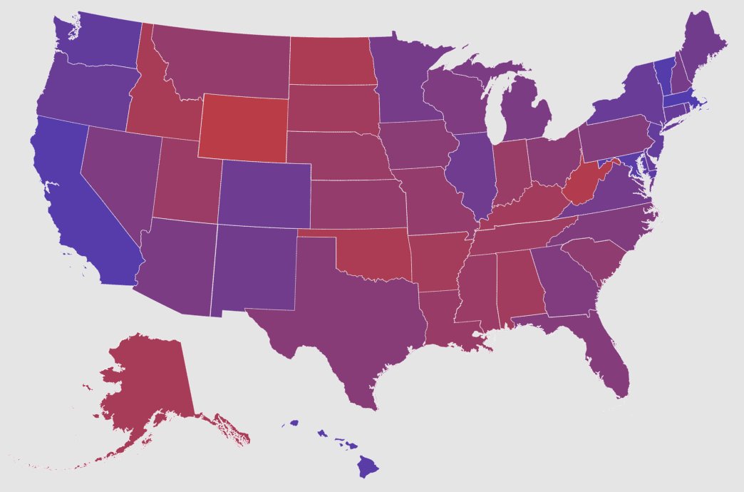
Showing red vs. blue maps leads people to see America as more divided—and judge people more by their state's stereotypes. Data: purple maps of state proportions are more accurate, and reduce perceived polarization and stereotypes. spssi.onlinelibrary.wiley.com/doi/abs/10.111… purplestatesofamerica.org


