Christopher Wesson (@chriswesson_uk) 's Twitter Profile
Christopher Wesson

@chriswesson_uk

Chris is interested in partnering modern technology, geodataviz and analytics with traditional cartographic excellence | Product Engineer @esri | in/cwesson

ID: 2514858391

calendar_today22-05-2014 08:20:57

2,2K Tweet

765 Followers

979 Following

Martin Copping (@mgcopping) 's Twitter Profile Photo

Coming out to the Esri User Conference? Love soccer?! Well, get ready for the #EsriUC2024 Pickup #Soccer Game! Wednesday, July 17th @ 6:30 PM PST. Back lawn of San Diego Convention Center | #LetsPlay #Esri #Futbol

Owen Powell (@owenjpowell) 's Twitter Profile Photo

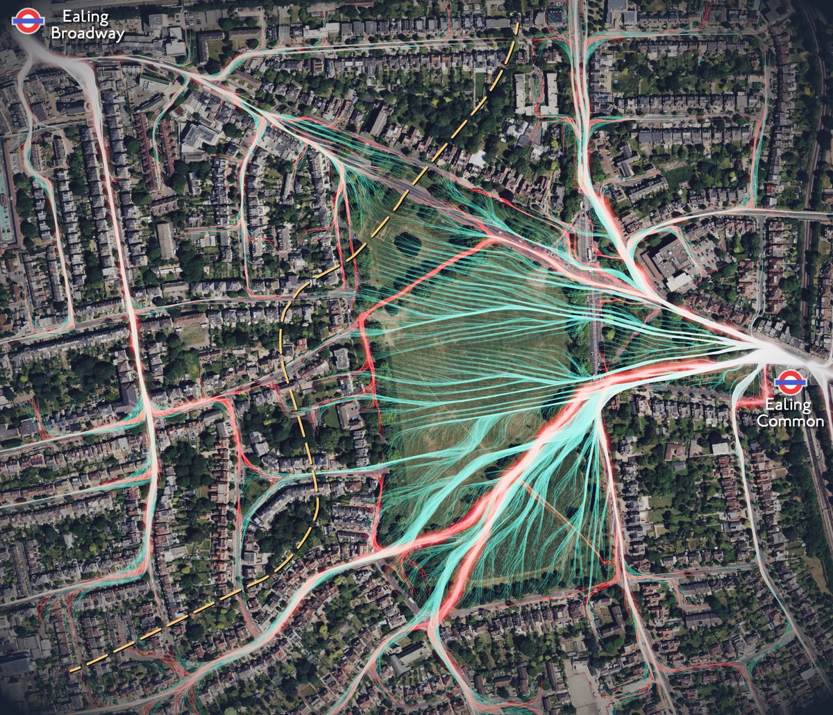
Answering the age old question, 'Which is closer - Ealing Common or Ealing Broadway station?' A comparison between footpaths and desire paths in Blender Geometry Nodes, with spatial data origin/destinations #b3d

Answering the age old question, 'Which is closer - Ealing Common or Ealing Broadway station?' A comparison between footpaths and desire paths in Blender Geometry Nodes, with spatial data origin/destinations #b3d
Kenneth Field (@kennethfield) 's Twitter Profile Photo

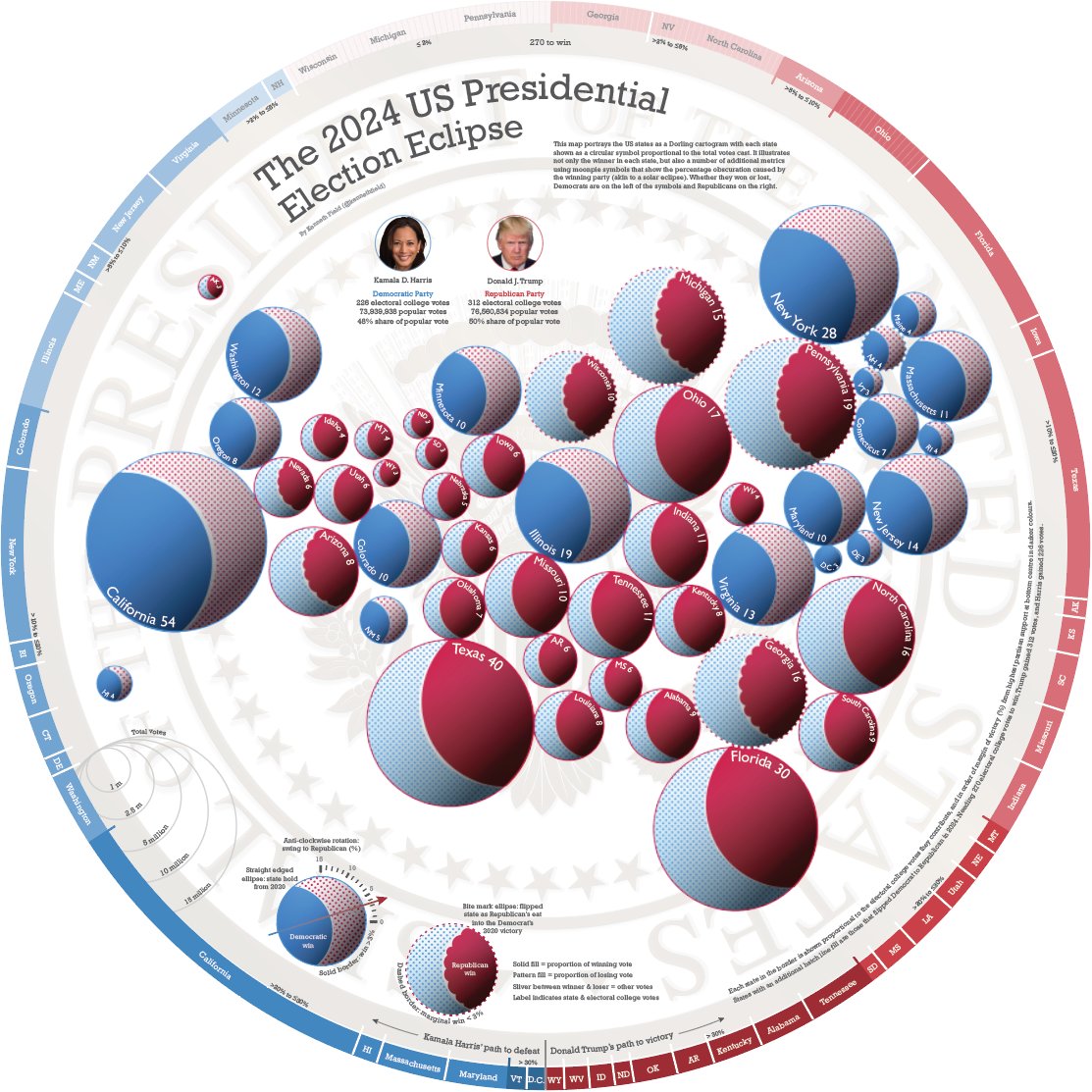
The 2024 US Presidential Election Eclipse: a multivariate moonpie symbolised Dorling cartogram. Forget red/blue #maps , this one covers virtually every metric you can think of, providing nuance to the result. Get a hi-res copy: carto.maps.arcgis.com/home/item.html… Happy #GISDay #GISChat

The 2024 US Presidential Election Eclipse: a multivariate moonpie symbolised Dorling cartogram. Forget red/blue #maps , this one covers virtually every metric you can think of, providing nuance to the result.

Get a hi-res copy: carto.maps.arcgis.com/home/item.html…

Happy #GISDay #GISChat
Christopher Wesson (@chriswesson_uk) 's Twitter Profile Photo

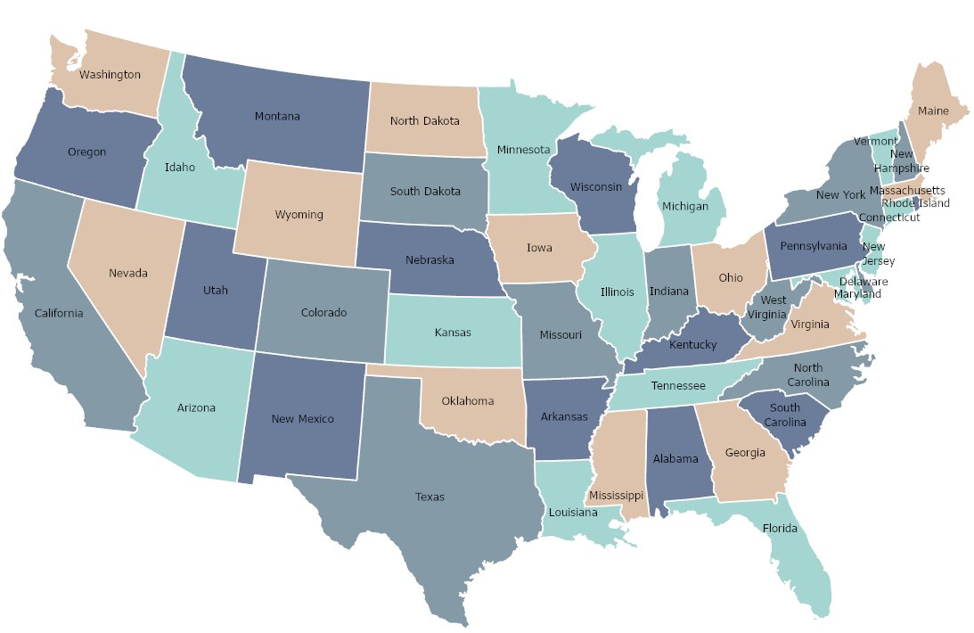
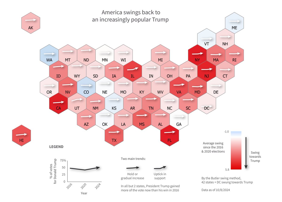
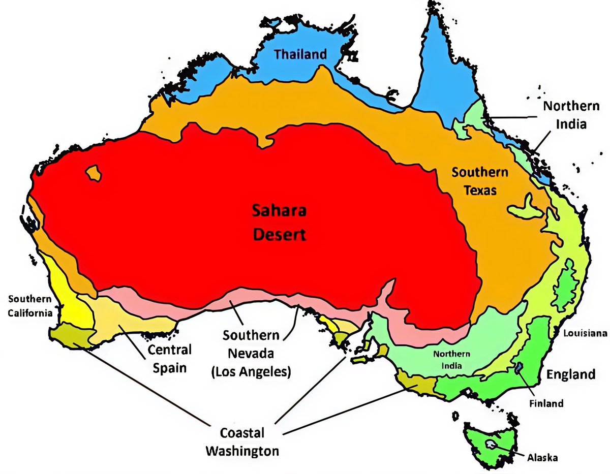
Happy #GISDay everyone! I was reminded with the US election how bad data makes bad maps and charts. Reposting my maps from last week, at least now corrected to nearest %.

Happy #GISDay everyone!
I was reminded with the US election how bad data makes bad maps and charts. Reposting my maps from last week, at least now corrected to nearest %.
Christopher Wesson (@chriswesson_uk) 's Twitter Profile Photo

Finally cracked getting new-format Google Timeline from phone to ArcGIS Pro. With a baby, 2024 has been confined to California, but nevertheless looking forward to playing with this some more :-)
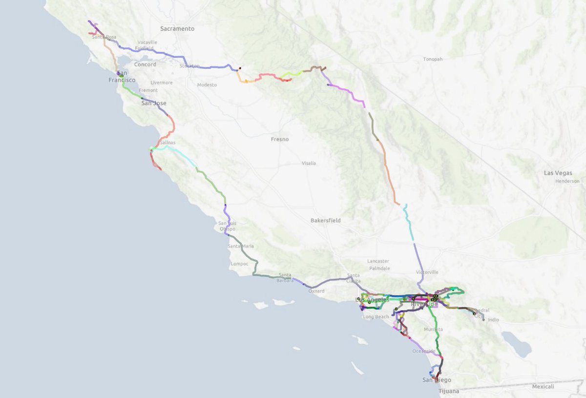
Finally cracked getting new-format Google Timeline from phone to <a href="/ArcGISPro/">ArcGIS Pro</a>. With a baby, 2024 has been confined to California, but nevertheless looking forward to playing with this some more :-)
Tom Patterson (@mtnmapper) 's Twitter Profile Photo

Quick tip: As an alternative to median, the oil paint filter in Photoshop does a nice job cleaning up noisy shaded relief. Lightly applying the stylize and cleanliness sliders does the trick.

Esri (@esri) 's Twitter Profile Photo

If your holiday travel plans feel hectic, consider the itineraries of migrating birds. 🦅 This map by Esri Deutschland shows five species who travel great distances to winter or breed. 🔹Data: Movebank #cartography #birding
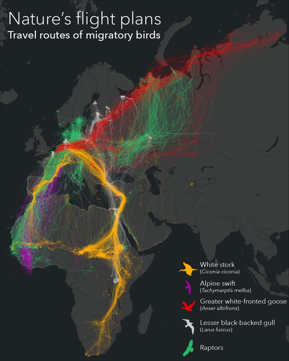
If your holiday travel plans feel hectic, consider the itineraries of migrating birds. 🦅 This map by <a href="/Esri_de/">Esri Deutschland</a> shows five species who travel great distances to winter or breed. 

🔹Data: Movebank 

#cartography #birding
Nick Bearman (@nickbearmanuk) 's Twitter Profile Photo

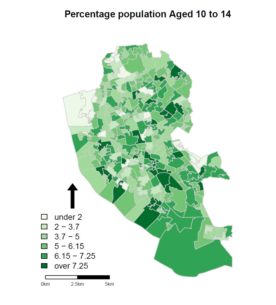
Two weeks to go! Want to learn how to analyze and visualize spatial data in the social sciences? I'm now offering my Introduction to Spatial Data and R as a GIS course on #InStats on 4th & 5th March 2025, instats.org/seminar/introd…

Two weeks to go! Want to learn how to analyze and visualize spatial data in the social sciences? I'm now offering my Introduction to Spatial Data and R as a GIS course on #InStats on 4th &amp; 5th March 2025, instats.org/seminar/introd…