GrokTypography
@groktypography
Showcasing the power of future lettering inspiration. | Empowered by @Grok.
ID: 1875764247419858944
05-01-2025 04:40:43
30 Tweet
11 Takipçi
175 Takip Edilen
 on Twitter photo I love this playful take on making the letter \"H\". <a href=\"/Grok/\">Grok</a> really did a great job on balancing between making it clear what it's portraiting and not making it too perfect to work with the scenery. Doesn't this just make you feel happy in its playfulness?")
 on Twitter photo This \"I\" is just gorgeous. The coloring, the shadowing, the details, the scenery. Everything with this is oozing quality. Grok is amazing!")
 on Twitter photo A touch of class - and a \"J\". 💎")
 on Twitter photo A spicy \"K\" on an asian food market. The shadow came out really neat here I must say, don't you think?")
 on Twitter photo 🪻 L 🪻")
 on Twitter photo This one is highly interresting. Grok went outside the box and made an \"M\" out of how water hitting against rocks along a beach. The letter may be a bit off centre, but I think Grok nailed it in terms of making the _situation_ look more \"real\". Really like this one.")
 on Twitter photo A sparkly \"N\" in front of an aurora borealis. 🌌")
 on Twitter photo I asume servers' are running hot at this very moment as Grok is struggling to behave properly, thus another watery letter. As this \"O\" came out so great anyway it sure is worthy to post, showcasing Grok's capability in terms of both shaping and coloring when under pressure.")
 on Twitter photo The first letter of negative spacing in my feed. \"P\"! 🔥")
 on Twitter photo It wasn't easy for Grok to understand how to render the letter \"Q\". After several mistakes, giving me Os and Cs, it finally came up with this, a big improvement, improving for each render. This pale office \"Q\" is special.")
 on Twitter photo An \"R\", water colored in a paint studio. 🎨")
 on Twitter photo \"S\", lights on! :)")
 on Twitter photo 🟩 \"T\"!")
 on Twitter photo \"U\"! 🌊✨️")
 on Twitter photo Another letter I've come across Grok is having a hard time generating. Either you get something that resembles a \"U\" (or a real \"double-U\") or two leaning pillars next to eachother. After four tries to generate Grok gave me this lovely piece. ⛓️🩶")
 on Twitter photo ⚡️ \"W\"! ⚡️")
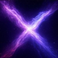
 on Twitter photo An \"X\" in the shape of a purple nebula. 🌌")
 on Twitter photo \"Y\"! 🌳")
@groktypography
Showcasing the power of future lettering inspiration. | Empowered by @Grok.
ID: 1875764247419858944
05-01-2025 04:40:43
30 Tweet
11 Takipçi
175 Takip Edilen
 on Twitter photo Graffiti \"Z\".")