Pawan Sachdeva (@pawansachdeva_) 's Twitter Profile
Pawan Sachdeva

@pawansachdeva_

Tableau Public Featured Author '20 | VOTD x 3 | Data Analyst | Tableau Desktop Specialist

ID: 1219913587516432390

linkhttps://public.tableau.com/profile/pawan.sachdeva#!/ calendar_today22-01-2020 09:24:32

1,1K Tweet

1,1K Followers

678 Following

Aliu Adekola (@emeritusali) 's Twitter Profile Photo

Nigeria will overcome its difficulties and shine. Nigeria and all Nigerians, both at home and abroad, wish you a happy 62nd anniversary of independence. God bless our country. Check out this viz about our past leaders! public.tableau.com/app/profile/al…

Nigeria will overcome its difficulties and shine. Nigeria and all Nigerians, both at home and abroad, wish you a happy 62nd anniversary of independence. God bless our country.
Check out this viz about our past leaders!
public.tableau.com/app/profile/al…
Pawan Sachdeva (@pawansachdeva_) 's Twitter Profile Photo

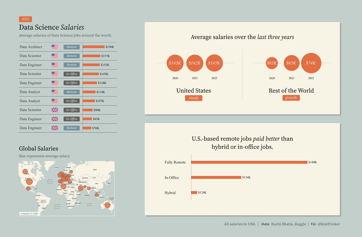
Thank you Tableau for featuring my Viz! I am honoured 😊 I've to admit that it is a bit tough to get back, after a long break from Vizzing and #datafam. Bt, the immense love and support that one gets from the community, from Tableau Public is heart warming. Thank you so much 🙏

Kevin Flerlage (@flerlagekev) 's Twitter Profile Photo

New Blog Post & Video - 5 Hacks Using Blank Characters in Tableau. Did you know there was such thing as a Blank Character? And that there are some super cool things you can do with it in Tableau? Check out this video to see five of them. flerlagetwins.com/2022/10/5-hack…

Tableau Public (@tableaupublic) 's Twitter Profile Photo

Did you know that Boston is home to one of the most extensive bike-share programs in the US? See Tableau Public Ambassador Preethi Lodha visualize in this #VizOfTheDay this system and dive into the details by viewing stations on a map and more. tabsoft.co/3BX3Th2
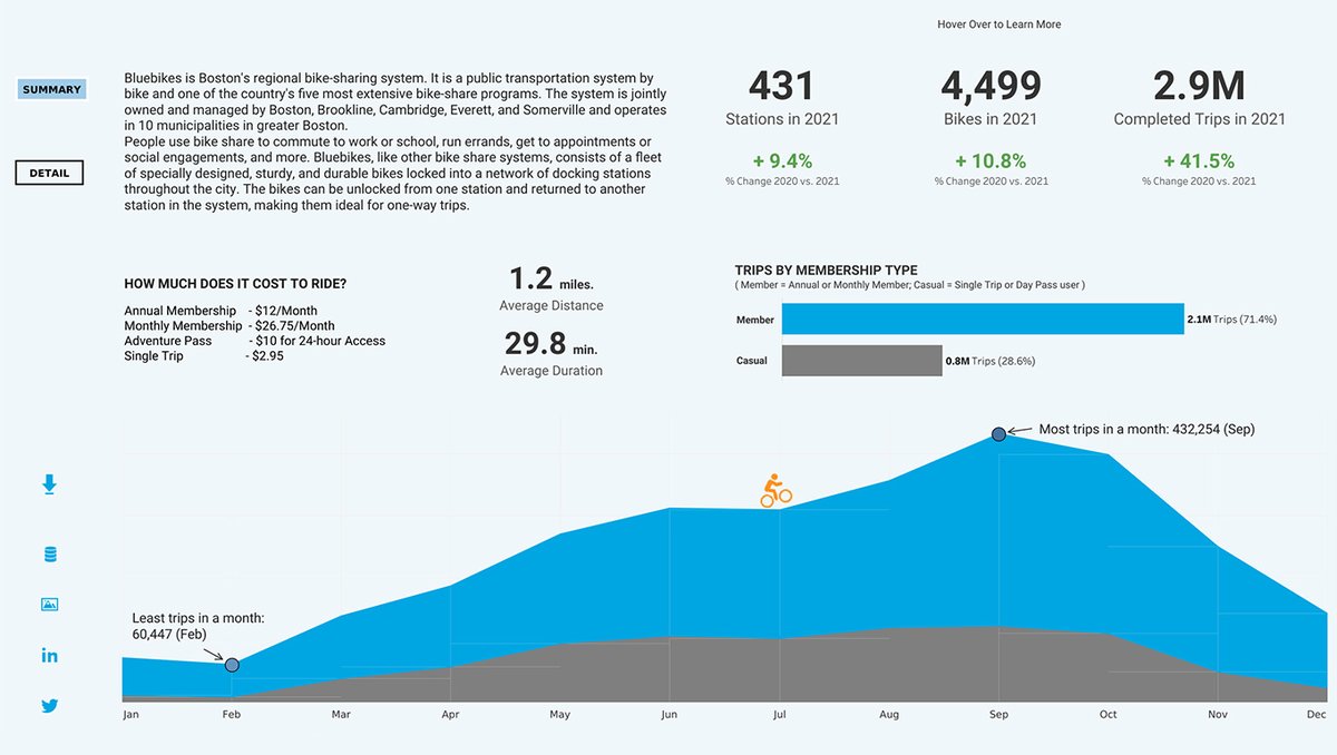
Did you know that Boston is home to one of the most extensive bike-share programs in the US? See Tableau Public Ambassador <a href="/Lodhaviz/">Preethi Lodha</a> visualize in this #VizOfTheDay this system and dive into the details by viewing stations on a map and more. tabsoft.co/3BX3Th2
Tableau Public (@tableaupublic) 's Twitter Profile Photo

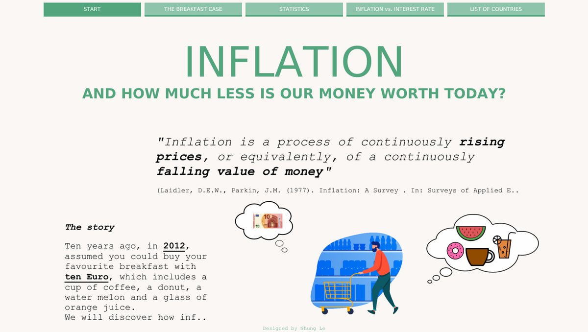
Have you ever wondered how much money is worth today in comparison to the past? Find out in Nhung Le’s #VizOfTheDay which visualizes inflation across different countries and scenarios in the past few years. tabsoft.co/3rwABkD

Have you ever wondered how much money is worth today in comparison to the past? Find out in Nhung Le’s #VizOfTheDay which visualizes inflation across different countries and scenarios in the past few years. tabsoft.co/3rwABkD
Tableau Public (@tableaupublic) 's Twitter Profile Photo

Are you participating in #IronViz this year? Building your next viz? Learn some data visualization best practices in this guide by Thiago Lima. #VizOfTheDay tabsoft.co/3fOesf6

Are you participating in #IronViz this year? Building your next viz? Learn some data visualization best practices in this guide by Thiago Lima. #VizOfTheDay tabsoft.co/3fOesf6
Tableau (@tableau) 's Twitter Profile Photo

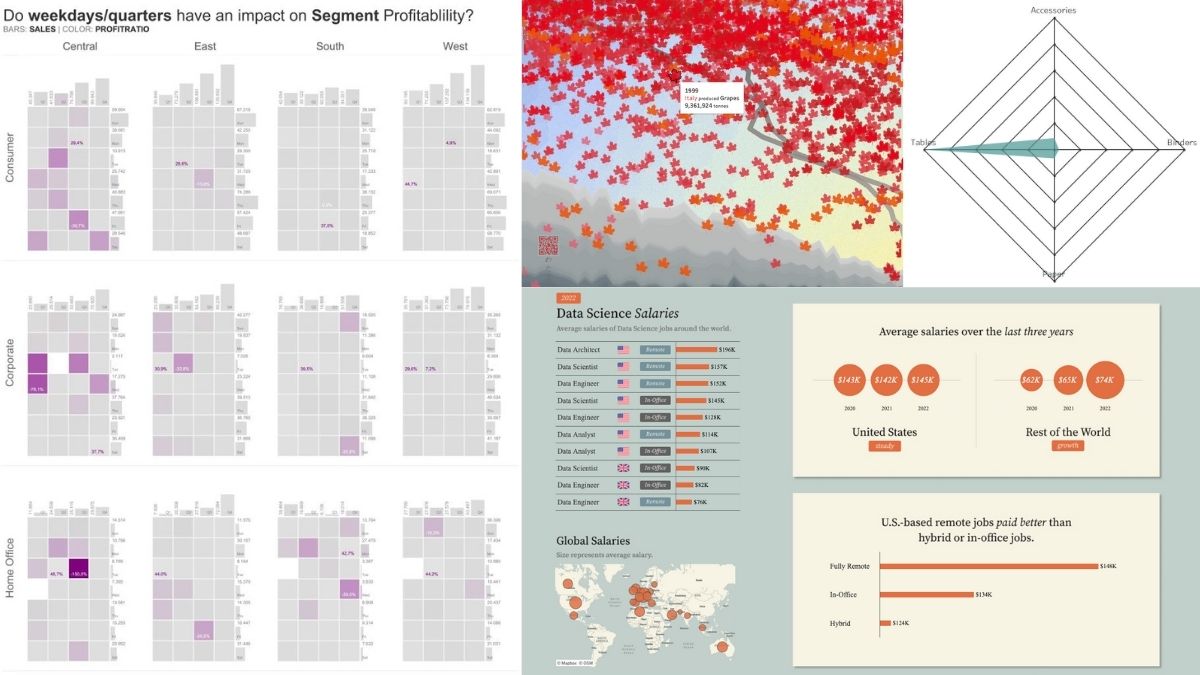
What are the latest tips, events, and visualizations from the Tableau Community? 💡Dive into this week's #DataFam Roundup and learn something new. tabsoft.co/3eiylur

What are the latest tips, events, and visualizations from the Tableau Community?

💡Dive into this week's #DataFam Roundup and learn something new. tabsoft.co/3eiylur
Tableau Public (@tableaupublic) 's Twitter Profile Photo

In recognition of #WorldMentalHealthDay, today's #VizOfTheDay is a data visualization by Shazeera Ahmad Zawawi about her experience with dermatillomania. She created this viz with the hopes that her story could help shed some light on the issue. tabsoft.co/3VhJlZO
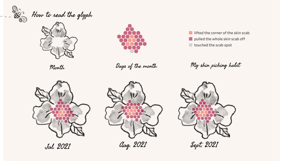
In recognition of #WorldMentalHealthDay, today's #VizOfTheDay is a data visualization by <a href="/ShazeeraZawawi/">Shazeera Ahmad Zawawi</a> about her experience with dermatillomania. She created this viz with the hopes that her story could help shed some light on the issue. tabsoft.co/3VhJlZO
Tableau Public (@tableaupublic) 's Twitter Profile Photo

Explore this #MakeoverMonday #VizOfTheDay to see ハラヨワ | Harayowa visualize download, upload, and latency speed averages throughout Europe. tabsoft.co/3CStkCn
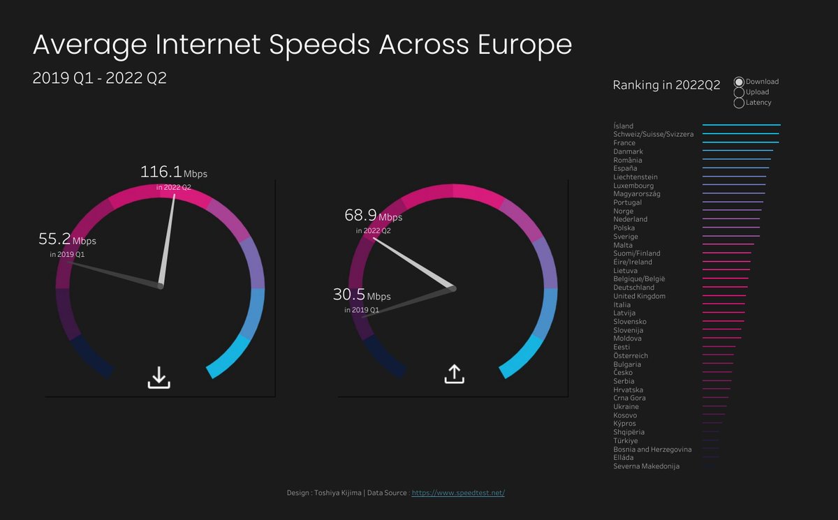
Explore this #MakeoverMonday #VizOfTheDay to see <a href="/jito60261993/">ハラヨワ | Harayowa</a> visualize download, upload, and latency speed averages throughout Europe. tabsoft.co/3CStkCn
Kevin Flerlage (@flerlagekev) 's Twitter Profile Photo

New Guest Blog Post - Using "Set Rankings" Instead of Table Calculations. In this post, regular contributor Kasia Gasiewska-Holc shows us a really creative way to use sets to calculate ranks & why we might use these instead of Table Calcs. Very cool stuff! Link: flerlagetwins.com/2022/10/using-…

Tableau Public (@tableaupublic) 's Twitter Profile Photo

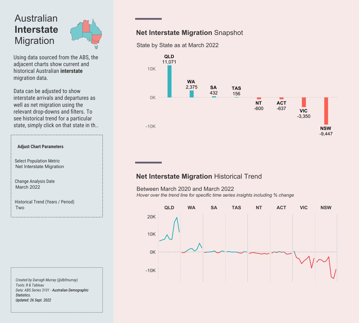
Check out this #VizOfTheDay to see @dbfmurray visualize data from the Australian Bureau of Statistics to see migration within Australia. Pro tip: Don't miss the interactive map in the upper left. tabsoft.co/3D5cf8e

Check out this #VizOfTheDay to see @dbfmurray visualize data from the Australian Bureau of Statistics to see migration within Australia. Pro tip: Don't miss the interactive map in the upper left. tabsoft.co/3D5cf8e
Kevin Flerlage (@flerlagekev) 's Twitter Profile Photo

I've created a lot of workarounds for a lot of things in @Tableau over the years. This new Dynamic Zone Control has the potential of solving tons of them. I'm finding all kinds of fun use cases. Here's one that I hacked a few years ago that can be solved with it.

Sam Parsons (@sparsonsdataviz) 's Twitter Profile Photo

🚨 New Viz! Tableau 2022.3 Dynamic Zone Visibility - some use cases! Including: Single chart zooming Added detail to charts (dimensions, labels etc) Reveal new controls when chart is zoomed in on. Link: tabsoft.co/3Smc7po Let me know what you think!

Tableau Public (@tableaupublic) 's Twitter Profile Photo

In this #VizOfTheDay, Saverio Rocchetti uses a two-color area chart to visualize data from Our World in Data that shows the annual change in global emissions from 1900 to 2020 and potential influential events. tabsoft.co/3V6ZkJl
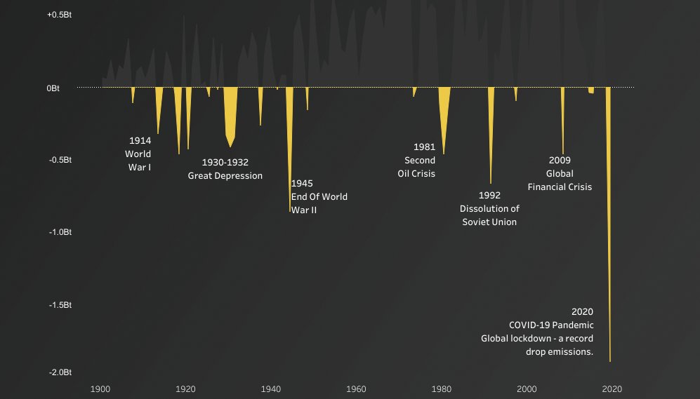
In this #VizOfTheDay, <a href="/Saveriorocc/">Saverio Rocchetti</a> uses a two-color area chart to visualize data from Our World in Data that shows the annual change in global emissions from 1900 to 2020 and potential influential events. tabsoft.co/3V6ZkJl
Andy Kriebel (@vizwizbi) 's Twitter Profile Photo

From Tableau to speaking so people want to listen, here are 12 ways to help you learn from this past week • Improve every day by making time to learn youtube.com/andykriebel

From Tableau to speaking so people want to listen, here are 12 ways to help you learn from this past week • Improve every day by making time to learn

youtube.com/andykriebel
Pawan Sachdeva (@pawansachdeva_) 's Twitter Profile Photo

Honored to be among such talented ppl in the #TableauNext cohort Humbled by the immense ❤️ we get from #datafam. Nt being able to contribute mch last year bt still being nominated. Means a lot! Will try my best to give back this yr🤗 Big thanks to Adam Mico for the initiative