profile-img
Nnaemeka Reuben (iReuby)

@InsightfulReuby

Microsoft Certified Trainer | Analytics & Insights | Chess | Strategist | MUFC | Performance Manager | Trainer @Dataleum

calendar_today15-08-2014 13:57:13

3,7K Tweets

4,6K Followers

771 Following

Nnaemeka Reuben (iReuby)(@InsightfulReuby) 's Twitter Profile Photo

Recommendations for ranking: Clustered bar chart and clustered column chart (my favourites). Possible to use Matrix or Tables and sort descending or ascending.

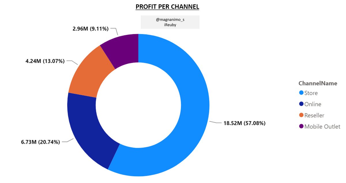
4. Part to whole. E.g. Sales Mgr, please what is the contribution of each sales channel to our overall profit?

7/17

account_circle
Nnaemeka Reuben (iReuby)(@InsightfulReuby) 's Twitter Profile Photo

Need: To identify the CONTRIBUTION of each part (channel) to the whole measure (profit).

Recommendations: Clustered (bar & column charts), 100% stacked (column & bar charts), stacked (bar & column charts), pie or donut charts...

8/17

account_circle
Nnaemeka Reuben (iReuby)(@InsightfulReuby) 's Twitter Profile Photo

(I have used a donut chart in the picture for illustration. Be careful with these two. Not ideal if categories are much), funnel chart (if categories are part of a process e.g. marketing).

9/17

(I have used a donut chart in the picture for illustration. Be careful with these two. Not ideal if categories are much), funnel chart (if categories are part of a process e.g. marketing). 9/17
account_circle
Nnaemeka Reuben (iReuby)(@InsightfulReuby) 's Twitter Profile Photo

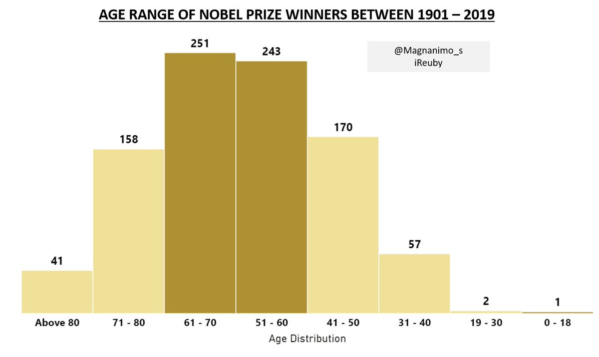
5. Distribution. E.g. Is age just a number? My mentor said I can do great things even at my young age. Malala Yousafzai won the Nobel Peace Prize at age 17. What is the age range of all Nobel Prize Awardees from 1901 to 2019?

Need: To display the DISTRIBUTION of values.

10/17

5. Distribution. E.g. Is age just a number? My mentor said I can do great things even at my young age. Malala Yousafzai won the Nobel Peace Prize at age 17. What is the age range of all Nobel Prize Awardees from 1901 to 2019? Need: To display the DISTRIBUTION of values. 10/17
account_circle
Nnaemeka Reuben (iReuby)(@InsightfulReuby) 's Twitter Profile Photo

Recommendations: Histogram (my favourite), Line chart and Clustered column chart. Depending on dataset, you could try Box and Whisker and Candlestick charts.

6.Correlation. E.g. Electricity cost and co. have skyrocketed...

11/17

account_circle
Nnaemeka Reuben (iReuby)(@InsightfulReuby) 's Twitter Profile Photo

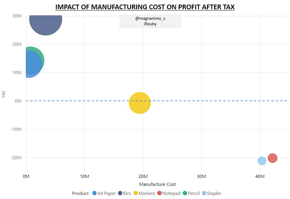
How does the manufacturing cost of my products affect their profitability? From the chart, it’s clear that increase in manufacturing cost decreases profit (negative correlation).

Need: To show CORRELATION between measures.

12/17

How does the manufacturing cost of my products affect their profitability? From the chart, it’s clear that increase in manufacturing cost decreases profit (negative correlation). Need: To show CORRELATION between measures. 12/17
account_circle
Nnaemeka Reuben (iReuby)(@InsightfulReuby) 's Twitter Profile Photo

Recommendations for correlation: Scatter plot (my favourite), enhanced scatter, line chart with clustered column. You can also try quadrant chart, venn diagram, or impact bubble chart.

7.Single value. E.g. What is the total number of Nobel Prize Awardees by gender?

13/17

account_circle
Nnaemeka Reuben (iReuby)(@InsightfulReuby) 's Twitter Profile Photo

Need: To present single values.

Recommendations: Card (favourite), Multi-row card, KPI, Matrix, Table and Scroller.

8. Flow. E.g. Hello Marketing Mgr. Based on your marketing campaign in Q2 2022, what was the solution’s market size & our new market share?

14/17

Need: To present single values. Recommendations: Card (favourite), Multi-row card, KPI, Matrix, Table and Scroller. 8. Flow. E.g. Hello Marketing Mgr. Based on your marketing campaign in Q2 2022, what was the solution’s market size & our new market share? 14/17
account_circle
Nnaemeka Reuben (iReuby)(@InsightfulReuby) 's Twitter Profile Photo

Need: To display a flow or dynamic relations.

Recommendations: Funnel chart and Waterfall. You could try Sankey chart, Chord, Hierarchy chart, Bowtie chart, Visio visual etc.

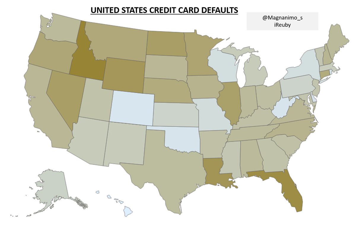
9. Spatial. E.g. How did each state in the US perform in terms of credit card defaults?

15/17

Need: To display a flow or dynamic relations. Recommendations: Funnel chart and Waterfall. You could try Sankey chart, Chord, Hierarchy chart, Bowtie chart, Visio visual etc. 9. Spatial. E.g. How did each state in the US perform in terms of credit card defaults? 15/17
account_circle
Nnaemeka Reuben (iReuby)(@InsightfulReuby) 's Twitter Profile Photo

Recommended: Map, Filled Map, Synoptic Panel, Shape Map, Azure Map, Heat Map etc.

Phewww! This turned out to be a long thread. I hope you found it insightful.

Did I miss out any use case or is there something that can be better?

16/17

account_circle