
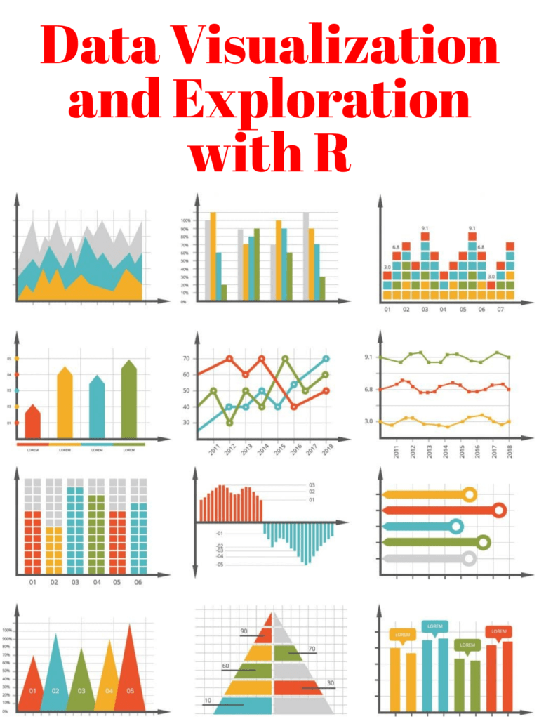
📌📄Data visualization and exploration are essential components of the data analysis process. They allow us to understand and communicate the patterns, trends, and insights present in our data. pyoflife.com/data-visualiza…
#DataScience #rstats #DataVisualization #DataAnalytics

Professional deformation is when you gift your husband an #infographics on your wedding anniversary with the number of text characters exchanged between us over the past 3 years.
#dataviz #Datavisualization #anniversary


Watch our #TutorialVideo that guides you through the #Jupyter #ColabNotebook containing our #OpenAccess #MERFISH #MouseBrain Receptor Map:
hubs.ly/Q01VYntb0
#DataVisualization #SingleCell #SpatialAnalysis #DeckGL #observable_jupyter #UMAP #SCANPY #ComputationalBiology


Fun and informative session Rosalyn W., PhD 🚗➡#ISTELive23!!! Thanks for sharing! #ISTELive #DataVisualization #iste23 #ISTELive 23

One type of chart a day, today we have a treemap. It displays hierarchical data using nested rectangles. Similar to the sunburst diagram, it is very useful for visualizing hierarchical structures.
#dataanalytics #dataanalysis #dataanalyst #datavisualization #datavisualisation

Just completed an exciting HR Analysis project using Tableau! 🚀 Check out the incredible insights we uncovered about employee engagement and retention. #HRAnalysis #Tableau #DataVisualization #Analytics

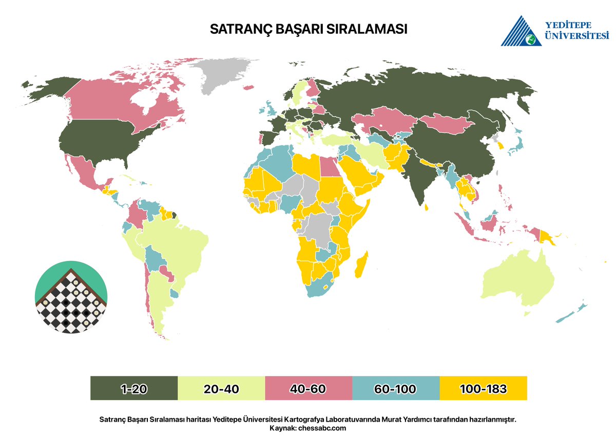
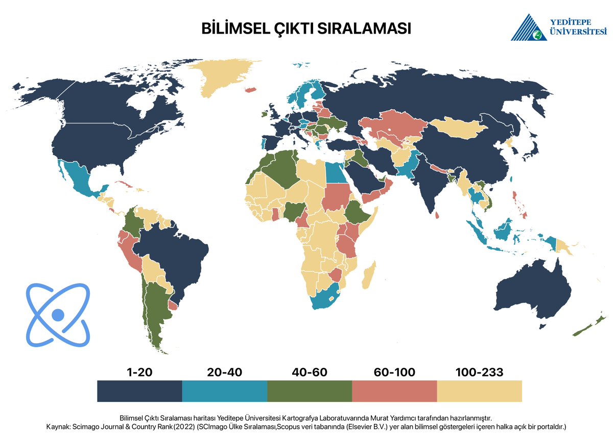
Bu sezon 3 Büyükler ligi ilk 3'te tamamladı. Çok da şaşılacak bir durum olmadı çünkü tarihte de çok kez yaşanmıştı bu.
(Tatil tatil ciddi bir grafik paylaşmayalım :) )
#verigörselleştirme #datavisualization #dataviz


📊 ¡TODOS los tutoriales de ggplot2 en un único sitio!
🙌 Código reproducible de diferentes personalizaciones del mismo gráfico o uno equivalente. ¡Filtra o elige la categoría que desees!
👤 R CODER
🔗 buff.ly/3YXHWZU
#dataviz #RStats #DataScience #Datavisualization

Senior Developer: Saving the Code, One Junior at a Time! 😋 😎
#datascienceprofessional #machinelearning #machinelearning algorithms #datascientist #dataviz #datavisualization #Programmer Humor #Programmer #Coding #Programming #Jokes #Technology #Humor #Coder #Developer


Far from perfect, I would like to share a part of my data analytics journey with you 😎😎
BluechipTechHQ
Damilare Oyetade 🇳🇬
PowerBI.Tips
#DataVisualization
#PowerBI
#DataAnalytics

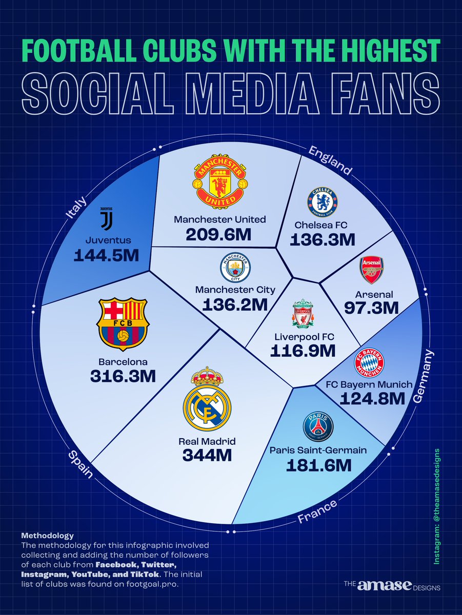
The first time I saw a circular Voronoi chart, I thought of a football. And so, I set out to use it to represent a dataset specifically for football enthusiasts.
So this post is dedicated to all passionate football fans out there❤️⚽️.
#datavisualization #dataviz #infographic

Connect with me on LinkedIn. You don't want to miss this 🥳🤩
linkedin.com/in/zehida-thab…
#DataVisualization #dataanalysis #PowerBI #womenintech #TechTuesday #DataScience #DataAnalytics #SQL


In the realm of data science, the use of mathematical foundations is paramount to extracting valuable insights and making informed decisions. pyoflife.com/mathematical-f…
#DataScience #RStats #DataAnalytics #mathematics #statistics #DataVisualization

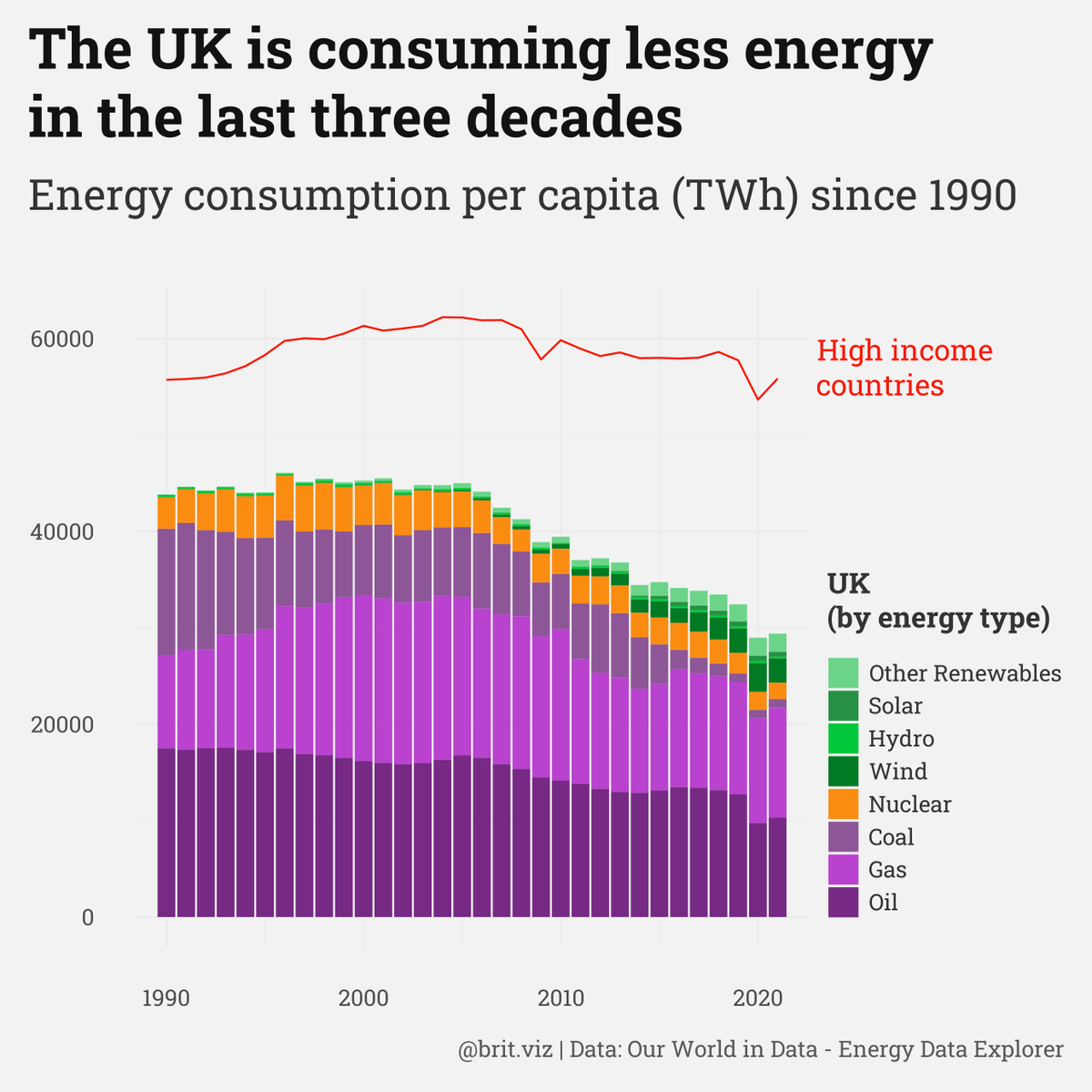
Keep digging old #tidytuesday data to work on. This one is a bit unexpected with the UK energy consumption so low compared to high-income countries in general.
#r #r stats #dataviz #datavisualization

So this is an Advanced dashboard using reactJS and Tailwind CSS with amazing looking charts using syncFusion
You can check the code out on my gitHub
github.com/J4mesdiamond/D…
#reactjs #tailwindcss #DataVisualization #uiux
#Webdesign
#DataAnalytics
#webdevelopment

