profile-img
jonathanboys

@JonathanBoys

Economist @cipd. Tweets on the world of work. demographics, pay, hours, skills, insecurity, WFH etc. Lots of charts. Retweet is probably an endorsement.

calendar_today14-03-2009 15:43:35

1,7K Tweets

1,2K Followers

947 Following

jonathanboys(@JonathanBoys) 's Twitter Profile Photo

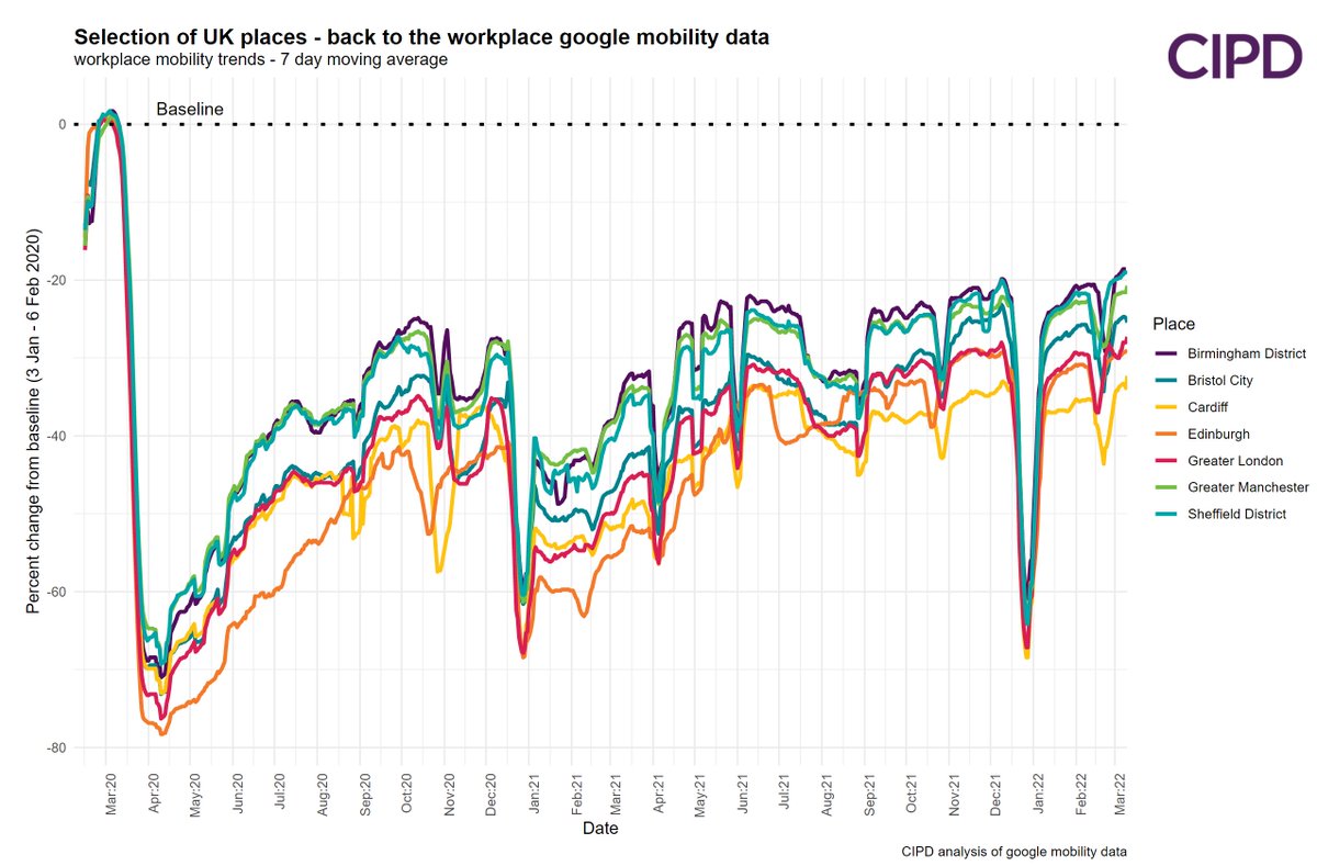
More / thoughts. 1/ With google mobility workplace data, places in the same country move in lockstep (the degree of change differs). Note - Edinburgh & Cardiff are the furthest below baseline, perhaps as devolved policy was less strong on going back to the office.

More #WFH/#commuting thoughts. 1/ With google mobility workplace data, places in the same country move in lockstep (the degree of change differs). Note - Edinburgh & Cardiff are the furthest below baseline, perhaps as devolved policy was less strong on going back to the office.
account_circle
jonathanboys(@JonathanBoys) 's Twitter Profile Photo

jonathanboys @LWpaulbivand I'd be wary of concluding that Cardiff/Edinburgh are furthest below baseline because of devolved policy differences. Think more to do with how city geography is defined - Greater London is 32 LAs with very different workplace activity profiles.
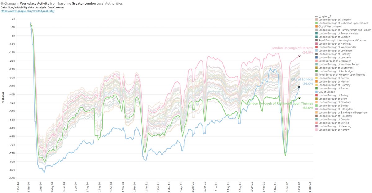
@JonathanBoys @LWpaulbivand I'd be wary of concluding that Cardiff/Edinburgh are furthest below baseline because of devolved policy differences. Think more to do with how city geography is defined - Greater London is 32 LAs with very different workplace activity profiles.
account_circle
jonathanboys(@JonathanBoys) 's Twitter Profile Photo

Dan Cookson @LWpaulbivand Fair point. Your chart is really nice. I like how the background lines are lighter. I can't chart more than about 7 lines without it getting too messy. Are you using a 7 day rolling average? I tried but don't know what to do about the city (of LDN) as lots of missing wkend data.

account_circle
jonathanboys(@JonathanBoys) 's Twitter Profile Photo

jonathanboys @LWpaulbivand Thanks. I use Tableau which has some nice settings for highlighting lines so can go crazy with number of lines. And yes I was using 7 day average in that chart but tend to remove the weekends from the workplace activity.
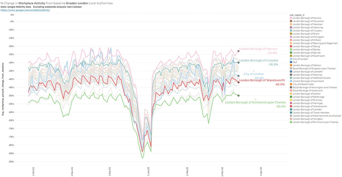
@JonathanBoys @LWpaulbivand Thanks. I use Tableau which has some nice settings for highlighting lines so can go crazy with number of lines. And yes I was using 7 day average in that chart but tend to remove the weekends from the workplace activity.
account_circle
jonathanboys(@JonathanBoys) 's Twitter Profile Photo

jonathanboys @LWpaulbivand Going crazy with lines!
Fair to say that Edinburgh/Cardiff/ and parts of London like Islington were at the very bottom of workplace activity - even on a global comparison
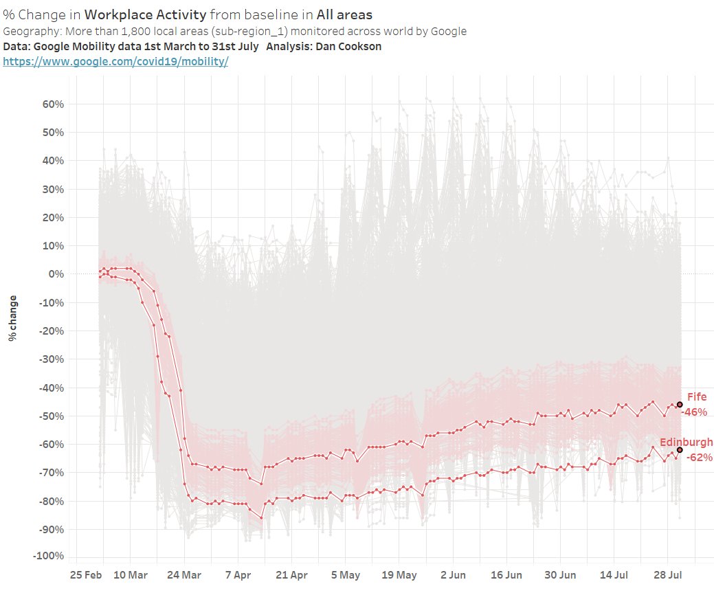
@JonathanBoys @LWpaulbivand Going crazy with lines! Fair to say that Edinburgh/Cardiff/ and parts of London like Islington were at the very bottom of workplace activity - even on a global comparison
account_circle
jonathanboys(@JonathanBoys) 's Twitter Profile Photo

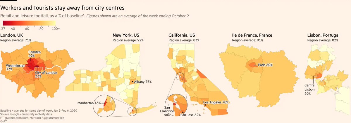
Dan Cookson jonathanboys @LWpaulbivand Yep, we did a big deep-dive into this a while back, and London was pretty much the global leader for remote working (only beaten at the time by Melbourne which was in a strict lockdown) ft.com/content/d5b45d…
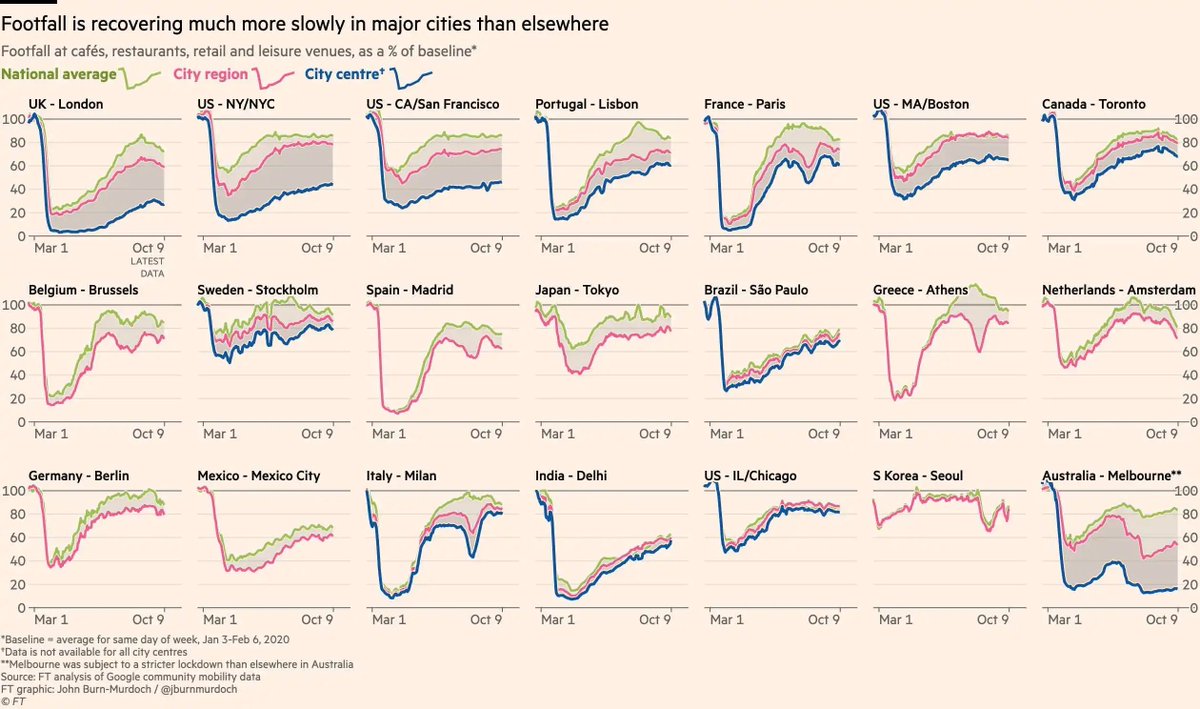
@danc00ks0n @JonathanBoys @LWpaulbivand Yep, we did a big deep-dive into this a while back, and London was pretty much the global leader for remote working (only beaten at the time by Melbourne which was in a strict lockdown) ft.com/content/d5b45d…
account_circle